

The Apartment Trade Is Over. Back to Apartment Investing.
The 2010s were a lightning strike. What comes next is what was always there.

In 1988, 87 members of the Forbes 400 had made their money in real estate — up from 48 just five years earlier. The cycle had minted them. S&L-fueled lending, syndication fees and a wall of institutional capital drove property values to record highs and turned developers into billionaires.
Five years later, 32 were left.
The Reichmann brothers, who had built Olympia & York into the largest real estate empire on earth, filed what was then the biggest real estate bankruptcy in history. Dozens of names that had seemed permanent at the top of the American wealth rankings were simply erased.
But not everyone got washed out. Donald Bren joined the consortium that acquired the 93,000-acre Irvine Ranch in 1977, then spent the next nineteen years buying out his partners one by one, finally becoming the sole owner only in 1996. He never chased the public markets for long — the apartment subsidiary he floated as a REIT in 1993, he had already taken private by 1999. He developed it methodically, decade after decade, collecting rent and compounding quietly while three cycles rose and fell around him. Today his net worth stands at roughly $18 billion — built on roughly $115 million for the initial stake in 1977, another half-billion to take majority control in 1983, and $256 million more in 1991 to settle out the last holdout, compounded over nearly fifty years on a single asset.
Bren survived the early 1990s downturn not because he timed the cycle. He survived because he was playing a different game entirely. Slower, more conservative, built on cashflow rather than leverage. The cycle washed out the fast money. The slow money compounded through.
Fast forward thirty years.
Many of the conversations I have these days sound the same. An LP who made a fortune in the last cycle, sitting on an underwater portfolio, wondering whether to cut their losses or hold. A syndicator who can’t raise a dollar no matter how much he tightens fees and promote. An investor who hasn’t bought a deal in three years and is starting to wonder if he ever will again.
They’re all asking some version of the same question: Why is this so much worse than the GFC recovery? When do rates come down and rents start growing again?
It’s a fair question. The answer is not what most people want to hear.
What you actually had between 2010 and 2022 was the simultaneous alignment of four tailwinds that rarely converge: cap rates compressed under a tide of credit, the largest generation in American history hit its prime renting years, supply ran lean for a decade and the political price of being a large landlord stayed near zero. Apartments’ outsized returns were built on those four tailwinds reinforcing each other.
All four have now reversed. None are coming back anytime soon.
But here’s the part the industry hasn’t fully absorbed yet. That’s actually a good thing. The 135 years of U.S. housing total return data show something remarkable. The get-rich-slow version of this business, one built on cashflow and operations rather than cap rate compression and momentum, compounds better. With less risk. And without the political backlash the get-rich-fast version inevitably triggers.
The 2010s were a lightning strike. What comes next is a reversion to the way the business was always supposed to be played.
The 43-Year Winning Streak
Before we can understand what changed, we need to understand how apartments performed for most of their institutional history.
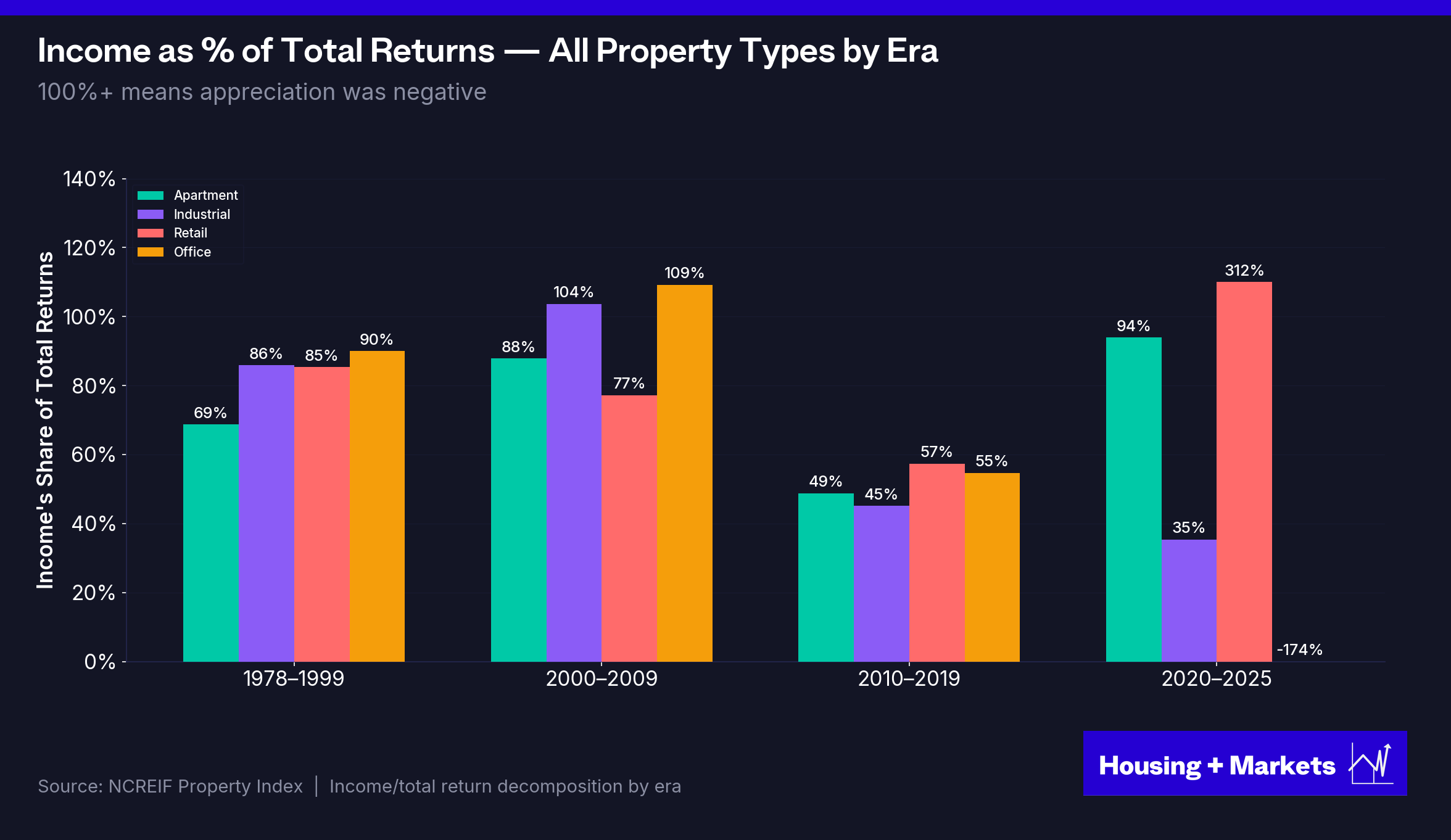
The NCREIF Property Index (the benchmark used by pension funds, endowments and institutional allocators to measure real estate performance) has tracked CRE returns since 1978. It is the longest continuous dataset on institutional property performance in existence. Housing + Markets analyzed the complete NCREIF return series for all four core property types, decomposing total returns into income and appreciation components across the full 48-year record.
The headline result: from 1978 through 2020, apartments led every other NCREIF property type in cumulative total return. Forty-three consecutive years at the top. The undisputed king of institutional commercial real estate.
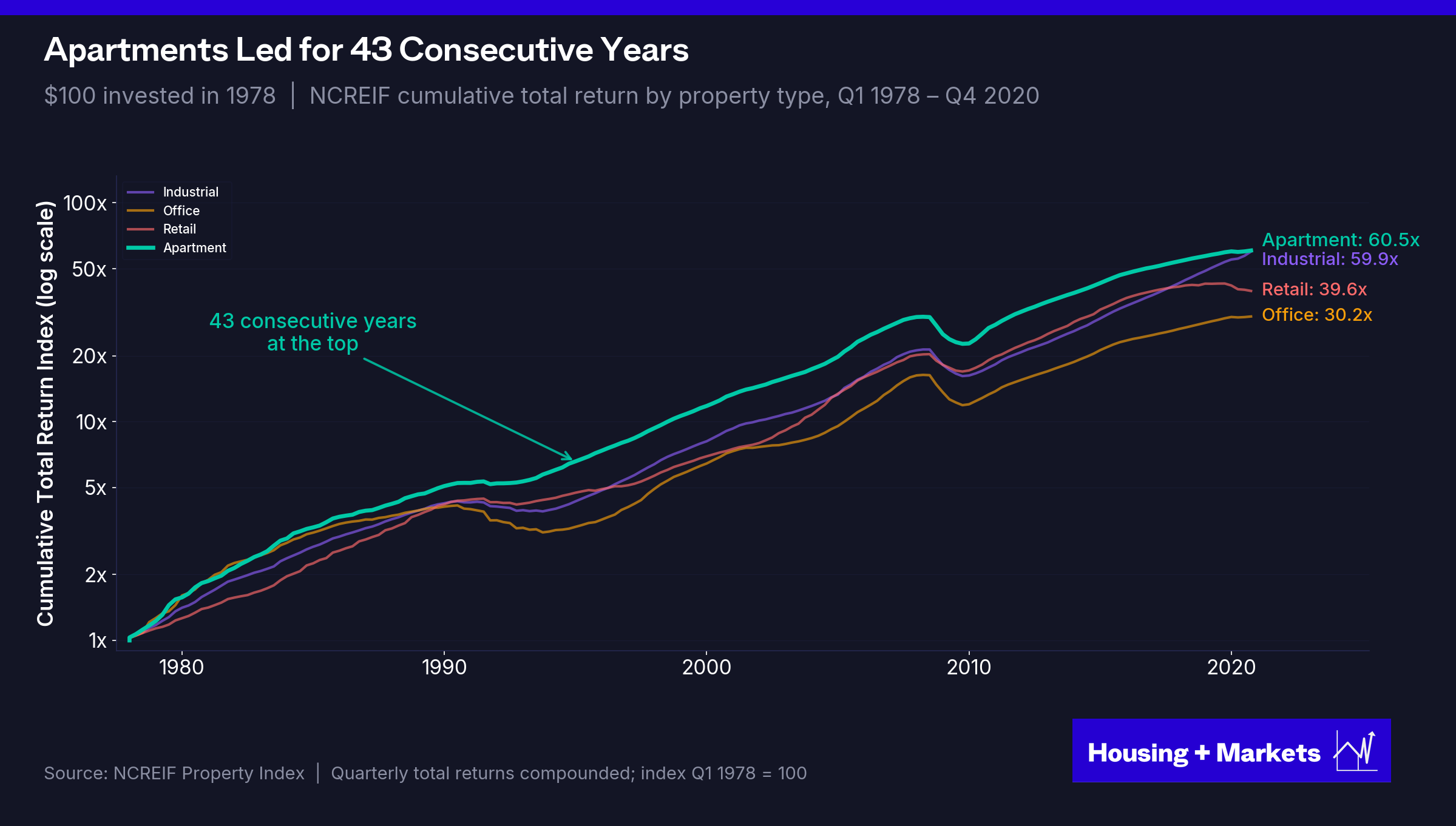
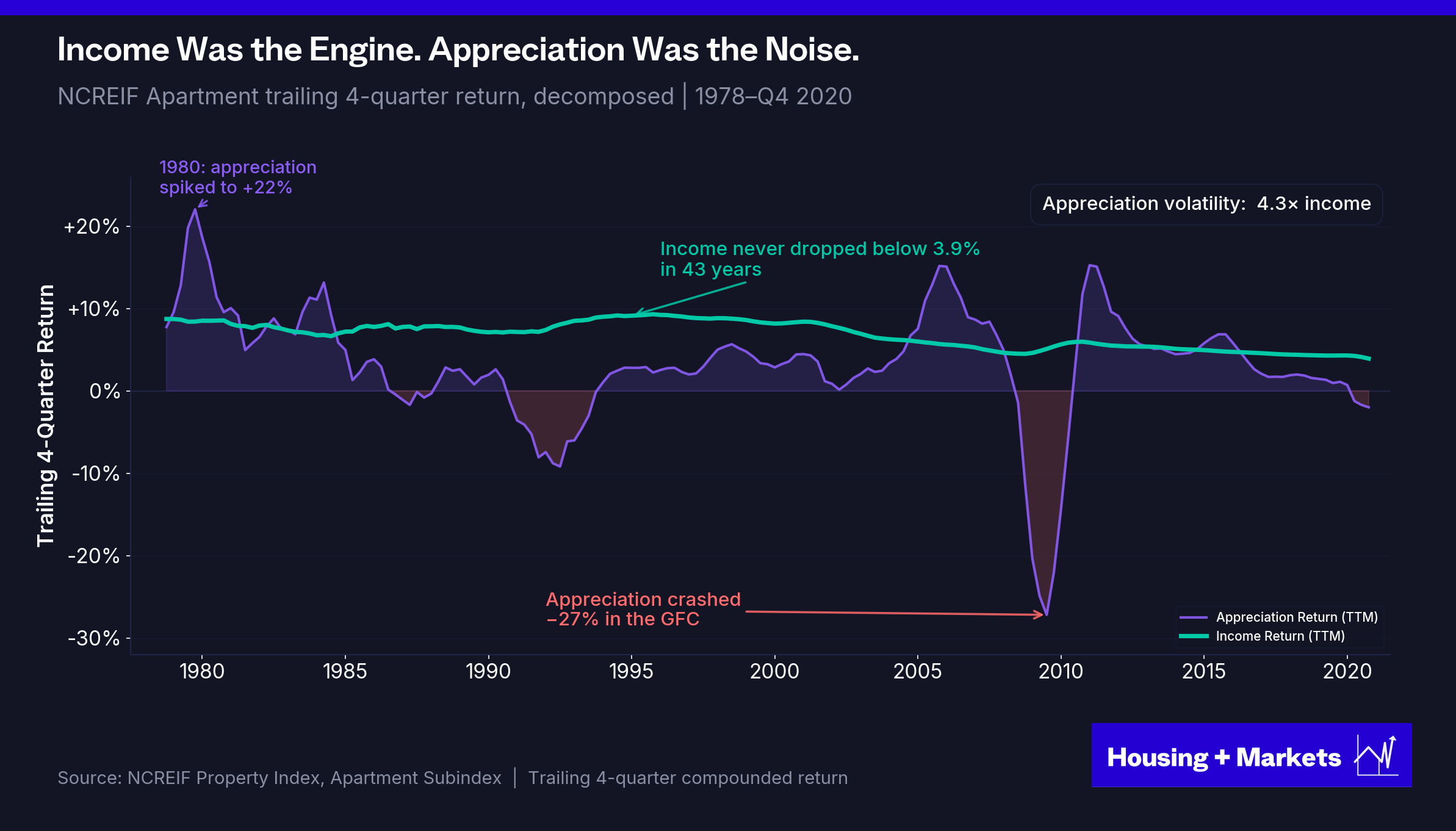
Forty-three consecutive years at the top. Apartments delivered roughly 10% annually across the run. And the engine wasn’t appreciation. It was rent.
For every dollar apartments returned to investors between 1978 and 2020, roughly 68 cents came from rent. The remaining 32 cents came from appreciation — and that 32 cents swung from +22% in 1980 to −27% in 2009.
Income produced 6.8% per year and never dropped below 4% — not through the S&L collapse, not the dot-com bust, not the GFC. Appreciation contributed 3.1% on average, but it got there through extreme volatility: appreciation moved 4.3× more than income. Apartments compounded the way real estate is supposed to compound: rent did the work, appreciation came along for the ride.
This ratio wasn’t an artifact of the period. Across the entire 1978–2020 NCREIF record, every property type pulled the majority of its return from income. Apartments were the cleanest case, but office, industrial, and retail told the same story. They were income assets first. Appreciation was the variable, not the foundation.
The chart shows the durability part of the argument. Income is positive every year. Appreciation isn’t. When appreciation went to −27% in 2009, income still threw off ~6% — the difference between a flat year and a catastrophic one. Income wasn’t just the bigger contributor to total return. It was the contributor you could underwrite.
But apartments didn't just deliver the strongest returns. They did it with the lowest correlation to the cycle. Through the entire pre-GFC era (1978 through 2007) apartment beta against the NCREIF aggregate sat at 0.80. Across thirty years of data, apartments were the only property type that posted both a sub-1 beta AND a top annualized return.
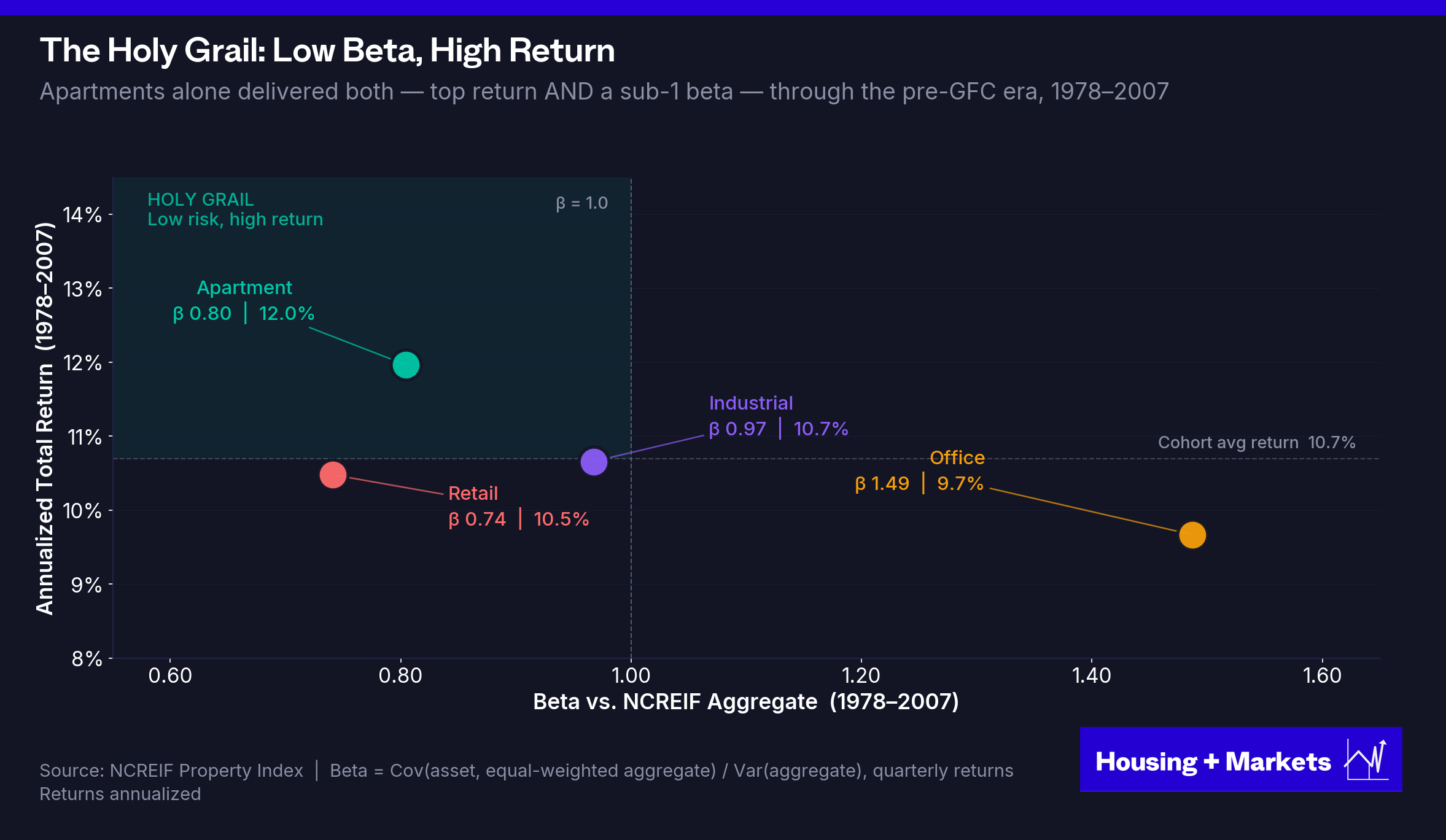
That’s the holy grail of institutional investing. Higher returns with lower systematic risk. It’s why allocators piled into apartments for decades. The sector delivered cycle-beating upside without forcing investors to underwrite the full volatility of commercial real estate as an asset class.
From Diversifier to Momentum Trade
Around 2008, after thirty years of income-driven compounding, the engine flipped. Rent stopped doing most of the work. Capital flows took over. By the middle of the decade, appreciation was producing nearly all of apartments’ total return and apartments started moving in sync with every other risk asset.
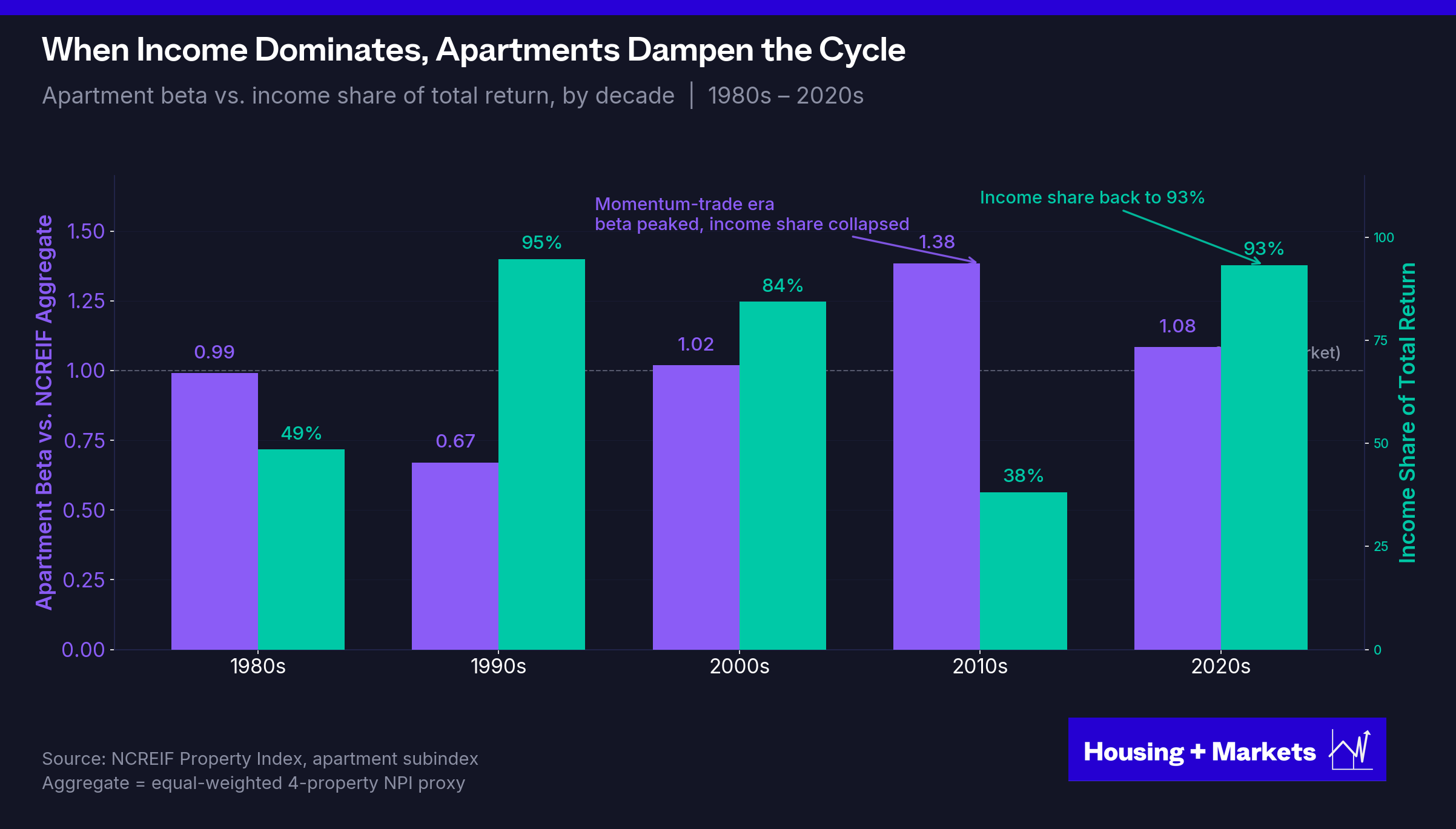
The chart makes the engine swap unmistakable. When income share runs at 80%+ (the 1990s, 2000s and now the 2020s) apartment beta sits at or below the market. When income share collapses, beta spikes. The 2010s ran the inversion to its extreme. Income’s contribution crashed to 38% and beta jumped to 1.38. The 1990s were the mirror image. Income produced 95% of return and beta sat at 0.67.
Today the pattern has reverted. Apartment beta sits at 1.08, still slightly above the market. But income’s share is back to 93%. Same beta surface as the 2010s peak, completely different engine.
The mechanism is intuitive. Income comes from rent checks. Rent checks arrive regardless of what the S&P did last quarter or what the 10-year is doing. Income is uncorrelated by nature. Appreciation comes from capital flows, credit conditions and market sentiment. The same forces that move equities, bonds and everything else. When appreciation drives returns, apartments inherit appreciation’s volatility. The asset class didn’t get riskier because something changed about the assets. It got riskier because the source of the returns changed.
This wasn’t just a multifamily story. For the first time in 48 years of NCREIF data, every property type’s income share collapsed simultaneously. The same zero-rate, credit-flooded regime distorted every corner of institutional real estate.
Apartments are the cleanest case study of the inversion. The longest income-driven streak in the dataset, the most pristine demographic and regulatory setup going in — and so the most ground to give back when the engine flipped. The reckoning shows up here first and sharpest because no property type had further to fall.
And then the streak itself ended. In Q1 2021, after 43 consecutive years of leading every NCREIF property type, apartments fell behind industrial in cumulative total returns. They have not reclaimed the top spot since.
A 43-year winning streak doesn’t quietly roll over at random. It breaks when the regime that produced it breaks. And apartments’ regime wasn’t generic. Rates and credit were the shared macro tailwinds. Every leveraged asset rode them. But the demographic wave, the supply deficit and the regulatory free pass were apartment-specific. Apartments outperformed for four decades because the shared macro tailwinds stacked on top of three structural tailwinds the other property types didn’t share. When all four reversed, apartments had the most ground to give back.
The outperformance wasn’t a structural feature of the asset class. It was a feature of an alignment that was uniquely favorable to multifamily. And the cause was four specific tailwinds operating in tandem. None of them were durable in the long run. All of them have now exhausted themselves.
The Four Tailwinds
Strip the storytelling out of multifamily’s 2010-2022 run and what’s left is four exogenous inputs that did the heavy lifting. Each was unusual on its own. The fact that they all aligned at once is what made the era exceptional. The fact that none are aligning now is what makes the next decade structurally different.
In order of contribution:
Cap rate compression, driven not by rates but by the largest credit injection in modern financial history.
The demographic wave — the millennial generation hitting peak rentership.
The supply hangover — a decade of underbuilding followed by a cycle-late delivery boom.
Benign politics — fifteen years of regulatory neglect that made aggressive rent growth politically free.
Let’s start with the biggest.
Tailwind 1: Cap Rate Compression Was a Credit Story, Not a Rate Story
For most of the asset class’s history, you didn’t need cap rate compression to deliver the required returns. Cashflow alone got you most of the way there. Appreciation was a bonus, not the business model. Then the 2010s turned that on its head and the explanation the industry reaches for to describe what happened is wrong, or at best half right. The story isn’t that rates fell and cap rates followed. The story is that the Fed flooded the credit system with liquidity, that liquidity poured into CRE and that’s what compressed cap rates. The distinction matters because the rates story implies a return is possible. The credit story says it isn’t.
For most of NCREIF’s apartment history, transaction cap rates sat between 6% and 9% — peaking at 9.4% in 1994 and not breaking below 6% until 2003. They had never touched 4% in the entire series until Q2 2021, then stayed below 4% for seven straight quarters and hit an all-time low of 3.39% in Q2 2022. Sub-4% cap rates aren’t cyclical lows. They’re a once-in-a-generation outlier.
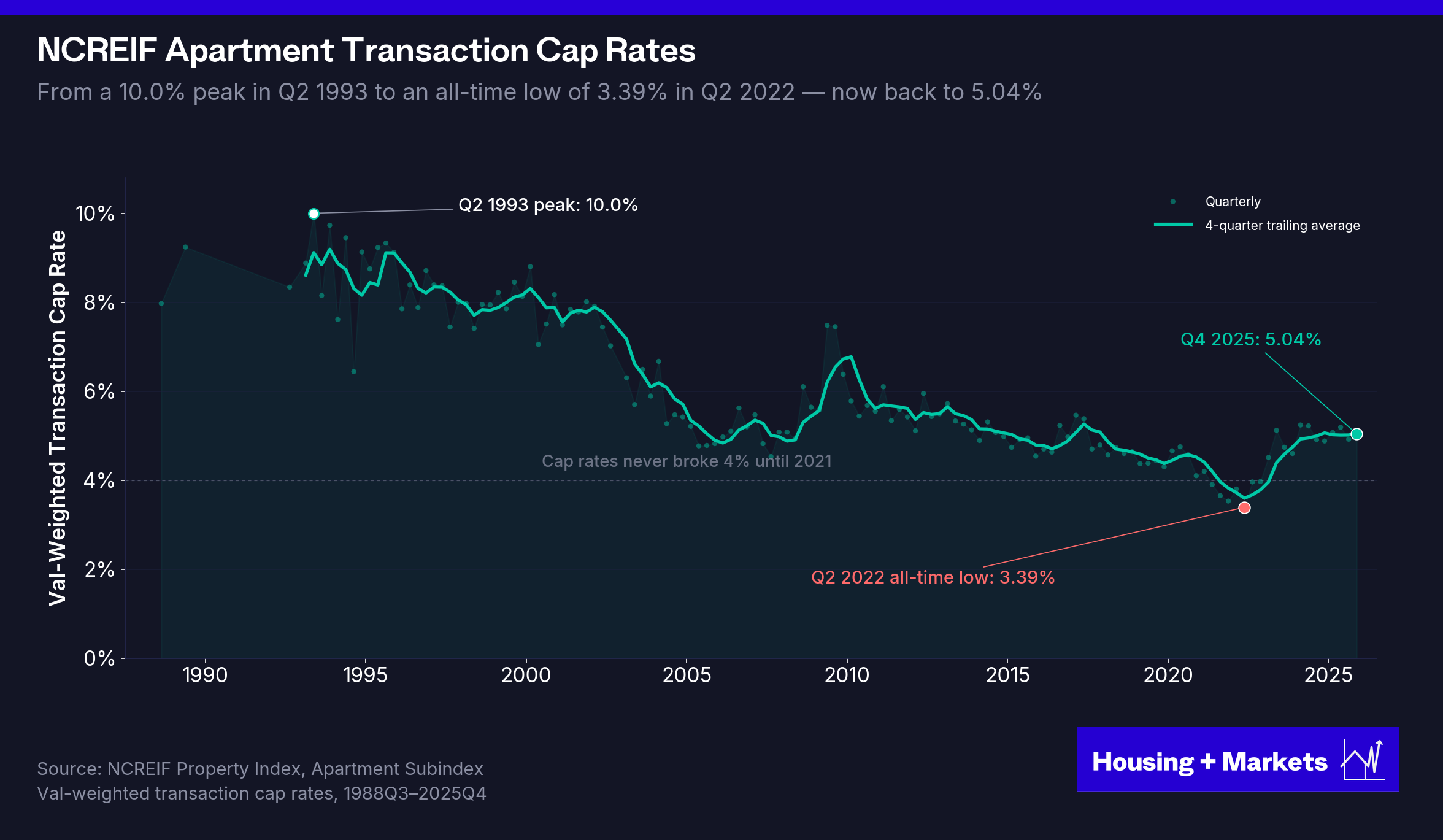
The math of cap rate moves is brutal. A deal bought at a 6.5% cap, marked to today’s 5%, is up 30% with no operational improvement. A deal bought at 3.5% in 2022, marked to that same 5%, is down 30% with no operational deterioration. Same NOI. Same ending cap rate. Brutally opposite fates.
The move that’s already happened — apartment transaction cap rates from a 3.39% all-time low in Q2 2022 to 5.04% in Q4 2025 — has erased roughly 32% of value at peak basis. NOI flat. No operational issues. No rent declines. Just the cap rate snapping back toward something like normal. The 2010s harvested a decade of cap rate compression. Now the bill comes due.
The standard story is that cap rates compressed because interest rates did.
It’s the version every conference panel reaches for and every pro forma builds in. It’s also wrong. The data doesn’t support a clean rate-to-cap-rate transmission. First American’s December 2025 analysis ran the regression across roughly 70 years of data and found that interest rates alone explain just under 25% of the variation in cap rates — statistically significant but, as a single explanation, weak. Morgan Stanley reached the same conclusion from a different angle: the five-year rolling correlation between Treasuries and cap rates oscillated between −0.82 and +0.79 from 1983 to 2013. In five of eight key periods of rising rates over that window, cap rates moved in the opposite direction. The relationship isn’t a transmission belt. It’s a partial driver. Sometimes invisible, sometimes inverted.
The current cycle puts an exclamation point on it. The 10-year Treasury moved from 0.52% in August 2020 to roughly 4.5% today. A 400 basis-point move. Apartment cap rates moved from 3.39% to 5.04% over the same window. 165 basis points. If interest rates were the driver, the move would have been violent and roughly proportional. It wasn’t. Something else is doing most of the work.
That something is credit supply. Cap rates respond more to how much real estate debt is available than to the price of that debt and the leading academic and industry research has been pointing at this for fifteen years. Peter Linneman’s multivariate model uses the flow of mortgage funds relative to GDP as a proxy for liquidity. His specific finding: when CRE mortgage debt grows roughly 100 basis points faster than GDP multifamily cap rates compress by about 22 basis points. Cornerstone Research published a chart in 2009, at the bottom of the GFC, showing mortgage debt as a percentage of GDP and NCREIF cap rates as near-mirror images of one another from 1978 forward. First American’s December 2025 update of the same data shows the relationship has held for the full seven decades the data covers.
The mechanism is intuitive once you see it. CRE is a credit-intensive asset class. Buyers rely on debt to acquire properties, so when lenders aggressively supply credit — low spreads, high LTVs, easy proceeds — competition for assets intensifies, transaction volume rises and pricing competition compresses cap rates. When the credit pipe narrows, transactions stall and cap rates expand, regardless of where rates are.
The price of money matters at the margin. The quantity of money matters in the aggregate.
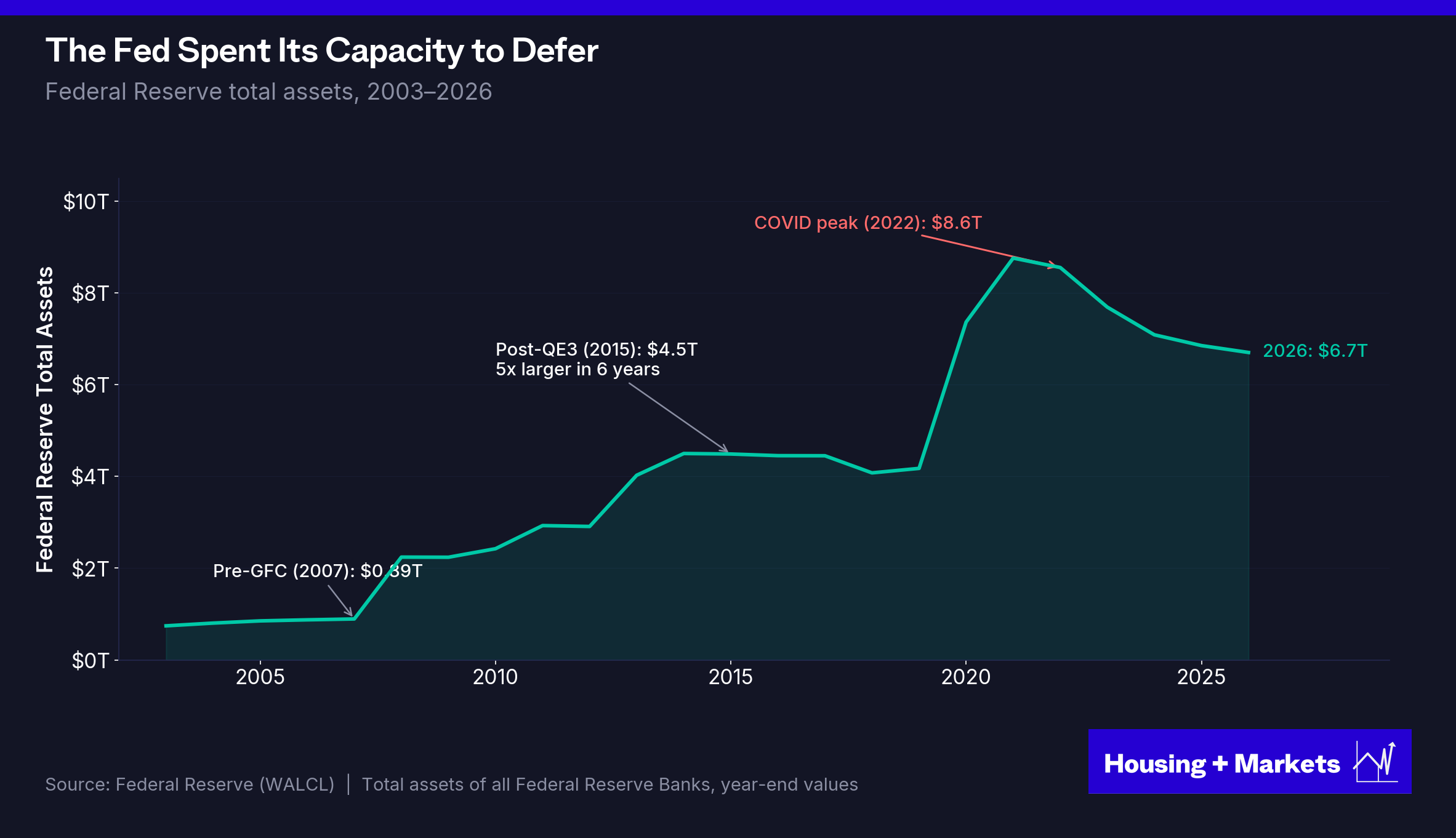
Once you reframe it that way, the 2010s stop looking like a rates phenomenon and start looking like exactly what they were: the largest sustained injection of liquidity into the global financial system in modern history. The Fed funds rate hit zero in late 2008 and stayed below 0.25% for seven years. But that was the smaller story. The bigger story was quantitative easing. The Fed deployed three rounds, adding roughly $3.9 trillion in asset purchases between 2008 and 2014 and another wave in 2020. The balance sheet expanded from $870 billion before the crisis to $4.5 trillion by 2015. Five times larger in six years and ultimately peaking at $8.97 trillion in 2022. That balance sheet wasn’t a rate-suppression instrument. It was a direct injection of credit into the system that had to find a home and risk assets (equities, private equity, private credit and CRE) are where it went.
CRE absorbed its share. Commercial and multifamily mortgage debt outstanding climbed back to levels not seen since the late 1980s. CMBS issuance ran at record pace. Bridge lenders multiplied. Banks and life companies competed for paper at tight spreads. The 2008–2014 recovery wasn’t really a recovery. It was the Fed substituting its credit for the credit that had collapsed and it worked because the Fed had the capacity and the political latitude to keep flooding the system.
That regime is now actively reversing, and this is why cap rates have moved when interest rates haven’t moved much in real terms. The Fed has been running quantitative tightening since 2022; the balance sheet has shrunk from its $8.97 trillion peak to roughly $6.8 trillion. CMBS issuance froze. Bridge lenders retreated. Banks have been selling loan books at discounts. Each contraction in credit supply pushes cap rates wider.
And the toolkit that built the 2010s isn’t available to rebuild it. The Fed funds rate sits in the low 4s — roughly 400 basis points of room before zero, compared to 525 in late 2007. In 2008 the balance sheet expanded 5x — from $870 billion to $4.5 trillion in six years. That’s the multiplier that powered the 2010s. To replicate it from today’s $6.8 trillion base, the Fed would have to grow its balance sheet to $34 trillion. It won’t. A realistic ceiling is closer to $12 trillion — same kind of dollar magnitude as 2008, but a 70% expansion instead of a 400% one. A fraction of the multiplier and credit markets price the multiplier, not the dollar amount. By 2009, headline CPI was negative for much of the year and the Fed could deploy unlimited stimulus with no inflation cost. In 2026, it’s still normalizing from a 9% peak in 2022.
The Fed can cut like it did in 2008. It cannot flood like it did in 2008.
That asymmetry is the single most important thing to understand about the cap rate environment from here.
Tailwind 2: The Demographic Wave Has Crested
That brings us to the second tailwind. Demographics don’t reverse on a Fed cut. The millennial wave took twenty years to build, crested in 2022 and is rolling off the back. The next wave — if there is one — is the next big cohort hitting the rental band, which is twenty years out.
The apartment boom of the 2010s was built on a collision: the largest generation in American history — 72.9 million millennials — entering their prime renting years all at once, into a market that had been starved of new supply for half a decade after the financial crisis. At their peak, millennials represented 37% of all renter households.
That collision is what made double-digit rent growth possible. You can’t push rents 15% in a year unless there are more people who need apartments than there are apartments available.
Both sides of the collision have now reversed. Demographics are the demand side, and the demand side is exiting in volume.
In 2015, roughly 65% of millennials rented — about 47 million people. By 2024, millennial homeownership had crossed 52.4%, dropping the renter count to approximately 35 million. Nearly 13 million millennials exited the rental market in under a decade. The generation that created the apartment boom is now the generation fueling single-family demand.
The cohort behind them is smaller. Gen Z, at roughly 67 million, is 8% smaller than millennials. Population growth has slowed to its lowest rate in decades. The birth rate has fallen to 1.7 — below the 2.1 replacement level. The domestic pipeline that produced the millennial wave isn’t producing another one.
And the one demographic force that could have offset that — immigration — has gone into reverse, hard. Net migration hit roughly 3.3 million in 2023, the highest level in American history. CBO’s September 2025 update projects net immigration of just 410,000 in 2025 and 570,000 in 2026 under current administrative actions. An 87% collapse from peak in two years. The steepest decline in net immigration on record.
The demographic cavalry isn’t coming.
There’s a structural consequence to the way the demand wave broke that operators don’t want to look at. The 2010s didn’t just produce a decade of strong rent growth — they pulled future rent growth forward into a single compressed window. Rents ran up. From here, the only path is down or sideways.
Housing + Markets reconstructed 135 years of real U.S. rent levels from the Jordà macrohistory database. For most of the 20th century, real rents oscillated around a long-run trend of roughly 0.35% annual growth — barely above zero. Rents rose, rents fell, rents mean-reverted. Then, starting around 2000 and accelerating sharply through 2021, real rents broke above the trendline and never returned. As of 2025, real rents sit 30% above the 135-year trend — the widest gap in the entire dataset.
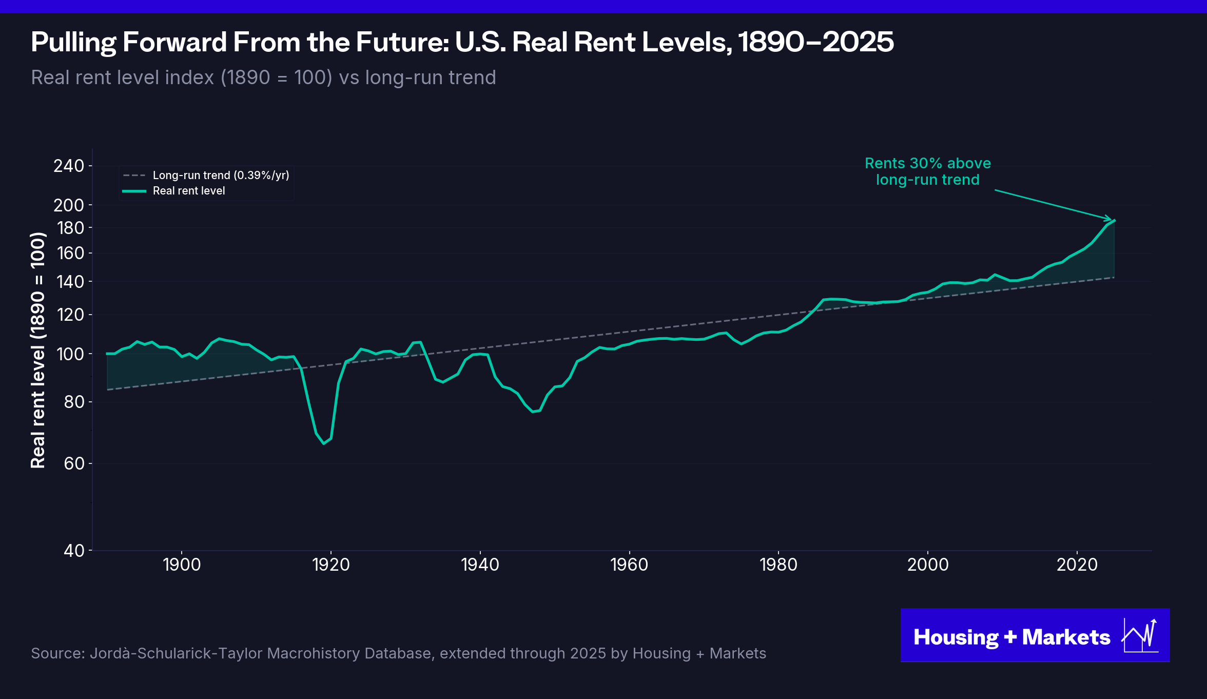
Before the standard objection — "that's just CPI; rents hedge inflation, this is what's supposed to happen" — run the numbers. It isn't. Through most of the 2010s, headline CPI ran at 1–2% while nominal rents grew 4–5% per year, producing real rent growth of 2–3% annually against the 135-year average of 0.35%. Then the 2020–2022 surge pushed nominal rents up 15–20% with CPI at 5–9%, delivering real rent growth of 5–10% for three straight years. This wasn't an inflation-era repricing. It was sustained real wealth transfer from renters to landlords, in a window where no inflation regime existed to justify it.
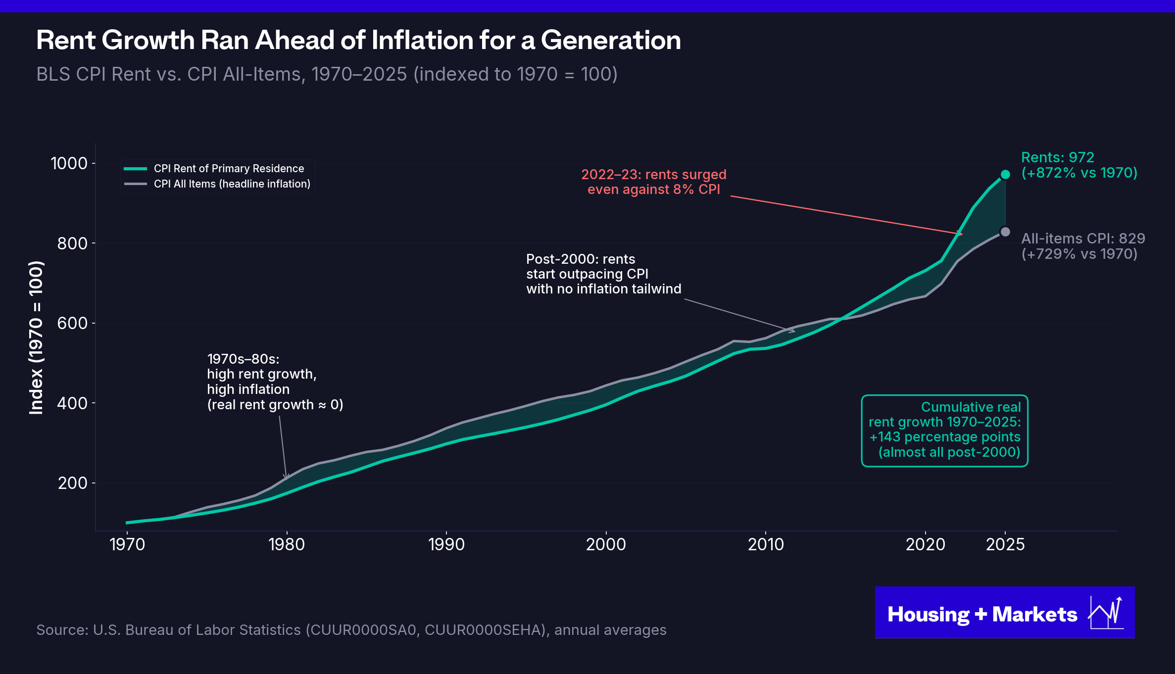
The 0.35% trendline isn’t a statistical curiosity. It’s a boundary condition. Apartments are economic infrastructure. They are the place where workers in the economy live. Workers pay rent out of wages. Wages are bounded by what the economy can produce. Across 135 years and every monetary regime financial history has produced — gold standard, Bretton Woods, the 1970s inflation, the great moderation, ZIRP — the wage-rent relationship has held. Rents have to live inside the wage envelope, or the system reprices to put them back inside it.
The 2020–2022 break didn’t repeal that constraint. It postponed it. Real rents 30% above their 135-year wage-tethered trend is not a new equilibrium. It’s a debt the market owes — and there are only three ways the market settles that debt: rents fall in nominal terms, wages catch up to rents, or rents stagnate in real terms while wages slowly grind forward.
The first hasn’t happened at scale. The second is happening slowly. The third — flat real rents for a decade or more while incomes catch up — is the path the data is currently on. If the 30% gap closes through stagnation alone, with wages growing at their long-run real rate of roughly 1.5%, that’s on the order of fifteen years of flat real rents. (Faster wage growth or a one-time downward rent reset shortens this materially; weaker wage growth or another inflation surge extends it. The headline number is sensitive to the wage assumption; the direction is not.) Faster reversion requires nominal declines.
Either way, the next decade of rent growth is not the last decade’s. It mathematically can’t be.
The wave that filled units faster than developers could build them has moved through. The renter base is no longer growing into the supply. The supply is growing into the renter base. That is not a temporary condition.
Tailwind 3: The Supply Deficit Has Flipped
The reason housing is uniquely susceptible to this is the supply lag.
When oil spikes, rigs come online and prices correct within months. When rents spike, the correction takes half a decade. Apartment construction takes three to five years from entitlement to delivery, so the market can’t equilibrate in real time. Operators capture future rent growth in a compressed window — years of gradual increases harvested in a few quarters — and by the time supply finally arrives, the growth has already been taken and the market is left oversaturated. The same supply lag that produced the 2020–2022 surge is what guarantees the post-surge stall.
The historical pattern is unambiguous: above-trend rent growth is followed by extended stagnation. Rents don’t necessarily crash — leases reprice gradually, not all at once — but they stall. And 0.4% national rent growth in 2025, against a 135-year average of 0.35%, tells you the stall has arrived. The rent growth operators are waiting for has already been consumed. It was pulled forward. It was spent.
After the GFC, multifamily underbuilt for almost a decade. Capital was scarce, construction lending was punitive, and the surviving developers stayed conservative. Rents recovered first because supply didn’t. From 2010 to 2014, the industry was completing roughly 150,000 apartments per year against demand for approximately 250,000 — an annual deficit of 100,000 units.
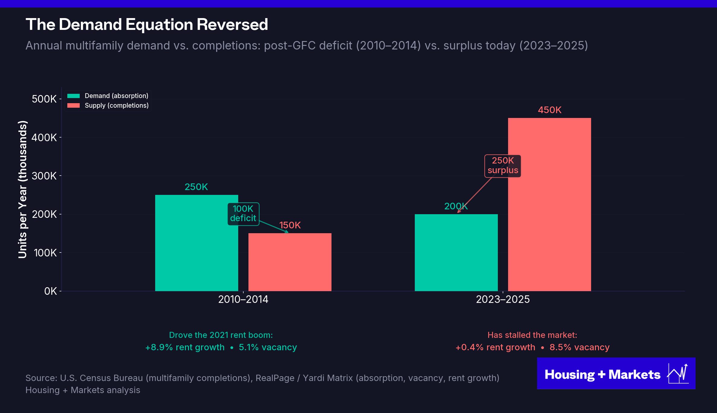
By 2020, that discipline broke. Cheap construction debt, strong rent comps, and abundant equity drew developers back in at scale. Permits surged. The pipeline filled. And then the units started to deliver — into a market where the demographic wave had already crested and rates had already moved.
Multifamily completions hit 450,000 units in 2023 — the highest level since 1987 and three times the annual pace of 2010–2014. By 2024 the figure crossed 600,000. RealPage’s tracker put calendar 2025 deliveries at roughly 409,500 units — a 33.9% step-down from the 2024 peak but still well above any year between 1990 and 2022. (Yardi Matrix’s figure runs higher, in the 540–580k range, reflecting different attribution methodology — pick your source; the direction is the same.) The 2026 forecast lands closer to 400,000 units, and the pipeline rolls off hard from there.
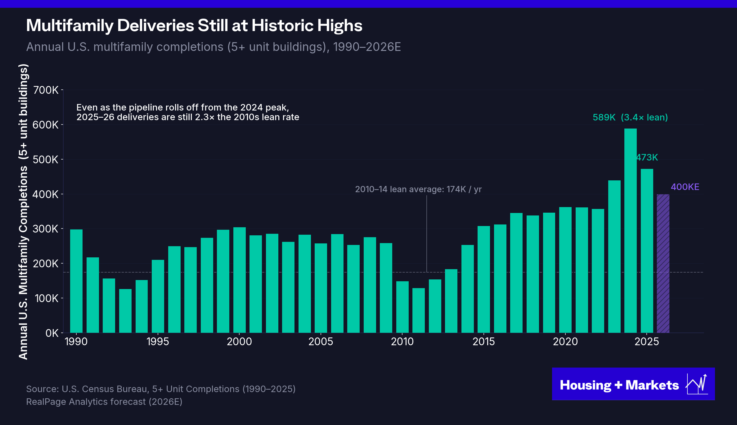
The supply that didn’t show up for a decade arrived all at once, at exactly the moment the demand wave that justified it was tapering. We are pacing into a 2026 delivery year that is still elevated, but the back of the wave is finally visible.
The market did what oversupplied markets do.
National apartment vacancy: 5.1% in 2021 → 8.5% in 2025.
Rent growth: 8.9% in 2021 → 0.4% in 2025.
National aggregates flatten the picture. The pull-forward — and the hangover — concentrate in the metros where institutional capital deployed hardest in 2018–2022. Austin, Phoenix, Atlanta, Nashville, and the Florida metros ran 25%+ rent surges in single years. Those same metros are now absorbing the highest delivery volumes per capita.
Austin entered 2025 with vacancy north of 11% and effective rents down roughly 7% from peak. Phoenix is tracking similarly — vacancy in the high single digits, rent declines that have been running for the better part of two years and counting. Nashville absorbed delivery volumes that would have been unimaginable in 2017. The Florida metros have been propped up by insurance dislocation and inbound migration that is itself a function of the post-pandemic moment, not a structural tailwind. The metros that won the boom are losing the digestion. The pull-forward gap is widest where the surge was sharpest.
The formula that made the 2010s possible was simple: unexpected demand hitting a depleted supply pipeline. The formula going forward is the opposite: expected demand hitting a saturated market.
Tailwind 4: Benign Politics Is Over
Of the four tailwinds, this is the one operators have been least willing to name. It’s also the one most clearly turning against them.
For most of the 2010s, new-lease rent-to-income ratios in market-rate apartments stayed remarkably stable around 22%. Incomes grew alongside rents. The share of cost-burdened U.S. renters actually improved from 50% in 2011 to 46% by 2019. That headroom is what let the supply-deficit rent surge run as long as it did without triggering a backlash.
Then 2021–2022 happened. Rents surged 15% in a single year while incomes lagged. New-lease RTI on the Yardi Matrix dataset climbed from 27% in 2016 to 30% by 2024. Cost-burden snapped back to 50% — matching the all-time high. As of 2025, 22.6 million U.S. renter households — 50.3% of all renters — are cost-burdened. A new record.
The cost-burdened renter is also a voter. The aggressive rent growth that produced the 23.2-million number didn’t just exhaust the supply pipeline and the Fed’s toolkit. It exhausted the industry’s political capital.
The 43-year winning streak that preceded it wasn’t a function of apartments being a special asset class. It was a function of the system staying in equilibrium — rents tracking wages, supply responding to demand, operators running tight buildings. When rent growth sat in the 2–5% range, renters didn’t get crushed, investors compounded durable cashflow and politicians didn’t reach for rent control or antitrust. The political response to housing operates on a threshold function: invisible below it, immediate above it.
The 2010s broke the threshold. The convergence of zero interest rates, a depleted supply pipeline and a generational demand wave produced a rent surge that no equilibrium could absorb. Explosive rent growth gets you one thing besides a sugar high on the pro forma: a political immune response that makes the next cycle structurally harder to operate in.
The geography that broke the script
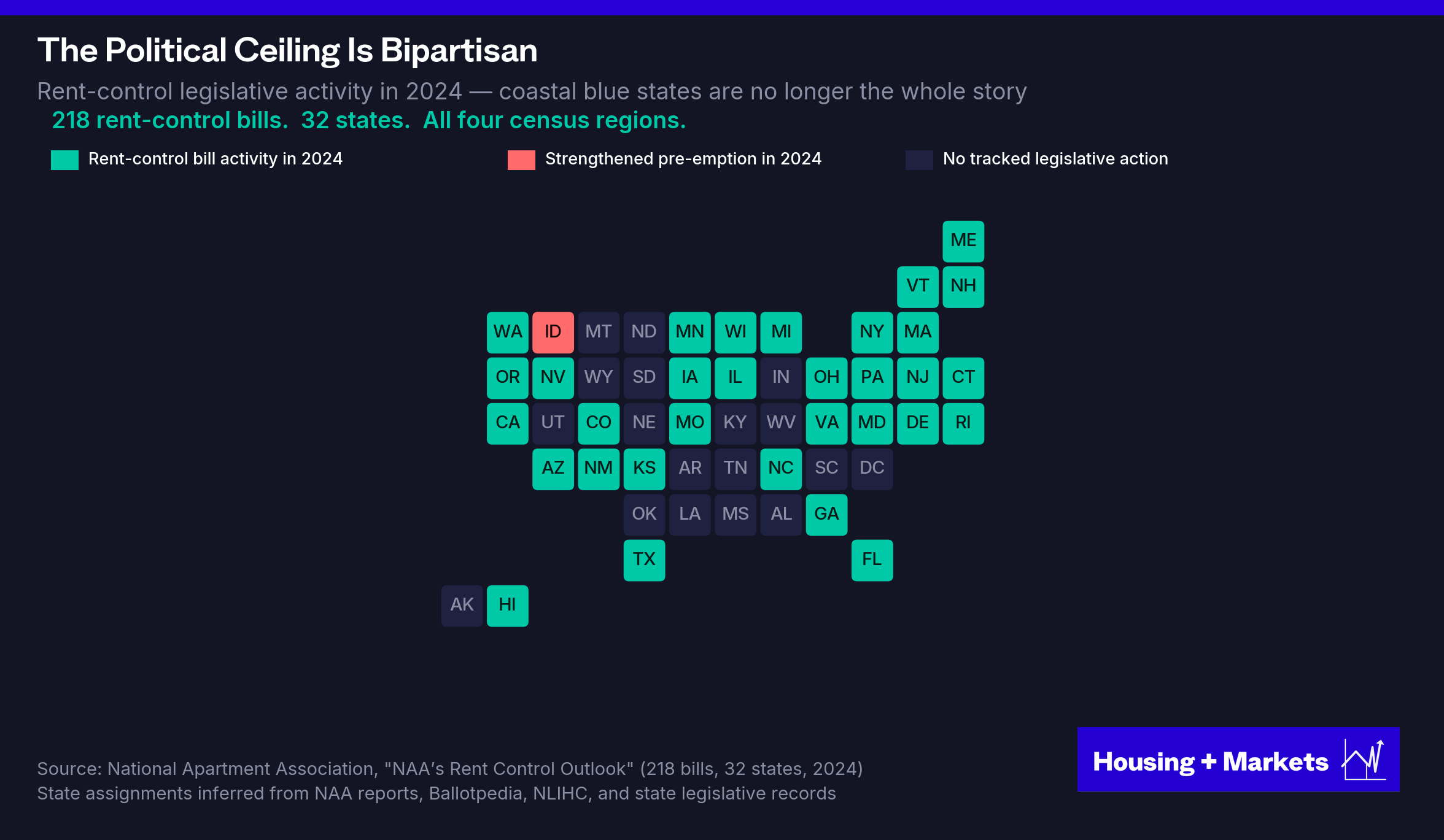
In 2015, Portland declared a housing emergency after rents rose 34% in five years. By 2019, Oregon had become the first state in the country to pass statewide rent control. The industry dismissed it as coastal progressive politics — something confined to deep-blue cities, not a structural feature of the business.
Then it happened in Austin. And Phoenix. And Atlanta. Between 2020 and 2022, rents surged more than 25% in Austin, 20% in Phoenix, and 18% in Atlanta — none of them coastal progressive strongholds. Nationally, rents rose roughly 15% in a single year. By 2022, more than half of U.S. renters were cost-burdened. And the political response, for the first time, came from everywhere at once.
South Carolina’s 2025 legislature filed a bill titled the “South Carolina Rent Control Act.” Indiana took up a statewide rent-cap bill of its own. Arizona and Georgia moved to repeal their state-level bans on local rent control — which would let their cities pass rent caps for the first time in decades. Idaho and Missouri went the other way, tightening their bans further. The National Apartment Association tracked 218 rent-control bills across 32 states in 2024. Not five. Thirty-two. The map no longer divides along familiar lines.
The federal response is bipartisan and operational
In November 2025, the DOJ settled its antitrust case against RealPage. The seven-year consent decree effectively dismantles the algorithmic pricing architecture the industry built over the prior decade: data inputs must be at least 12 months old, no real-time lease information, no geographic modeling below the state level, and no recommendations that ratchet only upward. The single most efficient revenue-management tool in multifamily history was taken apart by federal antitrust action. California’s separate $7 million settlement with Greystar that same year made clear state attorneys general aren’t waiting on Washington either.
In January 2026, President Trump signed an executive order titled “Stopping Wall Street from Competing with Main Street Homebuyers,” directing federal housing Agencies to stop approving, insuring, or securitizing sales of single-family homes to large institutional investors. A Republican president invoking federal housing power against landlords. That is not a story about progressive ideology. It’s a story about political incentives that operate independently of party.
In March 2026, the Senate passed the bipartisan 21st Century ROAD to Housing Act 89–10, after the House passed its companion bill 390–9 in February. The sponsors: Tim Scott, Republican of South Carolina, and Elizabeth Warren, Democrat of Massachusetts. The bill bans institutional investors holding 350 or more single-family homes from acquiring more, imposes a seven-year disposition requirement on excepted purchases, and grants sitting tenants right-of-first-refusal protection. Build-to-rent communities are exempted — but subject to the same seven-year disposition timeline. The bill includes a section literally titled “Homes Are For People, Not Corporations.”
Blue states use price caps. The federal approach uses antitrust, ownership restrictions, and forced disposition timelines. The legal theories are genuinely different. The political pressure reaching for them comes from one place.
Different parties. Different tools. Same direction.
The industry’s instinct is to argue back: rent control is bad policy that hurts the renters it’s meant to protect. The economists agree, with unusual unanimity. The Diamond, McQuade, and Qian study of San Francisco’s 1994 rent control expansion, published in the American Economic Review, found that landlords subject to rent control reduced rental housing supply by 15% — through sales to owner-occupants and conversions out of the rental market — driving city-wide market rents up by 5.1%. Short-run protection for incumbent tenants. Long-run rent increase for everyone else. The Stanford team’s conclusion: rent control “ultimately undermin[ed] the goals of the law.”
St. Paul, Minnesota is the more extreme version. The city passed strict rent control by referendum in November 2021 — and, unusually, did not exempt new construction. Apartment construction permits collapsed 84% in the year that followed. Property values fell 6–7% in the first three months alone, a $1.6 billion loss. The city has since walked back the strictest provisions. The damage to the supply pipeline is harder to walk back.
The economist’s case against rent control is correct — but it isn’t going to win the political fight. The pressure isn’t responding to the marginal-cost argument. It’s responding to 23.2 million cost-burdened households. As long as the rent-to-income ratio sits at the all-time high, the policy response will keep coming. And each round of policy response will reduce supply, raise long-run rents, and feed the next political cycle.
This is the dynamic the appreciation model produced. Aggressive rent growth created the political response. The political response is degrading the supply infrastructure that would have prevented future rent surges. The policy that hurts renters most over a long horizon is the policy that the aggressive cycle made politically inevitable.
Why the income model defuses the loop
Here’s the part the industry hasn’t internalized: the income model defuses the politics that the appreciation model creates.
Operators targeting 2–5% annual rent growth don’t trigger housing emergency declarations. They don’t show up in 218 rent-control bills in a single year. They don’t put their asset manager’s job at the mercy of state legislatures. The rent-to-income ratio stays inside the band that produced 43 years of compounding without political backlash. The threshold function stays on the right side of the threshold.
A sector built on durable income rather than aggressive rent increases creates the regulatory stability that paradoxically produces better long-term investor returns. The alignment between investor incentives and renter outcomes isn’t a coincidence. It’s the defining feature of the income model. The slow money is the politically durable money. It’s also, given everything that just happened, the only kind of money the next decade is going to support.
That is the fourth tailwind, reversed. And it is the tailwind that ties all four together: each of the first three was free to run because the fourth let it.
Pricing Has Reset. Trading Hasn’t.
The transaction market has gone quiet. Two large pools of capital are anchored to opposite reference points, and neither side wants to move.
On one side, roughly $350 billion in private equity dry powder, much of it raised between 2022 and 2024 and now circling investment deadlines, hunting a 2009-style distressed entry into multifamily. A recent industry survey found nearly three-quarters of multifamily investors expect a fresh wave of distressed sales. Most of the largest opportunistic real estate funds in the world have built dedicated strategies for exactly that moment.
On the other side, sellers anchored to early-2022 valuations, holding out for a pricing recovery that would let them exit at or near their original basis. Most aren’t experiencing true distress. They can wait. The credit environment is letting them. Banks don’t want to take back assets they can’t operate, special servicers extend rather than foreclose and the GSE’s lending caps are the largest they’ve ever been. Most owners aren’t being pushed to transact.
Here’s the wrinkle that makes the standoff so durable. In many cases, the buyer and the seller are the same investor wearing different hats. The fund chasing distressed acquisitions in the Sun Belt is the same fund refusing to mark down its existing Phoenix portfolio. The LP demanding double-digit IRRs on new commitments is the LP voting against any disposition that would crystallize a loss on an existing fund.
It’s not two opposing camps. It’s one camp with a split personality.
The result is predictable. Deals go to market, attract bids that reflect actual current cap rates, get pulled when the bids don’t hit the sellers’ anchored basis and quietly re-list six months later at a similar number. Brokers will tell you “sale fail” ratios have never been higher. The transactions that clear are the ones where one side grasps sanity long enough for the math to work.
The deals that do transact tell the actual story. Pricing and return metrics on closed transactions today are reasonable — not the V-shaped recovery the sell side wants, not the huge yield giveaway the buy side is hunting, but a normalized cap-rate environment where income-driven returns work. The reset has already happened. The trading volume just hasn’t caught up to it yet.
To see why both anchored positions are wrong, start with what 2009 actually was — and what 2026 actually is.
What 2009 actually was
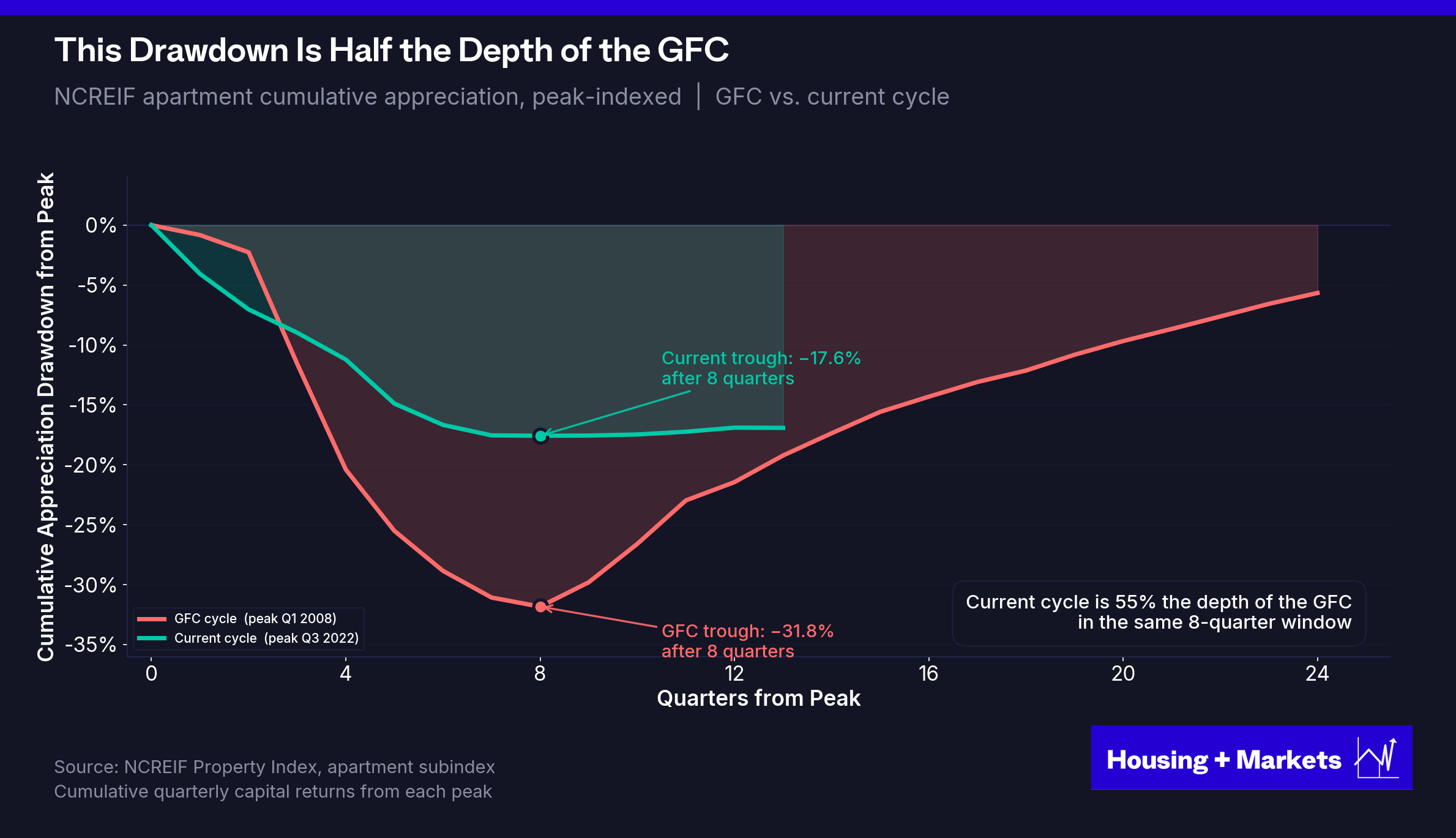
The GFC was a banking crisis. Credit froze. Lenders became forced sellers. Cap rates spiked roughly 300 basis points to 7%+ as the risk premium on every property type re-priced overnight. NCREIF apartment cumulative appreciation fell 31.8% in eight quarters. Distressed properties traded at 20–30% additional discounts beyond market — and at the bottom, organized buyers were closing transactions at 50%+ off the original mortgage balance.
Then — exactly when distressed pricing was deepest — the setup for the buyer flipped to the most favorable in modern history.
Rates went to zero and stayed there for seven years. The Fed expanded its balance sheet 5x through quantitative easing. The construction pipeline had been gutted by the credit freeze. The 72-million-strong millennial generation was just entering the renter pool. Net immigration was running at roughly a million a year. Fannie and Freddie kept lending through the storm. There was no political backlash to landlords because rents weren’t moving.
The 2009 buyer got distressed pricing AND every macro tailwind aligned in the same direction. Both, simultaneously. That’s why the trade worked the way it did.
What 2026 actually is
The current correction has the surface symptoms of 2009 without any of the structural conditions that produced the 2009 opportunity.
The correction is real — but half as deep. NCREIF apartment cumulative appreciation peaked in Q3 2022 and bottomed eight quarters later in Q3 2024, down 17.6%. Same duration, roughly 55% of the GFC depth. Cap rates expanded from an all-time low of 3.39% to ~5.0% — meaningful relative to 2022, almost trivial relative to the depths of the GFC when transaction caps routinely traded 7-8%.
But the depth of the correction isn’t the most important difference. The structure of the distress is.
There is no banking crisis. Banks are healthy, well-capitalized, and not selling at scale. Fannie Mae and Freddie Mac are lending more than they ever have — $146 billion in combined 2025 multifamily caps, the largest agency program in their history. The GSE liquidity backstop that didn’t exist in the 1990 S&L cycle is operating at full capacity now. There is no equivalent of the REO waterfall that fed the 2010–2013 distressed bid.
The maturity wall is real but not a meat grinder. Roughly $1 trillion in CRE loans matured in 2025, with another $930 billion coming due in 2026 — and multifamily is about a third of it. But the distress doesn’t clear through foreclosure; it clears through extension. The mechanism is mundane: the $310 billion of multifamily debt that matured in 2025 was largely modified-and-extended, not foreclosed. Lenders don’t want the assets. Special servicers push maturity dates. The GSEs keep writing. Each player makes the rational individual decision to push the problem forward, and in aggregate the result is the absence of a forced-seller cohort.
What real distress exists is concentrated in a specific cohort: 2021–2022 vintage syndicator deals with floating-rate bridge debt and aggressive value-add proformas. That cohort will produce real losses. But it’s a deal-vintage problem, not an asset-class problem — and it’s already being priced.
The setup for the buyer is the inverse of 2009. Rates aren’t going to zero. The construction pipeline isn’t depleted. The demographic wave isn’t entering the renter pool; it’s leaving. The political environment isn’t benign; it’s bipartisan and hostile.
The 2026 buyer gets a half-correction AND every macro tailwind blowing in reverse. The forced-sale shoe never drops, because the GSE liquidity is there to prevent it. That changes what the next eighteen months look like. It is not 1991, even though the underlying overshoot resembles 1991. It is a slower, longer, more orderly digestion — which is bad news for anyone hoping to deploy at vintage-1992 cap rates, and reasonably good news for anyone willing to underwrite to in-place income at today’s actual cap rates.
The Baseline Was Always Better
So if the fast money is over, the tailwinds have reversed, the political wind is blowing the other direction, and the only reset that’s coming has already happened — why would anyone still want to be in this asset class?
Because the long-run data says you should. And it says nearly everything wrong about the way the industry has learned to think about this business.
Why slow growth beats fast growth
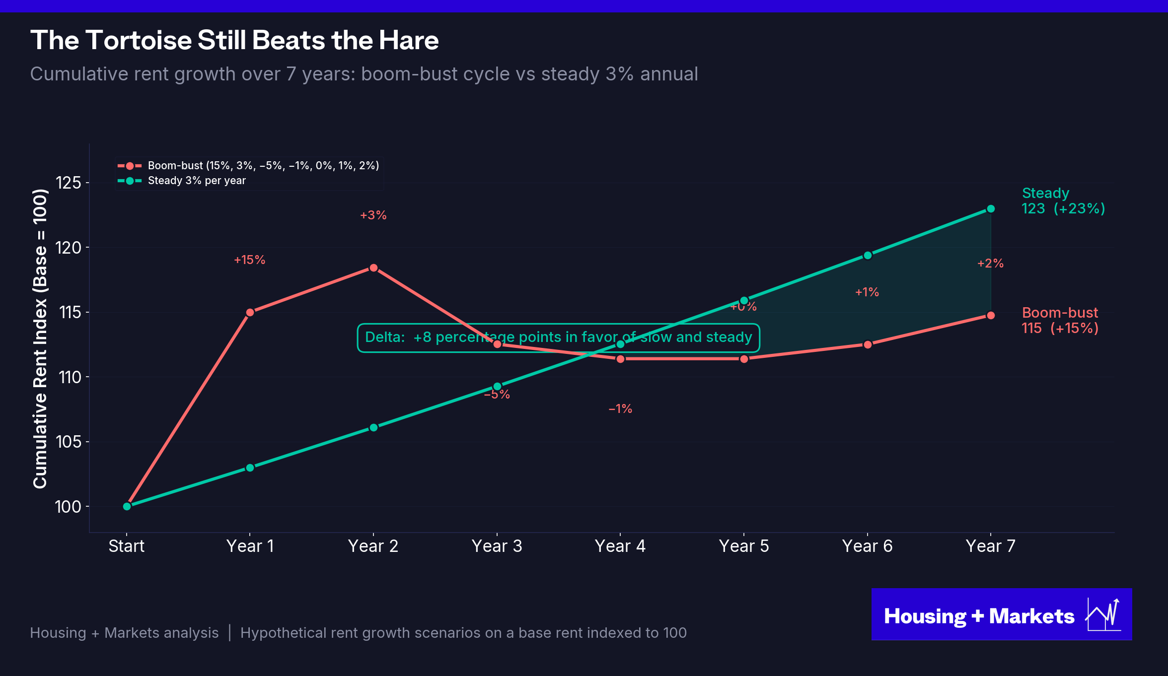
It sounds counterintuitive, but explosive rent growth is bad for apartment investors. A deal that pushes rents 15% in year one and then limps through the post-surge years — supply arrives, the political backlash hits, concessions burn, turnover spikes — produces less cumulative growth than a deal that compounds 3% annually across the same window. And the cumulative number is the smaller of the two costs. Volatility, lease-up risk, rent-control exposure, political risk premium, LP blow-ups — none of that shows up in the rent-growth comparison. The income operator never paid those costs. The tortoise wins on what isn’t on the chart.
The operators still standing after the S&L crisis, the dot-com bust, the GFC and this correction weren’t chasing the highest rent growth. They were buying yield and basis, running tight operations, and compounding cashflow at modest rates over very long holds. Bren was the literal tortoise — forty-eight years on a single asset, refusing to play the cycle’s game. He wasn’t a quirk. He was the rule. And the 135-year data shows why.
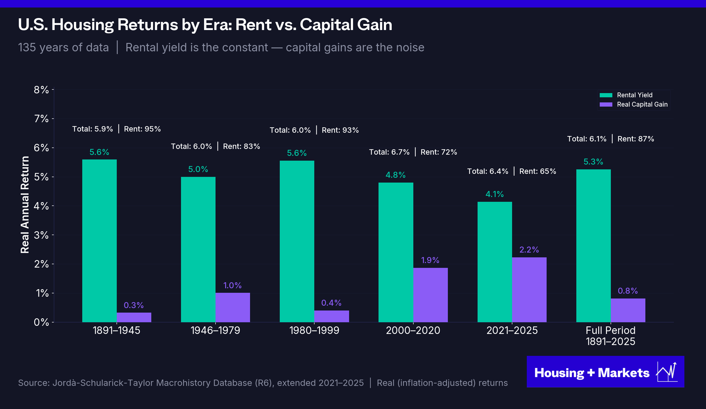
The 135-year baseline
The Jordà macrohistory database — the same dataset behind the 135-year rent series we used earlier — is part of a much larger project. In 2019, Òscar Jordà and his co-authors published The Rate of Return on Everything, tracking total returns for equities, housing, bonds, and bills across sixteen advanced economies from 1870 to 2015. Housing + Markets extended the U.S. series through 2025.
Sixteen countries. Every major asset class. For the United States, the binding constraint is the housing series, which starts in 1891 — the earliest year of total return data Jordà and his co-authors could reconstruct. To compare like to like, we anchor every series to that same year. The chart below shows what $1 invested in each asset class at the start of 1891 was worth in real terms at the end of 2025: a 135-year window, the longest unbroken record of U.S. housing total return that exists.
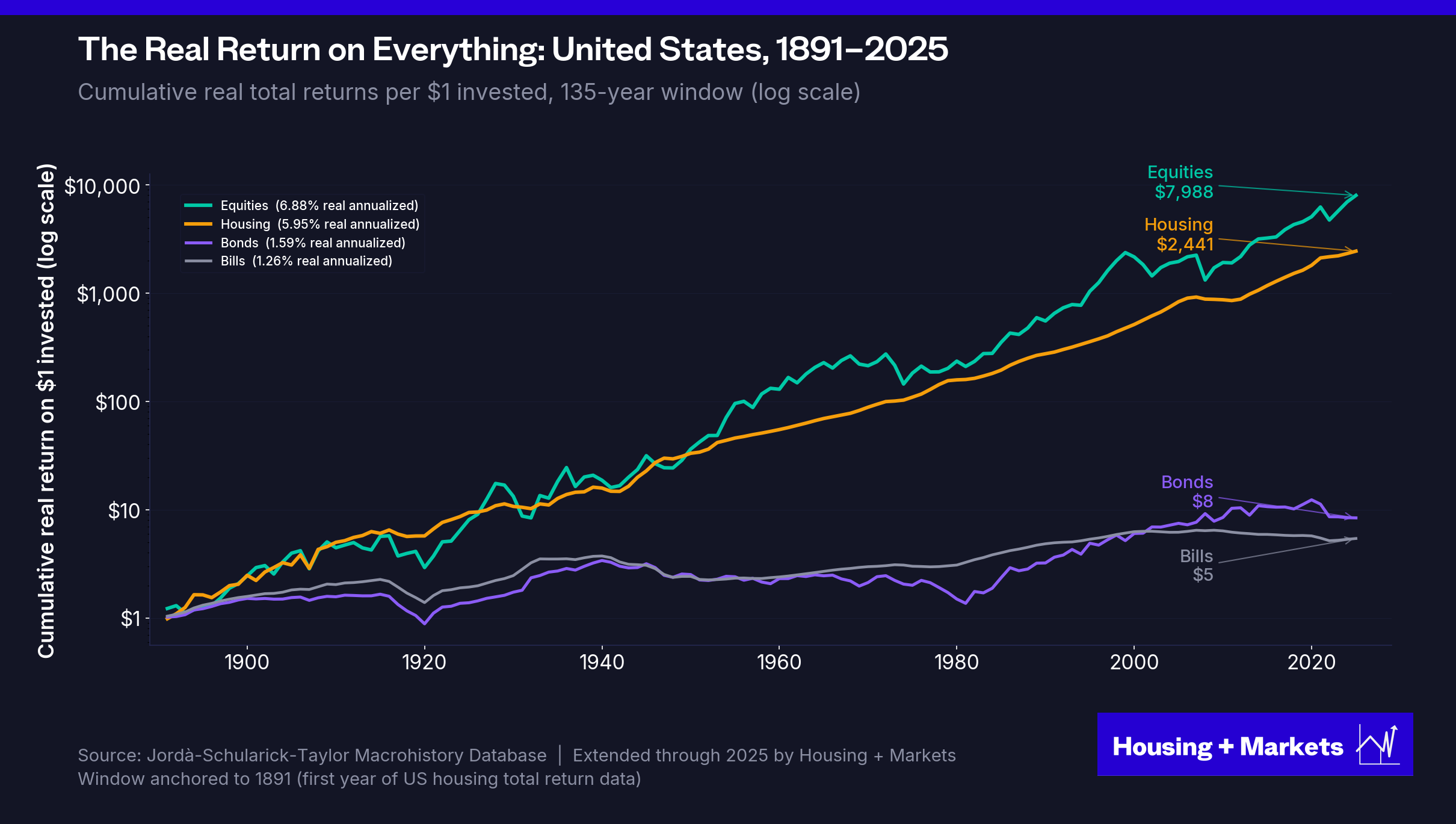
Over those 135 years, U.S. equities delivered 6.88% annualized real returns; housing delivered 5.95%. A dollar in equities in 1891 compounded to $7,988 in real terms by 2025; a dollar in housing, $2,441; a dollar in bonds, $8; a dollar in bills, $5. The math ties out: $1 × (1.0688)^135 ≈ $7,988, and $1 × (1.0595)^135 ≈ $2,441.
Equities win on raw return. They always have. That’s not the point.
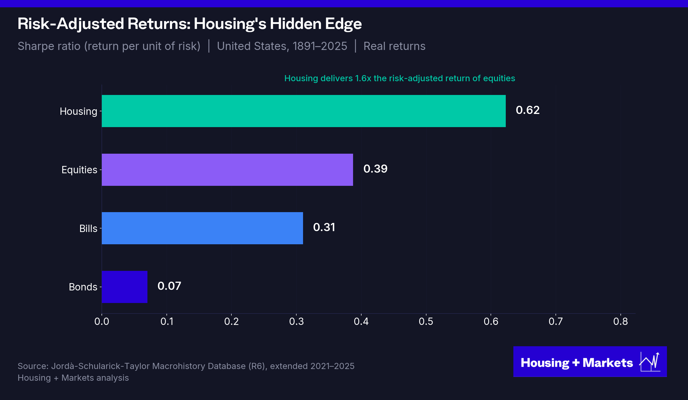
Housing did it with less than half the volatility — annual standard deviation of 7.8% versus 18.7% for equities over the same U.S. 1891–2025 window. On a risk-adjusted basis, housing’s Sharpe ratio was 0.62 versus 0.39 — roughly 1.5x as efficient per unit of risk taken.
And the composition matters more than the magnitude. Over 134 years of U.S. housing data, 87% of total real return came from rental income. Capital gains contributed barely 1% per year. The ratio is remarkably stable across eras — 1891–1945, 1946–1979, 1980–1999 — income carried 80–90% of the load in every period.
The Jordà authors are explicit about what their dataset says about the era most operators built their careers in:
“The post-1980 observation of large capital gain components in both equity and housing total returns is completely unrepresentative of the normal long-run patterns.”
The most comprehensive long-run return study in existence calls the appreciation-driven returns of the last four decades “completely unrepresentative” of how housing actually performs.
The tax wedge no other asset class has
And none of these comparisons price in real estate’s unique tax structure. Depreciation typically shelters 60–80% of a leveraged multifamily property’s current income from taxation. Layer on cost segregation (accelerating depreciation into early years) and 1031 exchanges (deferring capital gains indefinitely), and the after-tax gap widens further. Equities and bonds have no equivalent. The Jordà comparisons above are pre-tax. The after-tax picture for taxable investors is even more lopsided in housing’s favor.
The four-tailwind alignment, in context
The 2010s weren’t a cycle. They were the simultaneous convergence of the lowest interest rates in 5,000 years of recorded history, the largest demographic wave in American history, a post-crisis supply deficit and a wall of credit with nowhere else to go. The prior alignment was the post-S&L window of 1991–1999. These conditions have aligned twice in a hundred years, and the next alignment is probably not this cycle.
What the asset class actually does is compound quietly at 5–6% real returns, driven by rental income, with moderate volatility, through inflation and deflation and war and peace and crisis and recovery. That’s the baseline. That’s what was always there. The 2010s buried it under a once-in-a-generation event.
The next decade rewards the baseline
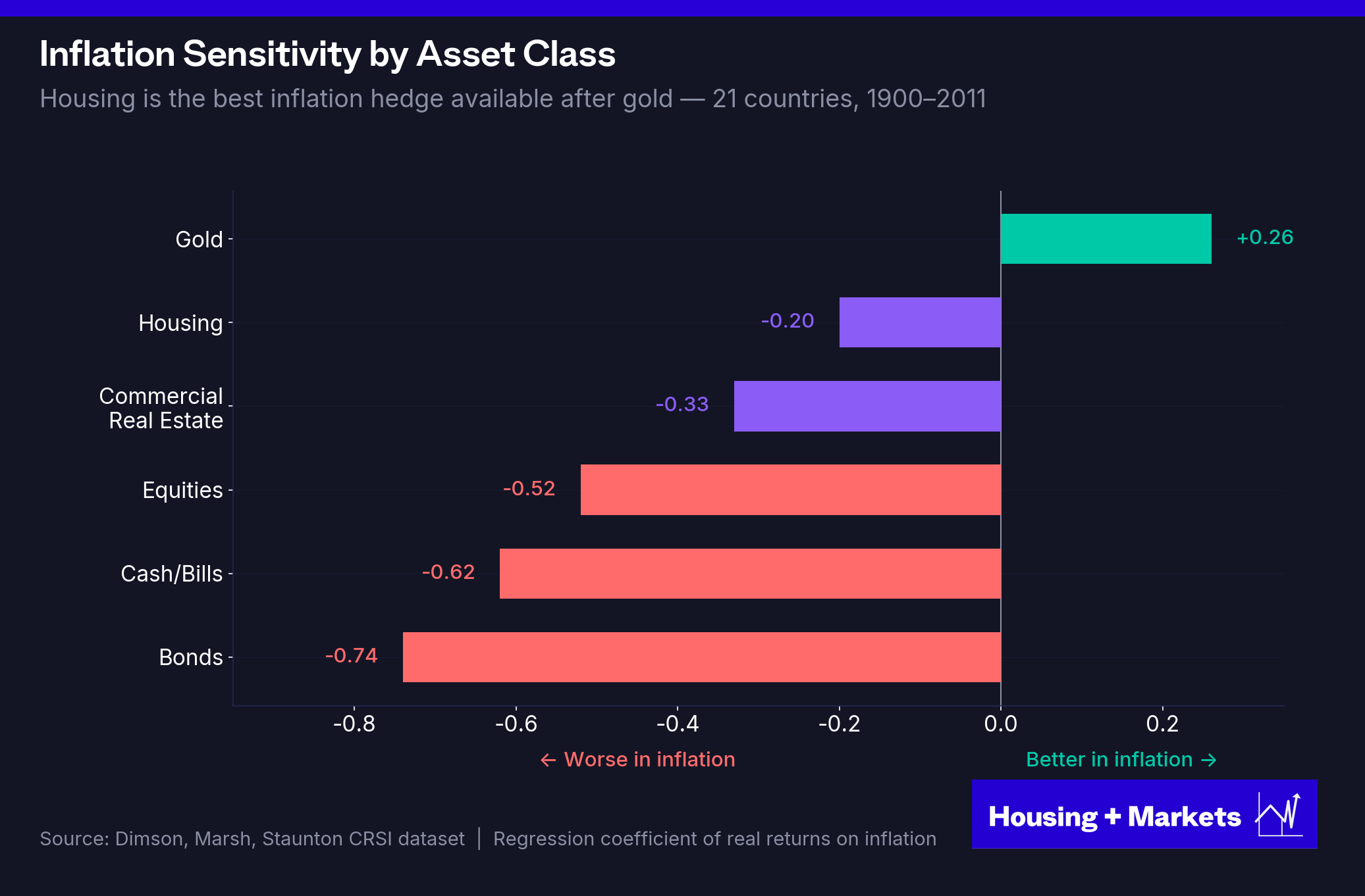
The forward environment lines up almost perfectly with the income model. The rest of the 2020s look to run more inflationary than the 2010s. Geopolitical eruptions, fiscal deficits, deglobalization and energy transition all point that way. The income model doesn’t just survive. It outperforms. The Dimson-Marsh-Staunton dataset covering 21 countries from 1900 forward shows housing as the second-best inflation hedge available, after gold. Rents reprice annually or monthly. Bond coupons don’t. Equity earnings get compressed by margin pressure in inflationary regimes. Real estate’s cashflow keeps pace.
Add it together. The 135-year baseline, the income composition, the tax wedge and an inflationary forward environment that favors hard-asset cashflow and the conclusion is mechanical. Not opinionated. The playbook for the next decade isn’t a recovery playbook. It’s the one the asset class always had.
Take your lumps
Fifteen years of monetary policy have trained a generation of investors to believe that holding on always works. Through the GFC, holding on did work. The Fed cut rates to zero, ran three rounds of QE, expanded its balance sheet five-fold and asset values eventually re-inflated. Through COVID, it worked again. Zero-rate policy, $4.5 trillion of fresh balance sheet and the same recovery on a faster clock. The investors who refused to crystallize losses got rewarded twice in a row. The investors who panicked got punished.
That conditioning is now load-bearing under the entire industry’s behavior. It’s why the seller is anchored to 2022 marks, refusing to acknowledge what cap rates have done. It’s why the LP votes against any disposition that would crystallize a loss. It’s why the dry-powder buyer is waiting for the 2009-style giveaway they have seen the Fed manufacture twice in their professional careers. The standoff in the transaction market is one expectation, expressed two ways. The cavalry will come, the macro will fix this, the rescue is being prepped right now.
It isn’t.
Warren Buffett’s first rule of investing is “don’t lose money”. The rule is widely misread. Buffett himself, in his 2014 letter to shareholders, called his original purchase of Berkshire Hathaway ‘monumentally stupid’ and estimated the opportunity cost at roughly $200 billion. The rule isn’t avoid every loss. It’s don’t sit on losses you should be taking. Your equity has an opportunity cost of sitting in a bad deal, even if its not all the equity you started with.
The losses on the 2021–2022 vintage are already real. Cap rates aren’t going back to 3.5% or 4%. The peak-2022 mark is gone. Holding doesn’t reverse that loss; it converts it into floating-rate debt service, deferred capex and an aging asset that competes with new product still delivering into a soft market. The arithmetic gets worse, not better.
If you are going to sell, you should be doing it now.
The mirror logic applies to the buyer. The 2009 setup isn’t coming, and the buyer who waits for it will spend the next decade waiting. What is actually available is the best entry-level basis in fifteen years. Apartment transaction cap rates moved from a 3.39% all-time low in Q2 2022 to 5.04% in Q4 2025. The drawdown bottomed in Q3 2024. We are off the bottom and grinding higher. The supply pipeline rolls off hard into 2026 and beyond. The deals that pencil on income alone are finally showing up.
If you are going to buy, you should be doing it now.
Both sides have been waiting for the same thing in different language. The seller is waiting for a recovery to peak-2022. The buyer is waiting for a 2009-style giveaway. Neither is coming. The trade that is available is the trade against the people on the other side of the market who haven’t yet acknowledged where we really are today.
The Go-Forward Playbook
The thesis flows out of the math. You don’t need a forecast about future rate cuts to underwrite. You don’t need cap rate compression to underwrite. You need a deal that cashflows on day one at a reasonable basis, with a sponsor whose hold period matches the asset, and a conservative debt structure. If those conditions are met, the entry math is doing more work than it has done in a decade.
Underwrite longer hold periods. There’s a reason institutional models are built around ten-year holds. That’s the window over which the income model actually plays out. The five-year flip was never really a hold-and-compound strategy. It was a cap rate arbitrage strategy dressed up as real estate investing. With cap rate compression off the table, the five-year IRR is mathematically gated by whatever rent growth you can generate in sixty months. Ten-year holds let income do the work. They also let you ride through a cycle rather than pray you’re exiting into the right part of one.
Use less leverage. The last four years have been a live demonstration of what high leverage does when values drop: it destroys equity asymmetrically. At 75% LTV, a 20% value decline doesn’t cost you 20% of your equity. It costs you 80% of it. And the refinance doesn’t fix it — it crystallizes it, because you’re locking in the lower valuation against a fixed paydown schedule. The operators who come out of this cycle with their portfolios intact are not the ones who juiced IRRs with 80% leverage. They’re the ones who sat at 55–60%, took the lower paper returns, and kept their equity.
Underwrite cashflow as the thesis, not the kicker. In the 2010s, most deal models had income contributing maybe a third of the projected return and appreciation the rest. Flip that. If cashflow doesn’t stand on its own as a real return, the deal doesn’t work. Appreciation becomes the bonus.
Buy right, but operate better. Buying right matters. Always has, always will. But you make your money in operations, not in timing the market. And that’s the part of the business the industry has under-appreciated for a decade.
I hear a version of this comment constantly from sophisticated operators: “We’re doing a lot more asset management than deal chasing, and we hate it.” I get it. Asset management isn’t glamorous. But it’s most of this business and always has been. The operators who compound through regimes like this one are the ones who’ve built the unglamorous operating infrastructure — utility audits, insurance reviews, collections discipline, faster unit turns. None of it makes a good pitch deck. All of it compounds.
Peter Linneman has framed multifamily as the stay-rich asset class — not the place to make a fortune, but the place to keep one once you have it. That framing is exactly right, and the industry has spent fifteen years confusing the two products. The get-rich version was a credit-and-demographic alignment that ran for a decade. The stay-rich version is the 135-year baseline. They are different products with different return drivers and different investor profiles, and the latter is the one that’s available now.
The days of effortless double-digit IRRs from riding a once-in-a-generation wave of rent growth and cap rate compression are over. The four tailwinds aren’t aligning. They have aligned twice in a hundred years. The next alignment is not on this cycle’s horizon, and possibly not on the next one.
What remains is what was always there — a business that rewards the patient, punishes the leveraged, and compounds quietly for the operators disciplined enough to let it. The apartment trade is over.
Apartment investing — the actual business, the one that has been compounding at 5.95% real for 135 years — is open for entries again, at the best basis in fifteen years, against sellers whose hold periods have run out.
That was always the better deal.
Housing + Markets publishes analysis at the intersection of housing, capital markets and financial history. Just the data and the mechanisms underneath.
Sources and Further Reading
NCREIF Property Index Data
NCREIF Property Index, Apartment Subindex (quarterly returns 1978–Q4 2025; income, capital, and total return decomposition)
NCREIF Property Index — Industrial, Retail, and Office subindices (cross-property cumulative total return comparison, 1978–2025)
NCREIF Apartment Transaction Cap Rates (value-weighted, quarterly, 1988–2025; all-time low of 3.39% in Q2 2022)
NCREIF Apartment Value Per Unit (unit-weighted market value, quarterly, 1990–2025; $56K → $418K peak → $369K)
Long-Run Asset Returns (Jordà Macrohistory Database)
Jordà, Knoll, Kuvshinov, Schularick, & Taylor: “The Rate of Return on Everything, 1870–2015” — NBER Working Paper 24112 (2017); Quarterly Journal of Economics 134(3) (2019). Sixteen advanced economies, total returns for equities, housing, bonds, and bills.
Jordà-Schularick-Taylor Macrohistory Database (macrohistory.net) — underlying time series.
Housing + Markets: U.S. series extension through 2025 (housing returns, real rents, equities, bonds, bills).
Real U.S. Home Prices
Robert J. Shiller: Online Data — Real Home Price Index, 1890–Present (irrationalexuberance.com; companion data to Irrational Exuberance, 3rd ed., Princeton University Press, 2015).
S&P CoreLogic Case-Shiller U.S. National Home Price Index (NSA), deflated by CPI-U for real-terms indexing.
Sovereign Interest Rate History
Sidney Homer & Richard Sylla: A History of Interest Rates (4th ed., John Wiley & Sons, 2005).
FRED: 10-Year Treasury Constant Maturity (DGS10) — daily data; August 4, 2020 close at 0.52%, the lowest U.S. sovereign rate on record.
Federal Reserve Balance Sheet & Monetary Policy
FRED: Total Assets of Federal Reserve Banks (WALCL) — weekly balance sheet, 2002–present.
Federal Reserve Board: H.4.1 Statistical Release.
Ben S. Bernanke: “The Federal Reserve’s Balance Sheet” (Federal Reserve Board speech, April 2009; pre-crisis ~$870B baseline).
Cap Rate Drivers and Credit Supply
First American Financial: “Back to the Future: Cap Rate Trends in the New CRE Cycle” (2024 webinar summary).
First American Financial: December 2025 cap rate decomposition analysis (interest rates explain ~25% of cap rate variation across seven decades of data).
Peter Linneman: Real Estate Finance and Investments; multivariate cap rate model relating mortgage debt outstanding to multifamily cap rate compression.
Cornerstone Research: 2009 white paper on mortgage debt outstanding as a percentage of GDP and NCREIF cap rates (near-mirror images, 1978 forward).
Morgan Stanley Research: Five-year rolling correlation between Treasuries and cap rates, 1983–2013.
Inflation Hedging / Asset Class Returns
Elroy Dimson, Paul Marsh, & Mike Staunton: Credit Suisse / UBS Global Investment Returns Yearbook (annual editions, 2002–present). 21 countries, 1900–present.
U.S. Demographics & Net Migration
Congressional Budget Office: “The Demographic Outlook: 2025 to 2055” (January 2025) and “An Update to the Demographic Outlook, 2025 to 2055” (September 2025).
U.S. Census Bureau: Vintage 2024 Population Estimates — net international migration component.
Multifamily Supply, Vacancy, and Rent Growth
U.S. Census Bureau: New Residential Construction (multifamily completions, monthly; 2023 = 450K, 2024 = 600K+).
NAHB / Eye on Housing: “2023 Multifamily Construction” and “2024 Multifamily Construction: Units Completed Reaches 38-Year High.”
RealPage Analytics: 4Q 2025 Multifamily Update; 2025 calendar deliveries (~409,500 units, −33.9% YoY).
Yardi Matrix: National Multifamily Market Report; new-lease rent-to-income ratio series (27% in 2016 → 30% by 2024); 2025 supply tracker.
Renter Cost-Burden Data
Joint Center for Housing Studies of Harvard University: State of the Nation’s Housing 2025 and America’s Rental Housing 2026 — 23.2 million cost-burdened U.S. renter households (50.3% of all renters), a record.
U.S. Census Bureau: 2024 American Community Survey (1-year estimates).
JCHS The State of the Nation’s Housing (annual editions).
Rent Control Policy and Empirical Evidence
Diamond, McQuade, & Qian: “The Effects of Rent Control Expansion on Tenants, Landlords, and Inequality: Evidence from San Francisco.” American Economic Review. (15% supply reduction, 5.1% increase in city-wide market rents.)
City of St. Paul: Rent stabilization ordinance (Question 1, November 2021); subsequent permit-collapse data.
National Apartment Association: “NAA’s Rent Control Outlook” (218 rent-control bills tracked across 32 states in 2024).
Oregon Senate Bill 608 (2019) — first statewide rent control in U.S. history.
Millennial Homeownership
Apartment List: “2024 Millennial Homeownership Report.”
Apartment Transaction Volume and Distress
MSCI Real Capital Analytics: U.S. Capital Trends (2023 apartment sales volume of $119B on ~5,400 properties; −61% YoY).
CRED iQ: distressed multifamily debt tracker ($22.8B in Q3 2025).
Real Estate Cycle History
William J. Poorvu: The Real Estate Game (The Free Press, 1999). Source for the Forbes 400 real-estate count across cycles: 48 (1983) → 87 (1988) → 32 (1993) → 27 (1998).
Anthony Bianco: The Reichmanns: Family, Faith, Fortune, and the Empire of Olympia & York (Times Business / Random House, 1997).
Irvine Company: official corporate history and Forbes / Bloomberg billionaire profiles for Donald Bren.
Federal Policy Actions on Housing & Institutional Landlords
The White House: Executive Order, “Stopping Wall Street from Competing with Main Street Homebuyers” (January 20, 2026).
U.S. Senate Committee on Banking, Housing, and Urban Affairs: “U.S. Senate Passes Chairman Scott’s Historic Housing Affordability Legislation” — 21st Century ROAD to Housing Act passage, 89–10 (March 2026).
U.S. House of Representatives: Roll Call vote on the Housing for the 21st Century Act, 390–9 (February 2026).
U.S. Department of Justice, Antitrust Division: “Justice Department Requires RealPage to End Sharing Competitively Sensitive Information” (November 24, 2025 settlement).
Industry Voices
Peter Linneman / Walker Webcast: “The Most Insightful Hour in CRE — Live from Philadelphia” (Part 20, January 2025); The Linneman Letter (quarterly market commentary).
Best write up on the MF market in 2026 I have read
Very insightful. FYI - Bren’s breakthrough is even more fascinating that the headline anecdote implies: https://www.linkedin.com/posts/the-untold-story-of-americas-richest-real-share-7295662481752866816-48b1/?utm_source=share&utm_medium=member_ios&rcm=ACoAAAA_Op4BagCbVFy3Mjisjz6DPsVGXFXB71Q