

Solvent, Stuck and Squeezed
The three forces holding the American housing market together — and the fracture lines underneath

The housing market should have cracked by now. Every affordability metric says so. Every sentiment survey says so. Every first-time buyer statistic says so. It hasn’t. Not because the stress isn’t real, but because the people who own homes can afford to keep them, the people who want to sell can’t afford to move, and the people who want to buy can’t afford to enter.
Solvent. Stuck. Squeezed.
These are the three forces holding the American housing market together in 2026 — and understanding each one is the only way to understand where the fracture lines actually are.
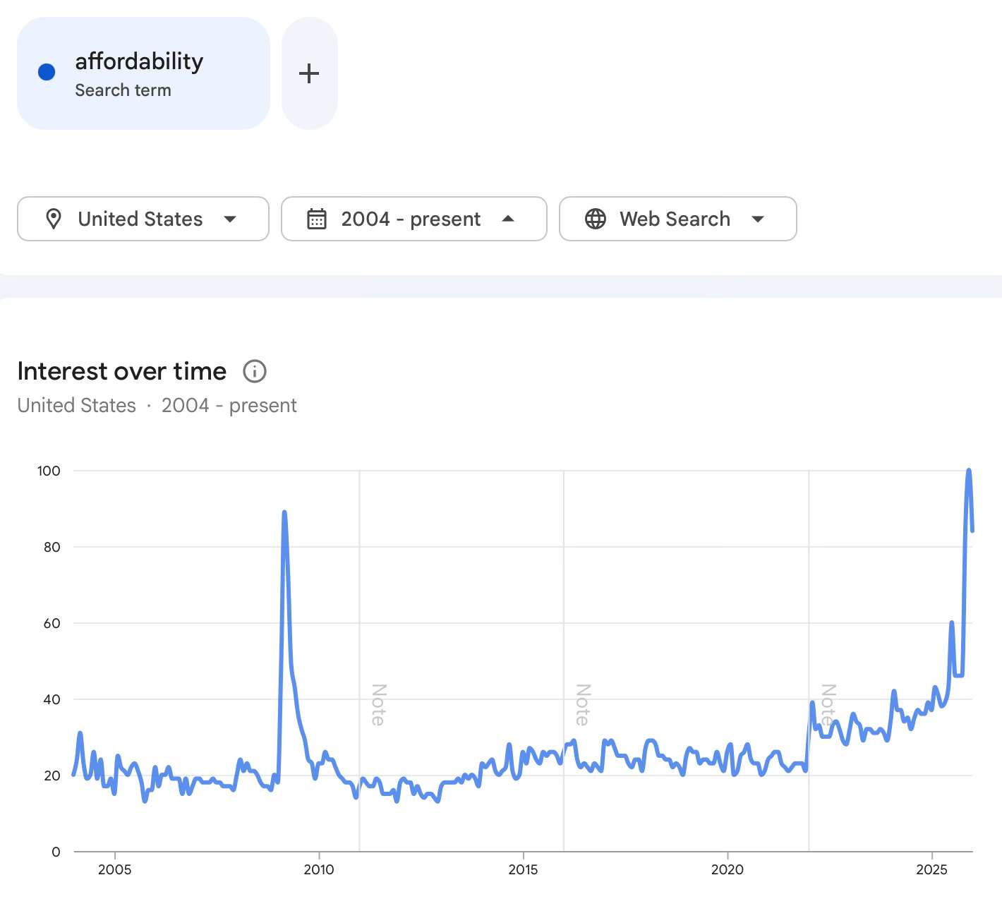
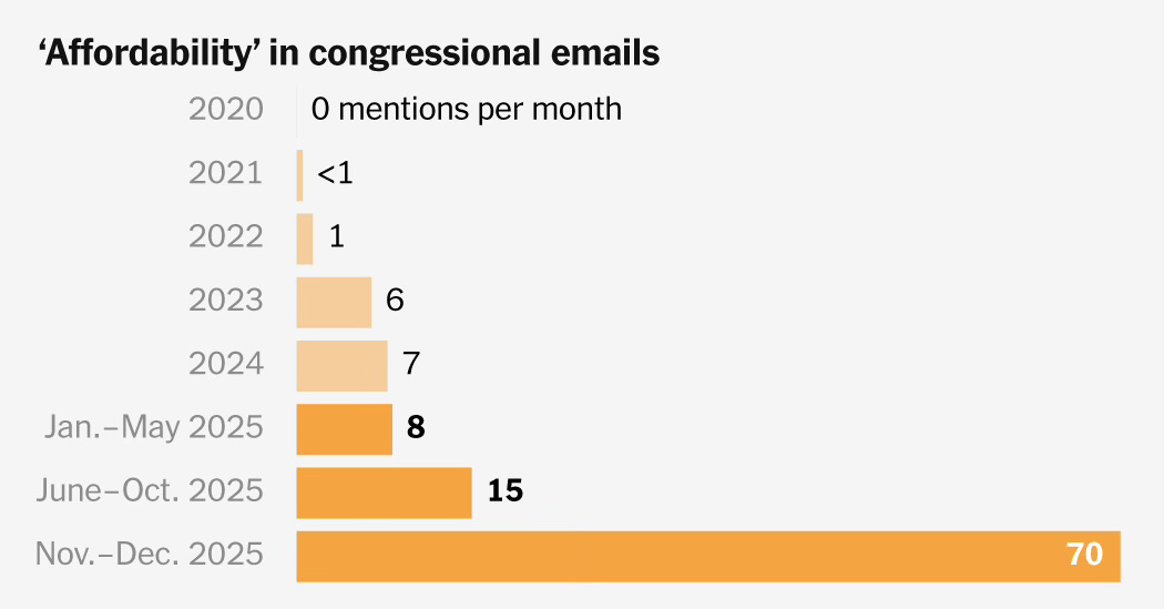
We’ve been hearing a lot about affordability. Housing is of course squarely at the center of this debate. The cost of homeownership is undeniably high on most historical metrics. There are very few taking the other side of that argument.
The more interesting question isn’t whether housing is expensive. It undeniably is. The question is how the market keeps clearing at these levels and whether “unaffordable” on its own is enough to break prices.
How have prices held up — and in many markets continue rising — even as mortgage rates doubled and monthly payments became 40-50% more expensive than they were in 2021?
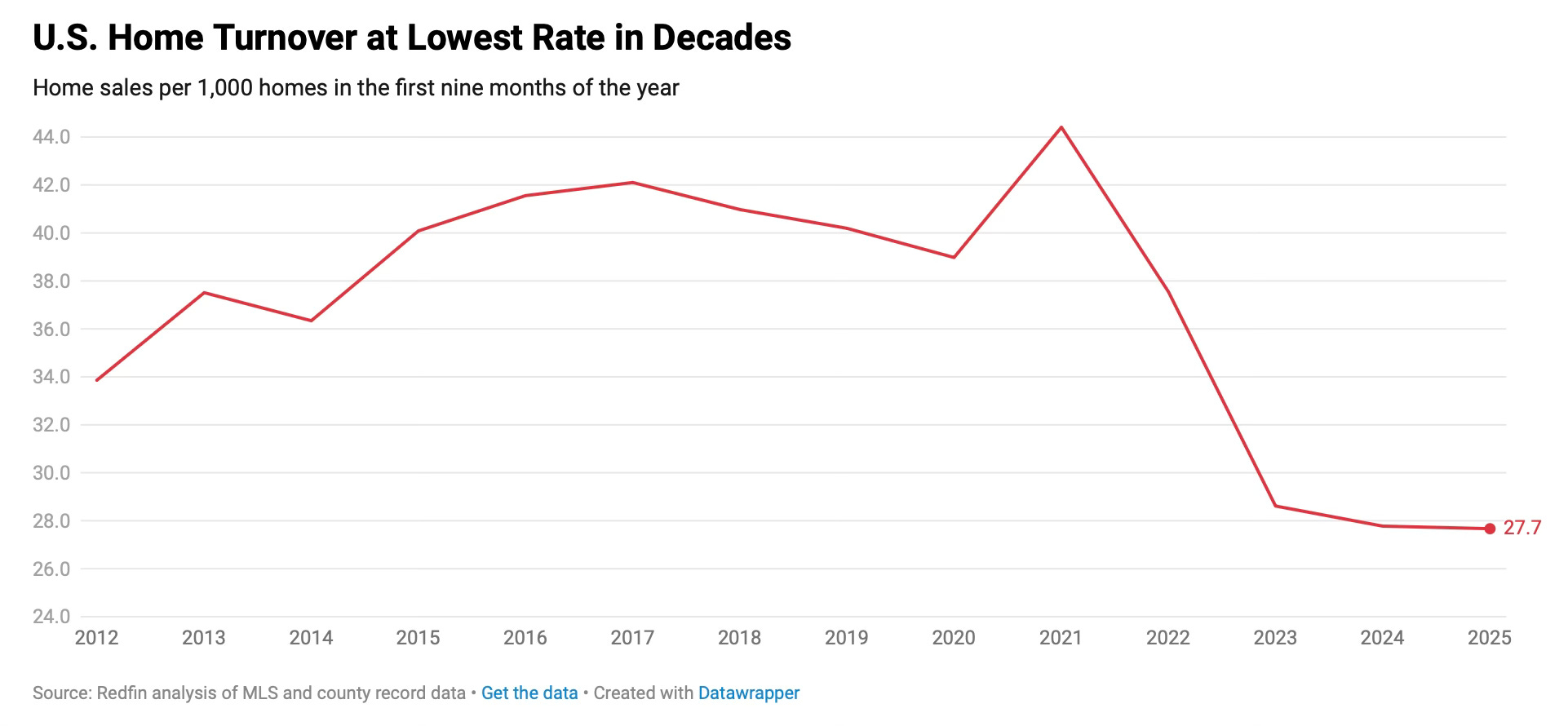
Yet transactions continue. Albeit at lower levels than during and before the Pandemic. Many housing analysts predicted that prices would follow volume lower. But we know that’s not how markets actually work. Supply and demand dictate pricing, not volume. Pricing has largely held up for years even with materially lower aggregate sales.
The reality is buying these homes that are coming to market. Of the nation's nearly 46 million renters, only 6 million can afford the median-priced home. That's only 13%. Consumer sentiment is sitting at levels historically associated with recessions, not with 4-5% unemployment and continued GDP growth — lower, in fact, than during the bottom of the GFC.
Percentage of Renter Households That Can Afford a Median-Priced Home
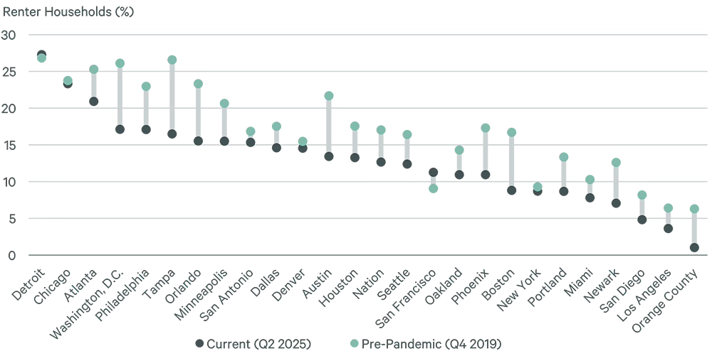
Source: CBRE
This is where conversations about housing usually pivot to crash predictions. The affordability charts look dire. The sentiment data looks dire. So the obvious question follows: when do prices fall?
I’m not going to answer that question here. That’s a different piece. What I want to do is map the terrain underneath that question — because most crash predictions skip this part entirely. They look at the affordability charts, declare it unsustainable, and wait.
But “unaffordable” isn’t a catalyst. It’s a condition. And conditions can persist for a very long time when the underlying household balance sheet doesn’t actually break. So before we can talk about what would break it, we need to understand what’s holding it together — and where the real fracture lines are.
To make sense of it, separate households into three groups: Solvent. Stuck. Squeezed
Solvent: The Structural Floor Under Prices
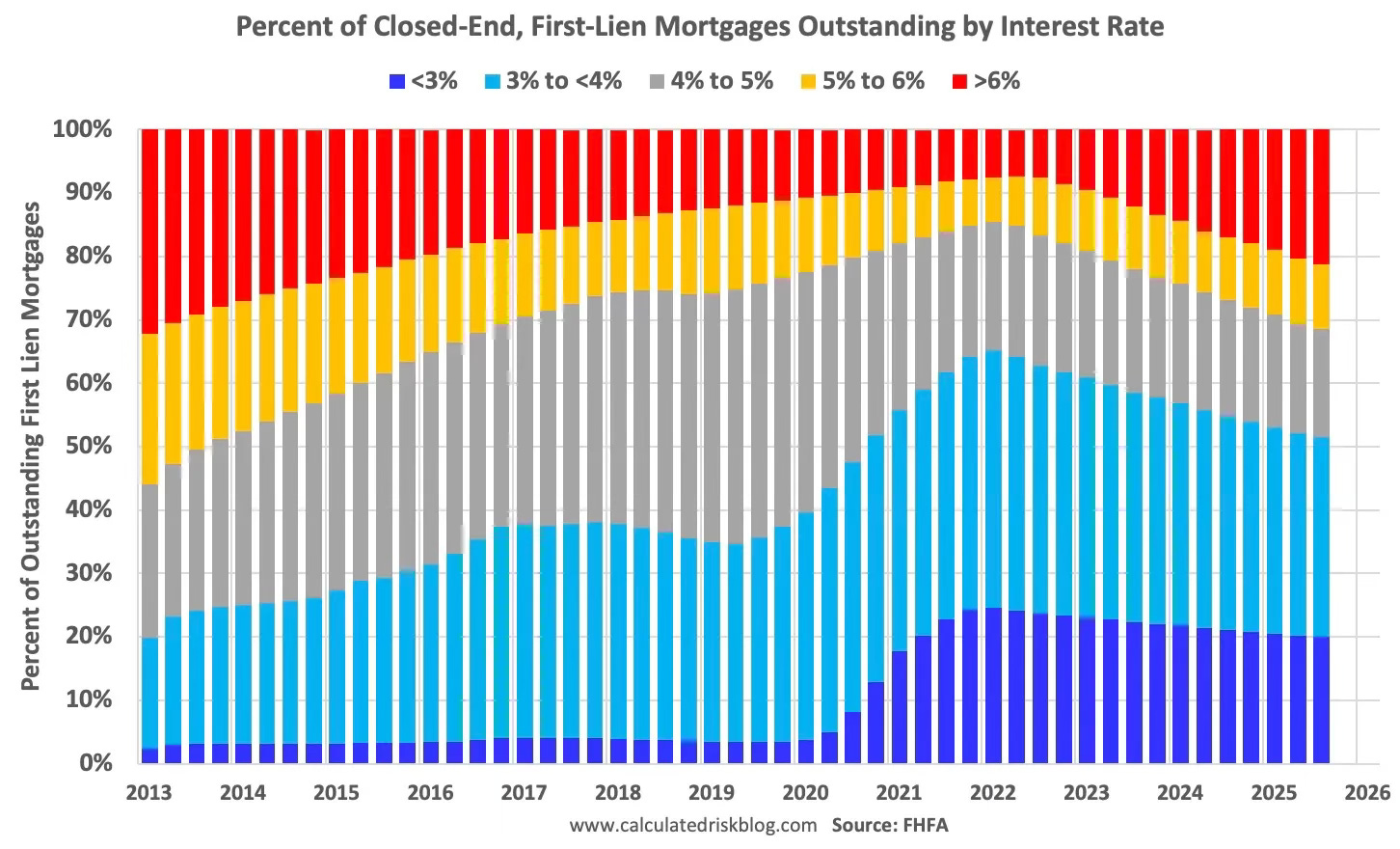
Start with the stabilizer most people miss: mortgage structure.
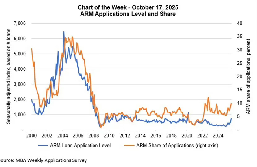
The typical homeowner is sitting on a fixed-rate mortgage. That alone changes the entire failure mode versus the last housing crisis, when adjustable-rate mortgages reset higher and forced homeowners into foreclosure. Yes, there’s been some recent ARM curiosity at the margin, especially for jumbo borrowers trying to arbitrage the rate curve. But the stock of outstanding mortgages that people are actually carrying remains overwhelmingly fixed-rate. When the Fed talks, the mortgage payment doesn’t move.
In 2007, homeowners were levered into adjustable-rate products, sitting on negative equity, and facing payment resets they couldn’t afford. The failure mode was mechanical: rates reset, payments jumped, defaults spiked, inventory flooded the market, prices collapsed.
That structure doesn’t exist today.
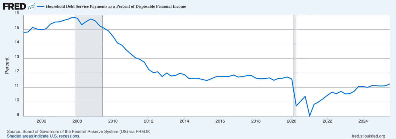
Household debt service payments as a share of disposable income are sitting in the low-11% range—elevated from the pandemic trough around 9%, but far below the 15%+ zone that defined the mid-2000s fragility.
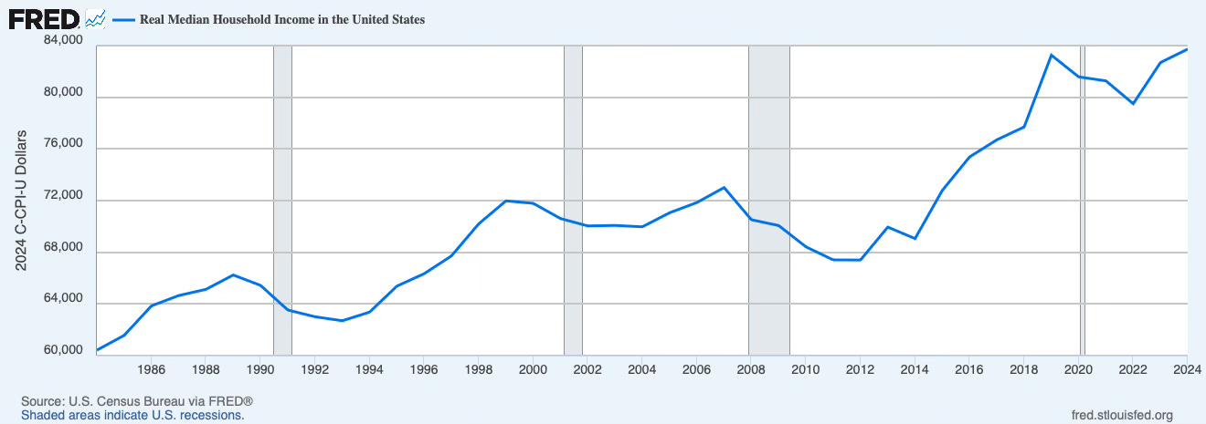
Real median household income has climbed back above its pre-pandemic level—$83,730 in 2024 versus $83,260 in 2019—after several years where inflation ate any real gains. But as you can clearly see, median incomes are not going down.
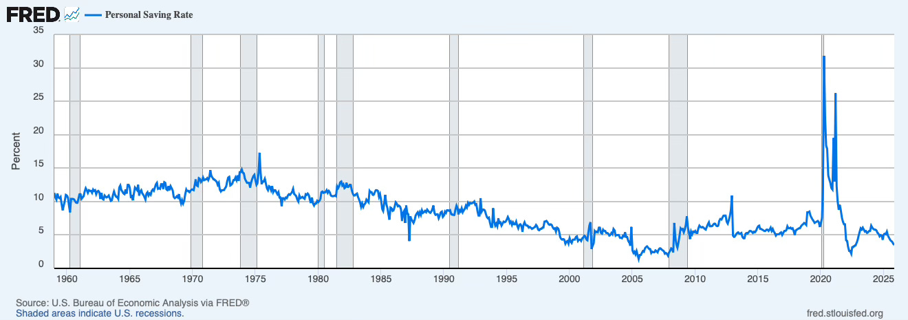
The personal saving rate is somewhat low compared with the late 2010s, but it isn’t zero. It’s been running in the mid-4% range through late 2025. Not out of line with the average of the last 20 years. Not great, but not flashing red.
The aggregate dashboard says: households can service their debt. They can pay their bills. They can keep the lights on.
But solvency doesn’t imply mobility. And housing markets need mobility to function.
Stuck: The Frozen Ladder
Most homeowners can’t afford to move—even if they can afford to stay.
A household sitting on a 3% mortgage locked in during 2020-21 would face a payment that roughly doubles if they moved and financed at today’s rates. Even with significant equity gains, the monthly cash flow hit is brutal. So they stay. They renovate. They make do. They turn down job offers. They delay upsizing. They defer downsizing. They absorb longer commutes. They live with layouts that no longer fit their lives.
The Fed estimates that mortgage-rate lock-in explains a large share of the collapse in borrower mobility coming out of 2021. One study found that lock-in prevented 1.72 million transactions from 2022Q2 to 2024Q2. Another estimated it reduced mobility for mortgaged households by 16% in 2022-23 and increased home prices by 7-8% by reducing supply that would normally come to market.
But this lock-in effect is beginning to ease.
For the first time, there are now more homeowners with mortgage rates above 6% than those with rates below 3%—a milestone that suggests the “payment advantage” of staying put is weakening. As more households hold mortgages at today’s rates, the decision to move becomes less about preserving a historically low rate and more about normal life factors: job changes, growing families, downsizing, relocation.
But the more important catalyst isn’t math. It’s life.
The “Five Ds”—Diapers, Diamonds, Divorce, Death, Diplomas—don’t wait for the Fed. You can defer a move for a year. Maybe two. But a growing family will eventually burst out of a starter home. An empty nester will eventually tire of maintaining four bedrooms. The 2021 cohort that locked in at 3% is now four years into ownership, entering the window where life events historically trigger moves regardless of rate spreads.
The 2020-21 rate environment pulled transactions forward — people who would have bought in 2022 or 2023 moved up their timelines. Then the rate shock froze the other side. Existing homeowners stopped listing. The rate shock didn’t just slow the market. It broke the sequence. The move-up buyer who would have listed a starter home, freeing it for the first-time buyer, who would have vacated a rental, opening a unit for someone moving out of a roommate situation. The whole chain seized.
Mobility fell. Listings fell. Inventory stayed tight in key segments. The market cleared at lower volume. Prices became sticky. And critically, the housing ladder — the mechanism by which households trade up and first-time buyers trade in — lost rungs. Those rungs don’t come back quickly, even as lock-in fades.
That supply deferral has an expiration date. But the damage to the ladder is structural, not cyclical.
The Escrow Trap
Everyone focuses on the mortgage rate. But the real pressure point for 2026 is escrow—taxes and insurance. The 3% mortgage rate is fixed. The escrow account is not.
Consider a Florida retiree who paid off their mortgage in 2018. No monthly payment. Solvent by any measure. But their homeowners insurance has gone from $2,400 a year to $15,000. Their property tax assessment, delayed during COVID, just caught up to a 40% price gain in a single reassessment. Their monthly carrying cost — with no mortgage — went from roughly $600 to over $1,800. On a fixed income, that's a forced move waiting to happen. And it shows up in no distress metric.
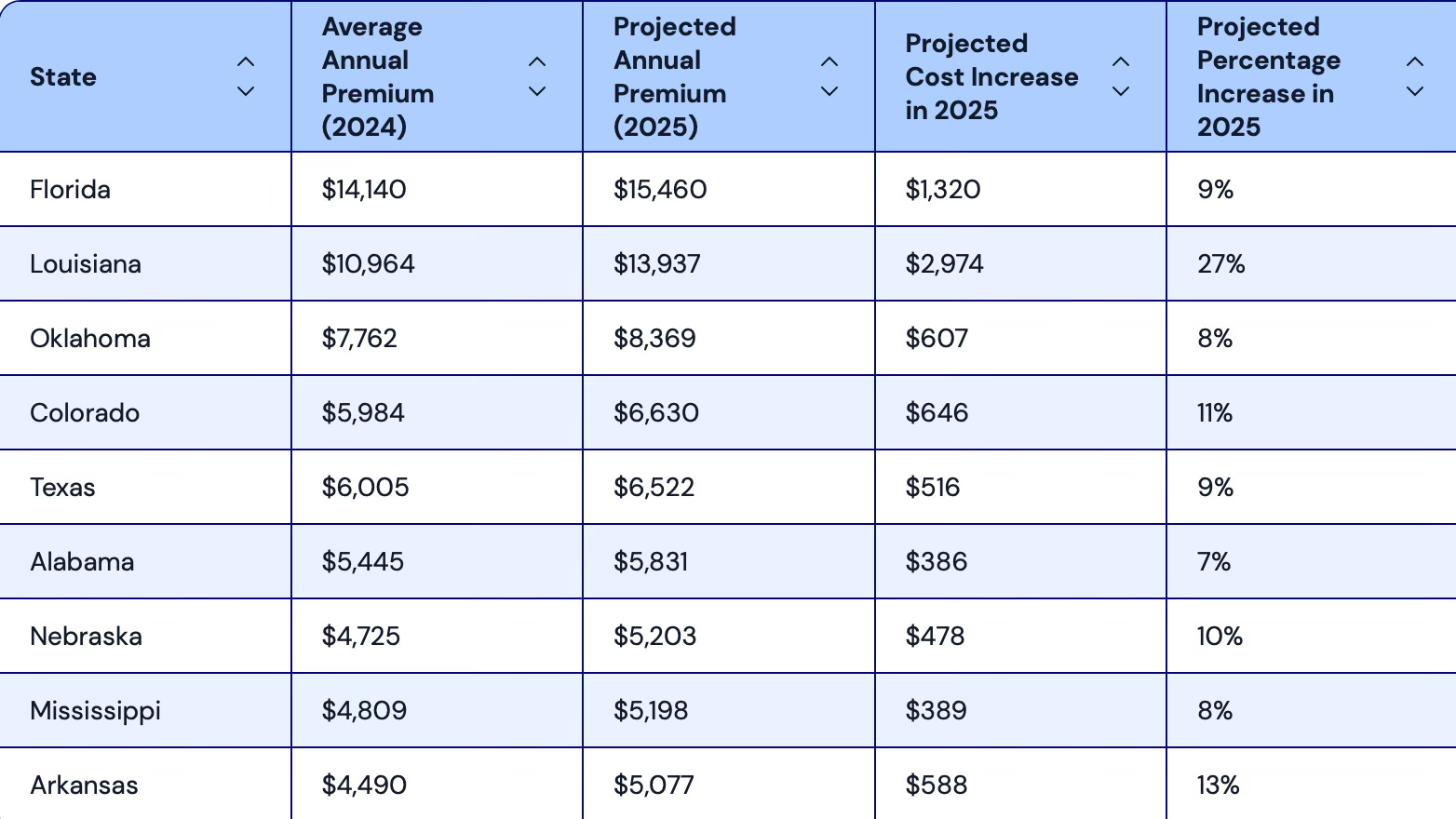
Insurance premiums rose double digits in 2023 and 2024, and are projected up another 6-8% in 2025-26. In Florida and parts of California, the issue isn’t just cost—it’s availability. Insurers are withdrawing from markets entirely. State Farm, Allstate, and Farmers have all pulled back from California. Citizens Insurance, Florida’s insurer of last resort, now covers over 1.2 million policies. The average Florida homeowner pays $15,460 annually for insurance—the highest in the nation and roughly triple the national average.
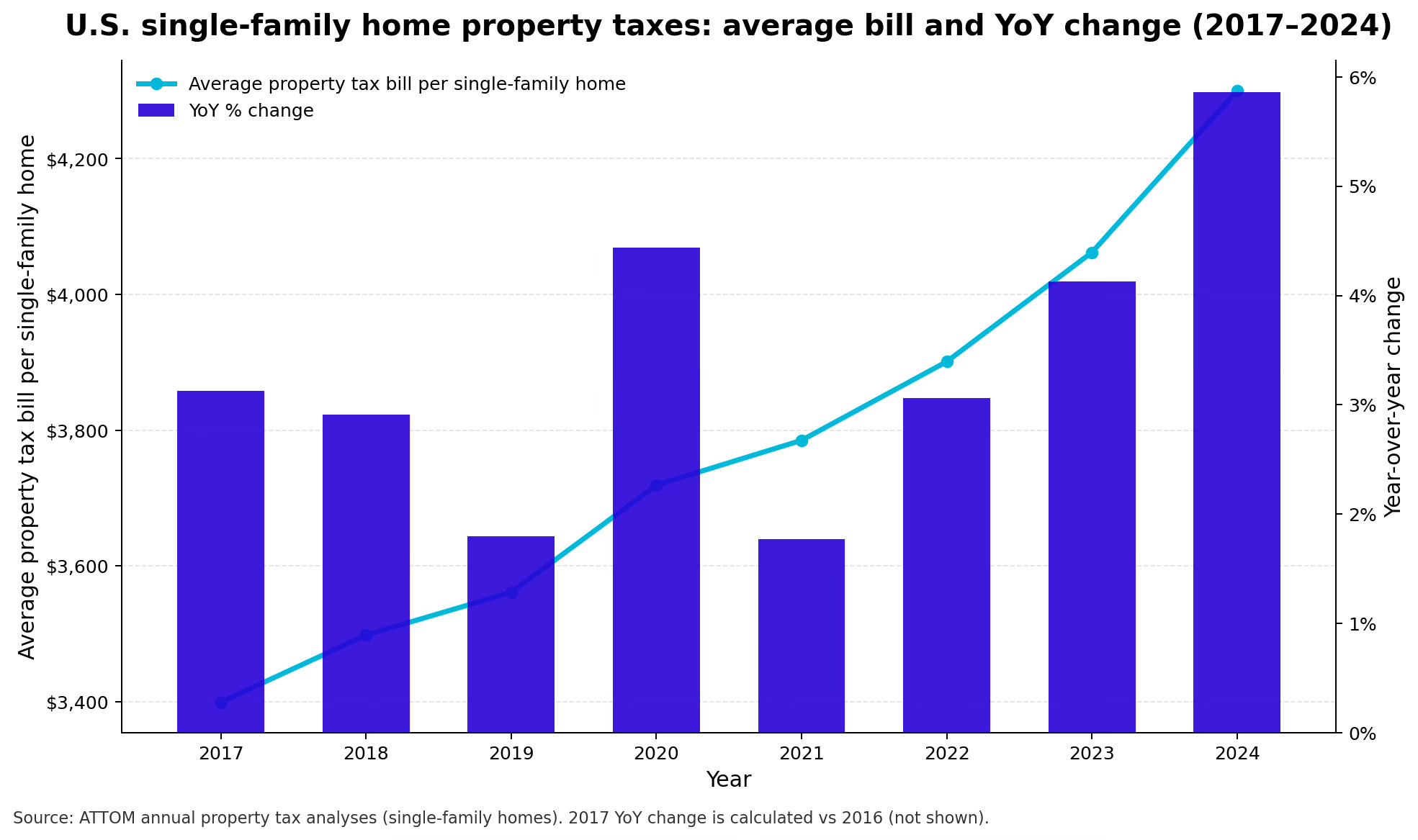
Property tax assessments are catching up to pandemic-era appreciation. ATTOM data shows average single-family property taxes rose 5.8% nationally in 2024 — the largest year-over-year increase in the dataset — outpacing inflation by a wide margin. Reassessment cycles in Texas and Florida are producing double-digit increases for some homeowners. Many jurisdictions delayed reassessments during COVID. Those are now catching up to 30-50% home price gains in a single adjustment.
The Sunbelt states that attracted so much pandemic migration don’t have income taxes. Revenue has to come from somewhere. Property taxes are often the only source with enough horsepower to fund a state. And unlike your mortgage rate, your property tax bill reprices whether you want it to or not.
This changes the solvency picture. A retiree on a fixed income with a paid-off house isn’t “solvent” in any meaningful sense if their escrow doubles over five years. That’s the wedge that could force inventory from a population that doesn’t fit the standard distress profile—not underwater, not unemployed, just unable to absorb the carry costs.
The escrow trap matters because it creates a potential supply release mechanism that doesn’t require the traditional distress signals.
Squeezed: The Participation Trap
Now bring renters back into the picture.
The standard narrative is that rents are crushing renters. The reality is more complicated — and in some ways, more troubling.
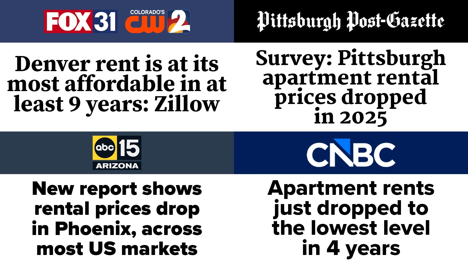
Start with the headline data: rent growth has slowed dramatically since the 2021-22 spike. In many Sun Belt metros, rents have actually declined. The national median asking rent hit its lowest level since 2022 in early 2026, posting its sixth straight monthly decline — down 6.2% from peak levels. In Los Angeles, rents are at a four-year low. Denver renters are seeing the most affordable prices in at least nine years. Markets with the most new construction — Austin, Phoenix, parts of Florida — have seen outright decreases.
So if rents are flat or falling in real terms across much of the country, why are renters more stressed than ever?
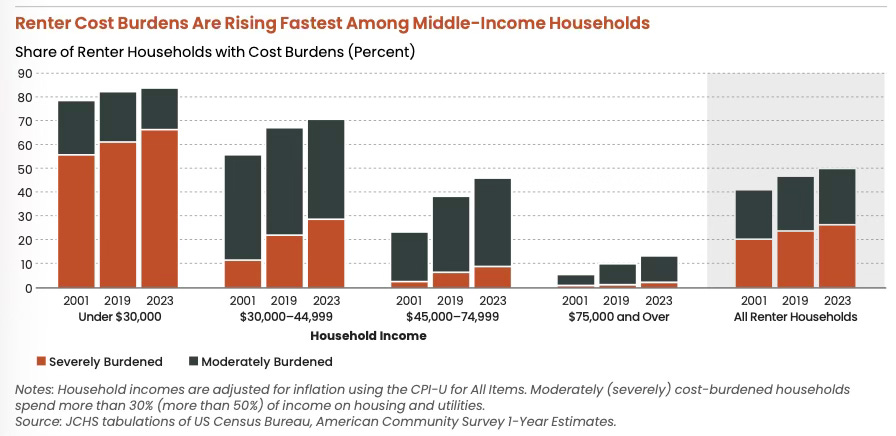
Because 22.6 million renter households — a record 50% — are now cost-burdened, spending more than 30% of income on housing and utilities. That includes 12.1 million who are severely burdened, spending more than half their income on rent. For three consecutive years, both numbers have set new highs.
And the strain isn’t confined to the bottom of the income ladder. It’s creeping up. In 2001, 55% of renters earning $30,000 to $45,000 were cost-burdened. Today it’s 70%. For those earning $45,000 to $75,000 — solidly middle-income households who historically fed the first-time buyer pipeline — burden rates have doubled to 45%. Even 13% of renters earning $75,000 or more are now cost-burdened. These aren’t the working poor. These are households with two earners, steady jobs, and no path to ownership.
Source: The State of the Nation’s Housing 2025 - Joint Center For Housing Studies of Harvard University
Here’s the paradox: rents don’t need to be at record highs to break the buyer pipeline. They just need to absorb enough income that nothing is left over.
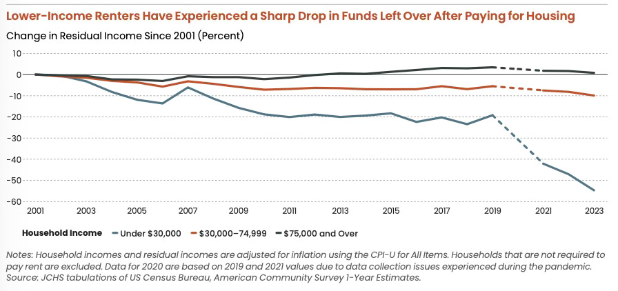
The Harvard Joint Center puts it starkly: renters with annual incomes under $30,000 now have a median of just $250 per month left after paying for housing — down 40% in real terms since 2001. Middle-income renters ($30,000-$75,000) saw residual incomes fall by double digits over the same period. That’s the money that was supposed to become down payment savings. It’s gone.
But the culprit isn’t rent alone. It’s the total cost of participation.
Michael Green’s analysis of the “participation budget” captures this perfectly. Consider a Basic Needs budget for a family of four — two earners, two kids, no vacations, no Netflix, no luxuries. Just the essentials required to hold a job and raise children in 2024: housing, healthcare, childcare, transportation, food, and the technology now required to function — smartphone plans, home broadband for bank authentication, work emails, school portals. After accounting for federal, state, and FICA taxes, the required gross income totals $136,500.
The official poverty line sits at $31,200.
That gap explains why the affordability crisis doesn’t show up cleanly in default statistics. You can be solvent by official measures — pay your bills, service your debt, avoid default — and still be unable to participate in the version of economic life that used to be considered normal.
The poverty line is anchored to a world where food was the primary household expense. Modern budgets get crushed by housing, healthcare, childcare, and transportation — the participation tickets required to function in today’s economy. Rent isn’t pushing people over the edge on its own. It’s everything else combined with rent that’s doing it.
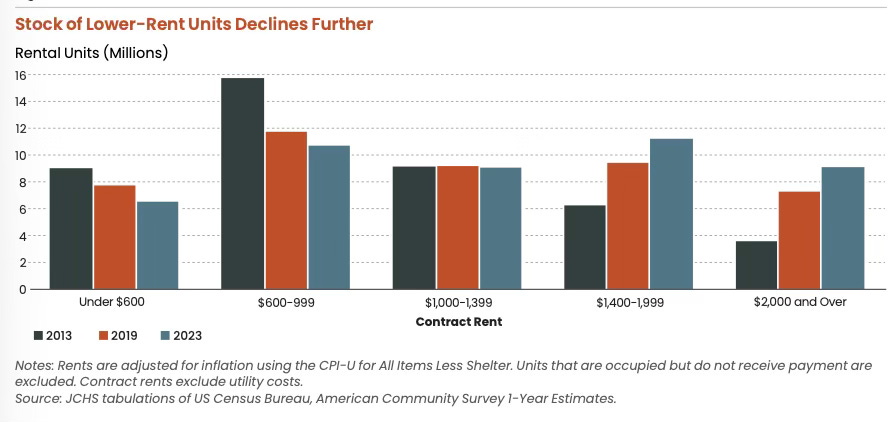
Between 2013 and 2023, the stock of rental units priced below $1,000 per month dropped by over 30%, falling from 24.8 million to 17.2 million units. Meanwhile units renting for $2,000 or more nearly tripled, from 3.6 million to 9.1 million. The disappearance of affordable rental stock compresses the entire housing ladder: middle-income renters compete for fewer units in their price range, which delays their ability to save for homeownership while low-income renters have nowhere to go.
This friction shows up in behavior before it shows up in median-income charts.
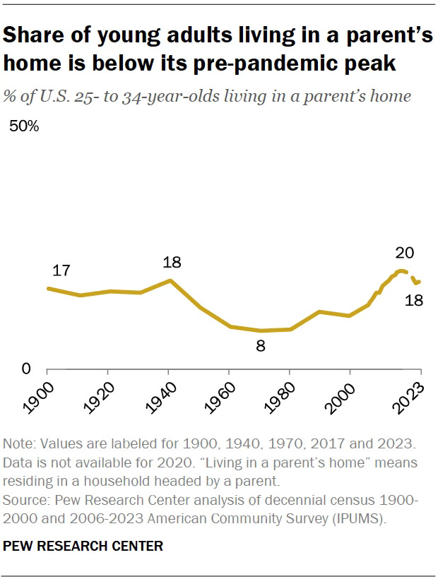
People delay marriage. They delay children. They rent longer than planned. They double up. They move back home. They stop forming new households entirely. Pew’s analysis puts the share of adults ages 25-34 living in a parent’s home at 18% in 2023. That’s a pressure valve for rents in the short term — fewer independent households means less rental demand — but it’s also a signal that the life-cycle buyer is being pushed forward in time.
So who IS buying?
The National Association of Realtors’ 2025 Profile of Home Buyers and Sellers tells the story. First-time buyers made up just 24% of purchasers — near record lows. The typical first-time buyer is now 38 years old, a record high. The American “starter home” has become a midlife purchase.
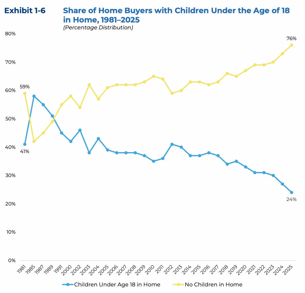
Only 24% of recent buyers had children under 18 at home, down from 58% in 1985. The classic image of the marginal buyer — young couple, kids, stretching into ownership — is no longer the median reality.
The marginal buyer is older, higher-income, and more likely to be buying with equity, cash, or family help. NAR notes a rise in multigenerational logic inside the purchase decision. Buyers cite taking care of aging parents, cost savings, and adult children moving back home as key motivations. Median home prices are hovering around $420,000, roughly 5x median household income. Monthly mortgage payments on the median-priced home require an annual income of at least $126,700 under typical first-time buyer terms.
The buyer pipeline hasn’t disappeared. It’s been replaced. The household that used to drive first-time purchases — young, dual-income, saving from rental into ownership — has been pushed out by a combination of cost burden, disappearing affordable stock, and the rising price of simply participating in the economy. In its place: existing homeowners trading equity, families pooling resources across generations, and cash buyers who don’t need the mortgage market at all.
The path to homeownership used to run through income. Now it runs through equity, inheritance, or family money. That's a different system — and it doesn't scale.
The Homeownership Paradox
Here’s the question nobody asks: the homeownership rate sits at roughly 65%. If housing is so unaffordable, how is that number so high?
Because the 65% is a legacy number. It measures who already owns — not who could buy today.
The median homeowner is sitting on a home purchased years or decades ago at a much lower price point. Roughly 40% of owner-occupied homes are owned free and clear — no mortgage at all. The rate stays high because existing owners stay owners. They’re the Solvent and the Stuck. The system works for people who are already inside it.
But look at the inflow. Of the nation’s 46 million renter households, only about 13% could qualify to purchase a median-priced home today. That’s roughly 6 million households. In a country of 130 million.
The 65% homeownership rate isn’t evidence the system works. It’s a snapshot of who got in before the door narrowed. The 13% — that’s the real number. That’s the pipeline. And it tells you everything about where this is headed.
When household formation slows, everything downstream changes: starter-home absorption, rental demand mix, roommate dynamics, fertility decisions, and the political temperature around housing.
So What Breaks?
This isn’t a 2008 setup. There’s no ARM wave resetting. There’s no negative equity spiral. The household balance sheet, in aggregate, is solvent. The people who own homes can afford to keep them — mostly.
But “not crashing” isn’t the same as “working.”
What we have is a slow stratification. A market that functions perfectly well for the people already inside it — homeowners with locked-in rates, rising equity and manageable debt loads. And a market that is systematically excluding everyone trying to enter — through a combination of high prices, high rates, rising carrying costs and an economy where the cost of simply existing consumes the surplus that used to fund down payments.
The Solvent keep the floor under prices. The Stuck keep inventory off the market. The Squeezed keep getting priced out. And together, these three dynamics produce a market that looks “unaffordable” on every chart but refuses to correct — because the transmission mechanism that would force correction (distressed selling, rising inventory, defaulting borrowers) doesn’t exist in sufficient scale.
That doesn’t mean it can’t break. It means the break, if it comes, won’t look like 2008. It’ll look like something else — a slow erosion of mobility, a generational wealth divide that widens until it becomes politically intolerable, or an external shock (recession, unemployment spike, credit event) that hits the Stuck cohort hard enough to force listings.
The affordability charts are real. The stress is real. But this kind of stress isn’t a catalyst. What breaks housing markets is forced selling. And right now, almost nobody is forced to sell.
The question isn't whether this is sustainable. It probably isn't. The question is what, specifically, changes the math. That's next.
Share this with someone who wants to understand why housing feels broken but won't crash!
Housing + Markets publishes analysis at the intersection of housing, capital markets, and financial history. No crash porn. No cheerleading. Just the data and the mechanisms underneath.
Sources and Further Reading
Household Balance Sheet & Income
Household Debt Service Payments as % of Disposable Income — Federal Reserve via FRED
Real Median Household Income in the United States — Census Bureau via FRED
Personal Saving Rate — Bureau of Economic Analysis via FRED
Index of Consumer Sentiment — University of Michigan via FRED
Housing Market & Transactions
2025 Profile of Home Buyers and Sellers — National Association of Realtors (first-time buyer share, median age, children in home data)
Median Sales Price of Houses Sold — Census Bureau via FRED
Existing Home Sales — National Association of Realtors
Percentage of Renter Households That Can Afford a Median-Priced Home — CBRE Research
Mortgage Structure & Lock-In
Percent of Closed-End, First-Lien Mortgages Outstanding by Interest Rate — FHFA National Mortgage Database (via Calculated Risk)
The Lock-In Effect of Rising Mortgage Rates — FHFA Working Paper 24-03 (1.33 million prevented transactions, 2022Q2–2024Q2)
Locked In: The Effect of Rate Hikes on Housing Markets and Mobility — Federal Reserve FEDS Working Paper (16% reduced mobility, 7-8% price increase from withheld supply)
Weekly Mortgage Applications Survey — ARM Share — Mortgage Bankers Association
Carrying Costs: Insurance & Property Taxes
2024 Annual Property Tax Report — ATTOM Data Solutions (5.8% national increase)
Homeowners Insurance Premiums by State — Insurance.com (Florida $15,460 average; state-by-state comparisons)
Citizens Property Insurance Corporation — Florida’s insurer of last resort (1.2 million policies)
Renters & Affordability
The State of the Nation’s Housing 2025 — Harvard Joint Center for Housing Studies (cost-burdened renters, residual income, affordable stock decline)
Renter Households Cost-Burdened by Race — U.S. Census Bureau (22.6 million cost-burdened, record 50%)
National Rent Report — Apartment List (median rent trends, six consecutive months of decline)
Denver Rent at Most Affordable in 9 Years — Zillow via FOX31
Demographics & Household Formation
Young Adults Living in a Parent’s Home — Pew Research Center (18% of adults ages 25-34)
Analysis & Further Reading
Michael Green, “My Life Is A Lie” — Simplify Asset Management / Substack (participation budget framework, $136,500 basic needs calculation) [Note: confirm exact post URL]
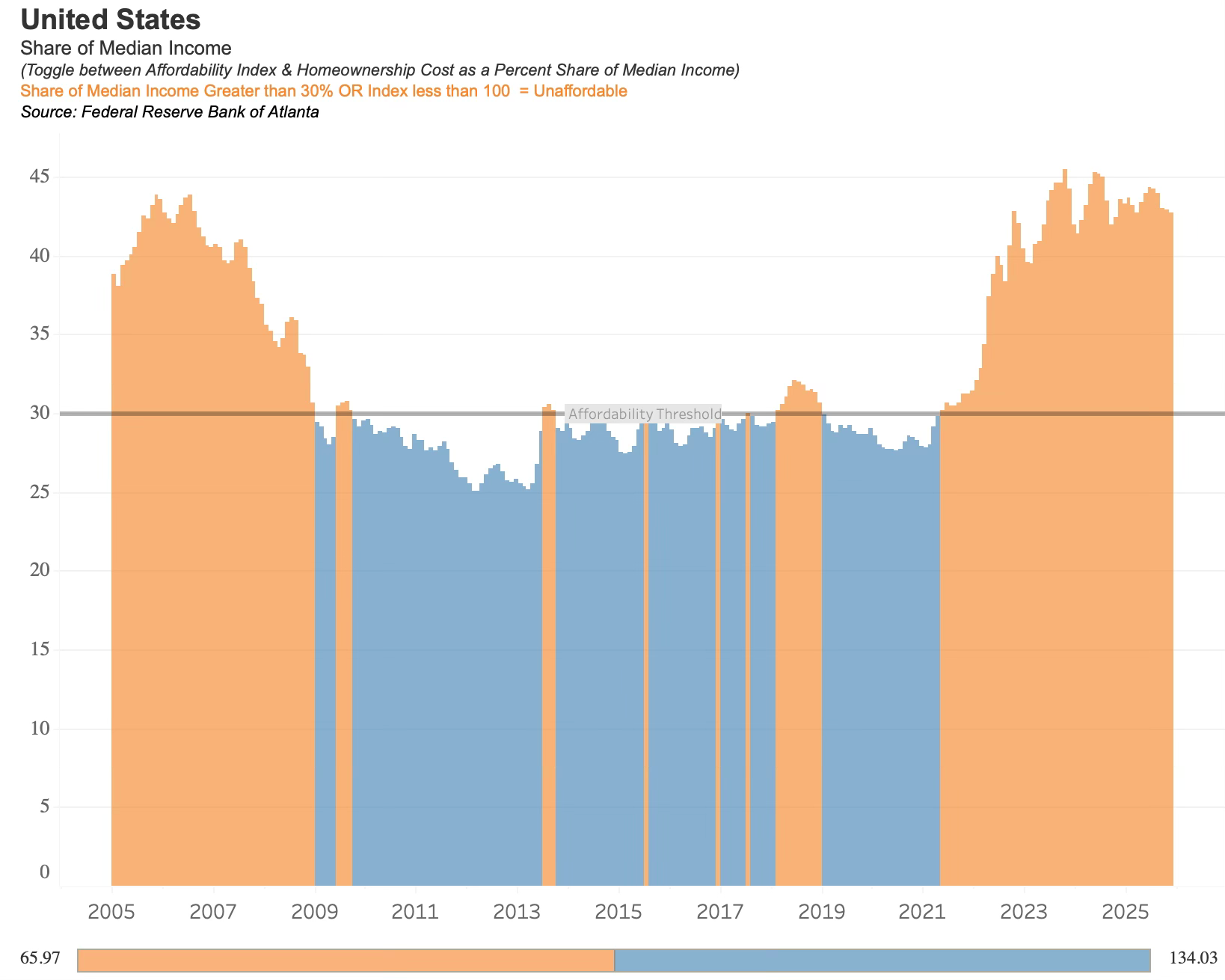
Atlanta Fed Home Ownership Affordability Monitor — Federal Reserve Bank of Atlanta (affordability index, share of median income)
Note: Some chart sources (Datawrapper visualizations, Trading Economics) are embedded in the article images and linked to their original platforms where applicable.