


San Francisco has 73,000 fewer residents than it had in 2020 and 6% fewer jobs than it had in February of that year. Its apartment rents are up 12.7% in a year, while owners almost everywhere else are complaining about flat rent rolls.
Austin has added nearly 400,000 people and 29% more jobs since 2019. Its asking rents are 12% below where they stood in 2022.
Hold those two cities in mind. The entire apartment industry is organized around a sentence that says the opposite should have happened.
Invest in housing where jobs are being created.
It is hard to overstate how central that one idea is to how apartment capital moves. Housing is where workers live, so buy where employers are hiring. Most strategies in this business reduce to some version of it, and for a long time the data agreed.
Across the 50 largest U.S. apartment markets, job growth and asking-rent growth were positively correlated in every year from 2010 through 2021. With a correlation of +0.51, job growth was the single best predictor of rent growth.
Then the relationship broke. And it didn’t just stop working. It went in reverse.
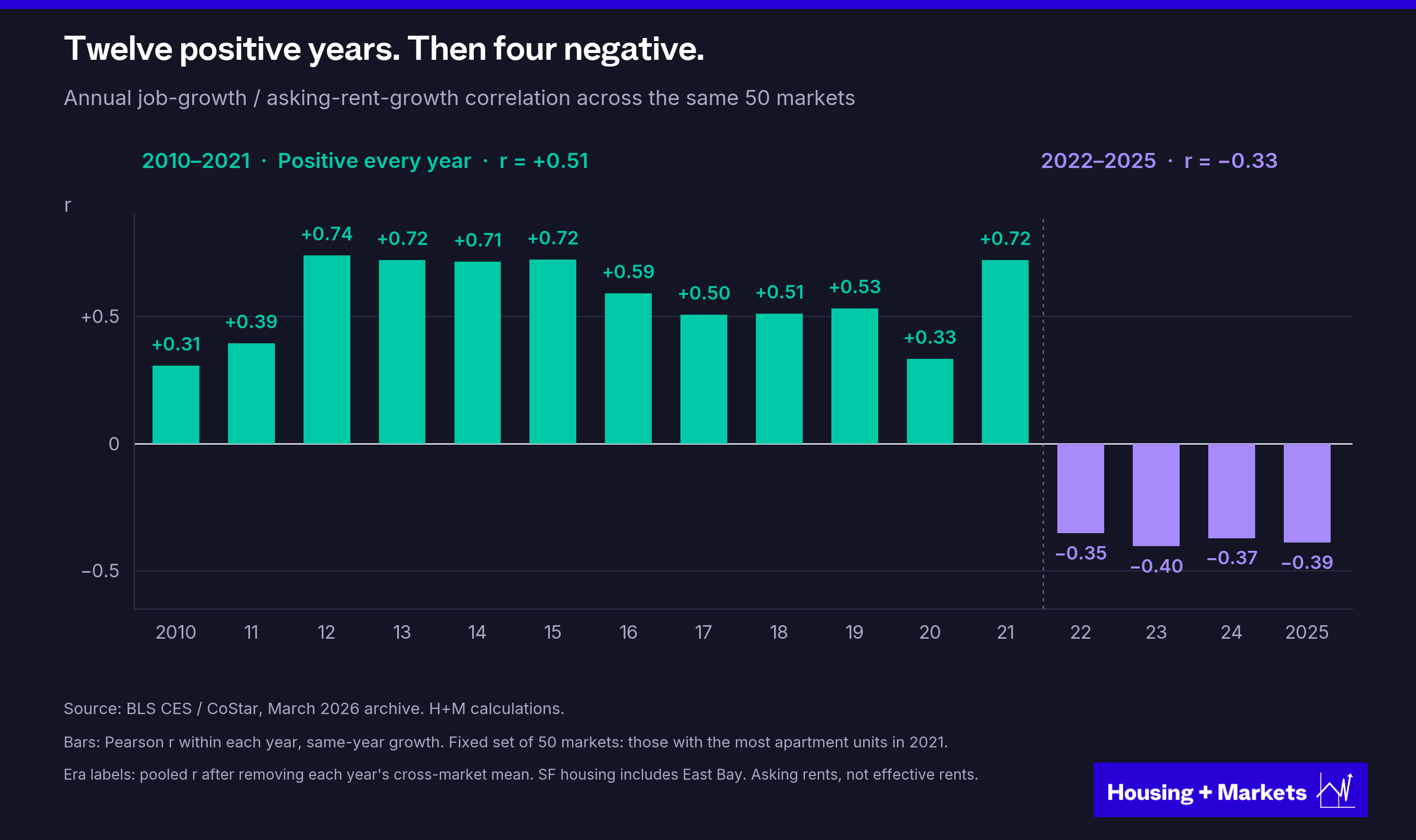
From 2022 through 2025 the correlation was negative in every year, −0.33 across the period.
For almost five years now, markets with stronger job growth have tended to deliver weaker rent growth.
This was not simply a familiar relationship becoming less reliable. It is now pointing in the opposite direction. I am not the first to notice. RealPage flagged the weakened relationship in February 2025 and offered two explanations, remote work and the changing composition of hiring, with no data behind either. Nobody has since published a rigorous look at why a relationship this foundational broke. Four questions naturally follow.
1. Has this ever happened before?
2. If job growth no longer predicts rent growth, what does?
3. Is this a passing phenomenon, or is job growth dead as a compass for rents?
4. And if/when jobs matter again, how do we measure them?
Let’s start with the first one.
Has this happened before?
Before declaring this a strictly post-pandemic phenomenon, it is worth asking how long this relationship has existed. RealPage’s rent series only goes back to 2010. CoStar’s data gets you to 2000. But the BLS has published metro rent CPI and job counts since 1972, which gives us a look back over half a century.
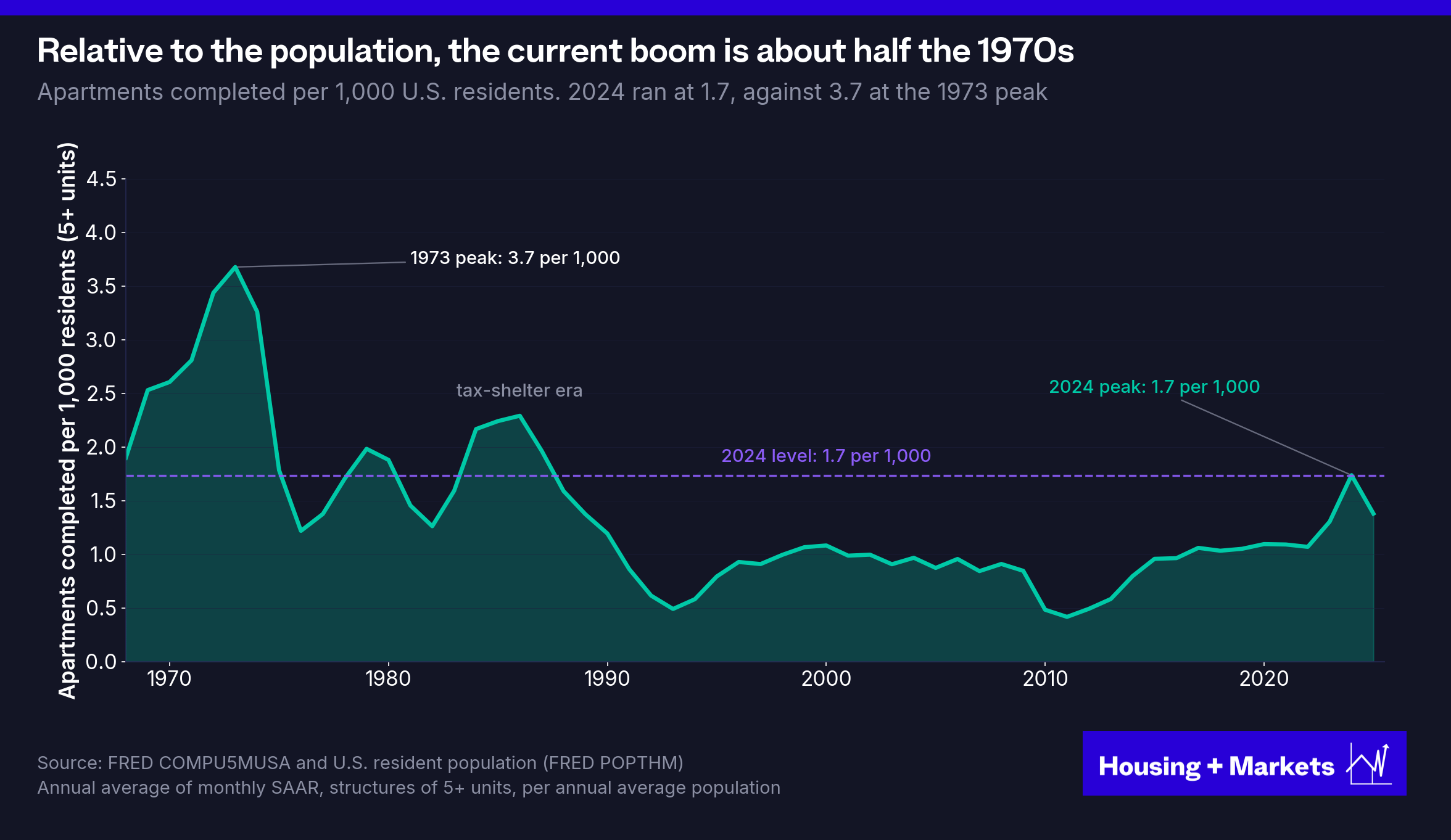
Across that half century the relationship has been positive in every year with the exception of two time periods. One in 1973/1974, at the crest of the largest wave of apartment construction America has ever seen. Roughly 780,000 units were completed in 1973, against the 592,000 that marked the peak of the current cycle in 2024. Be careful with those two readings. They sit barely below zero, on 21 cities, and dropping any one city can push them back above it. The third negative year is 2025, at −0.27, and it stays negative no matter which city you drop.
Both times, a historic wave of apartment supply was followed by a break in the relationship between jobs and rents.
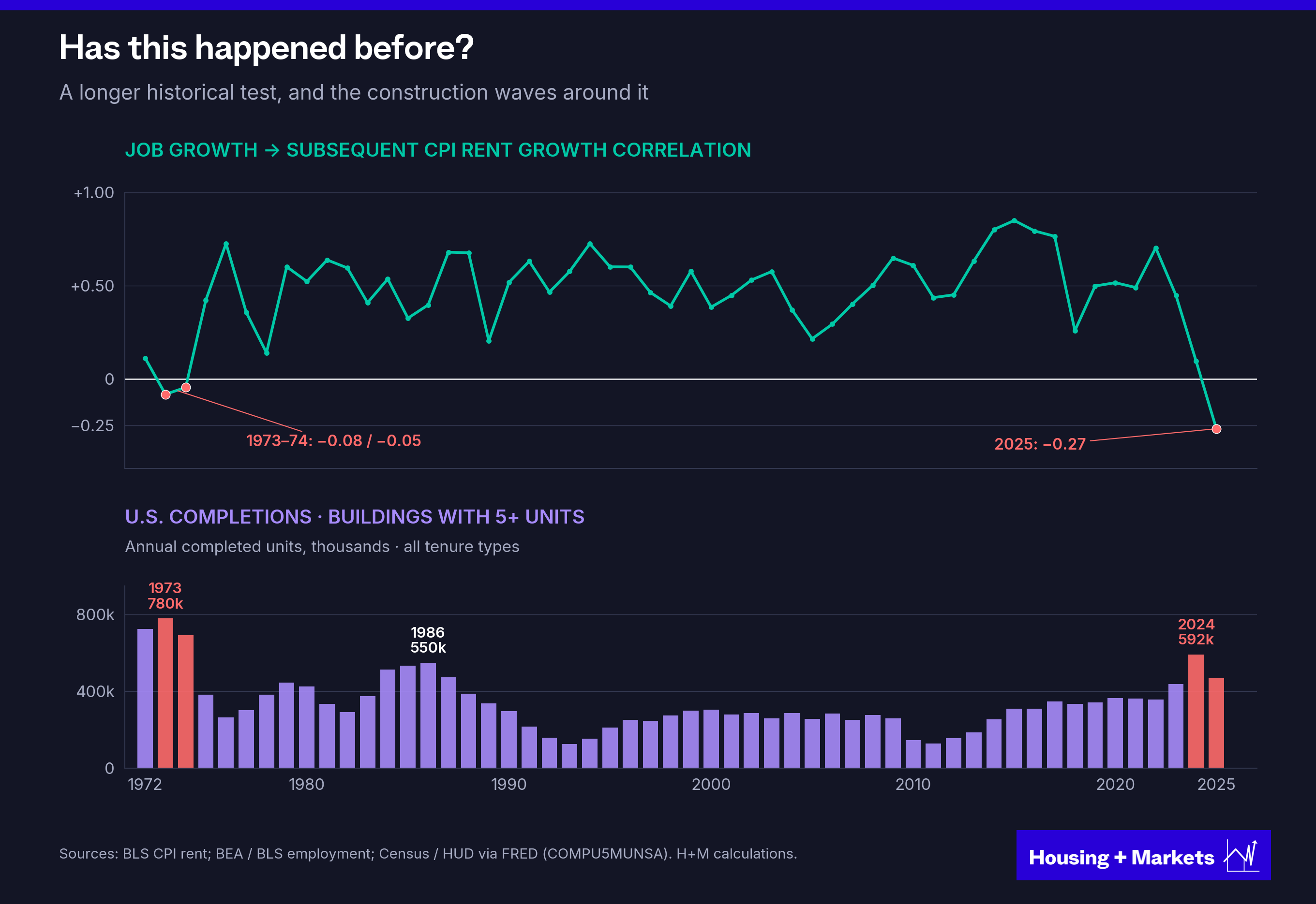
So is this just short-term supply overwhelming demand? A wave that will pass and once again restore job growth’s signal? If so, how do we explain why the correlation has not merely broken down, as it did in the 1970s, but fully inverted?
And if excess supply is the answer, why is this inversion happening now, when the supply wave of the 1970s was so much larger, both in total units and relative to the population and the housing stock?
Here is the short version. The rest of this piece fills it in.
Think about what it takes for a signal like job growth to stop working. If new apartments show up at random, with no relation to where the jobs are, the signal just gets noisier. Some fast-hiring markets get buried in new supply and some don’t, and the correlation drifts toward zero. That is a breakdown, and it is what the 1970s look like.
Now think about what it takes for the signal to run backwards. That requires something more specific. The new supply has to land hardest in exactly the markets that ranked highest on the signal, and it has to arrive a couple of years later, after everyone has already bought on the strength of the ranking. When that happens, the markets at the top of the jobs list become the markets with the most new competition. The correlation does not fade. It flips.
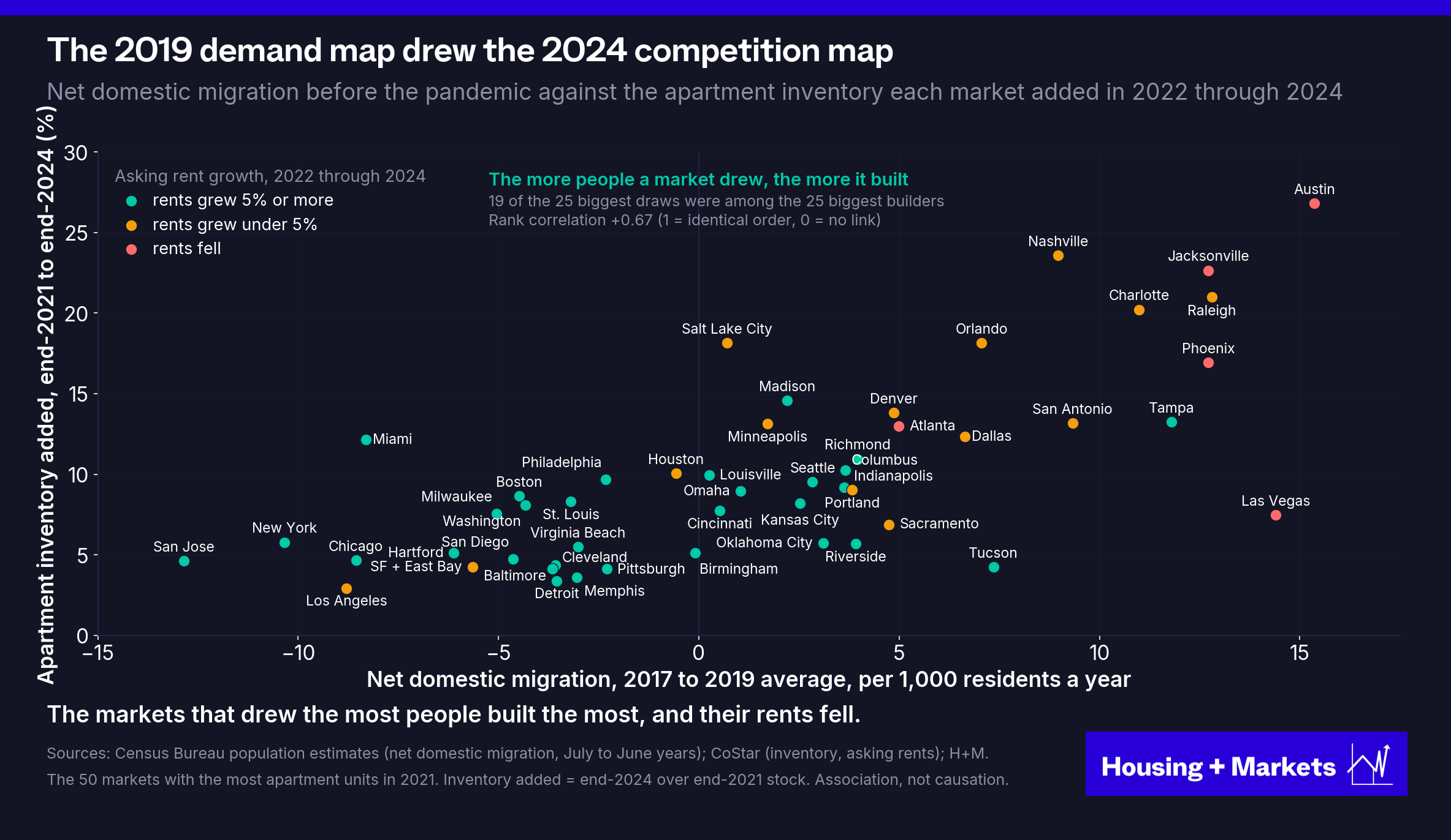
I cannot tell you whether the 1970s wave landed that way. The metro data from that era is not good enough to settle it. The 2020s data is, and it is clear. Developers built in proportion to the same demand rankings investors were using, and the top of the 2019 jobs list became the top of the 2024 deliveries list. Put plainly, the 2019 jobs ranking was a construction forecast dressed up as a demand signal.
So what is different about this era? The answer sits inside the second question.
What predicts rent growth now?
With one of the industry’s core beliefs so thoroughly defenestrated, the next step was to interrogate the rest.
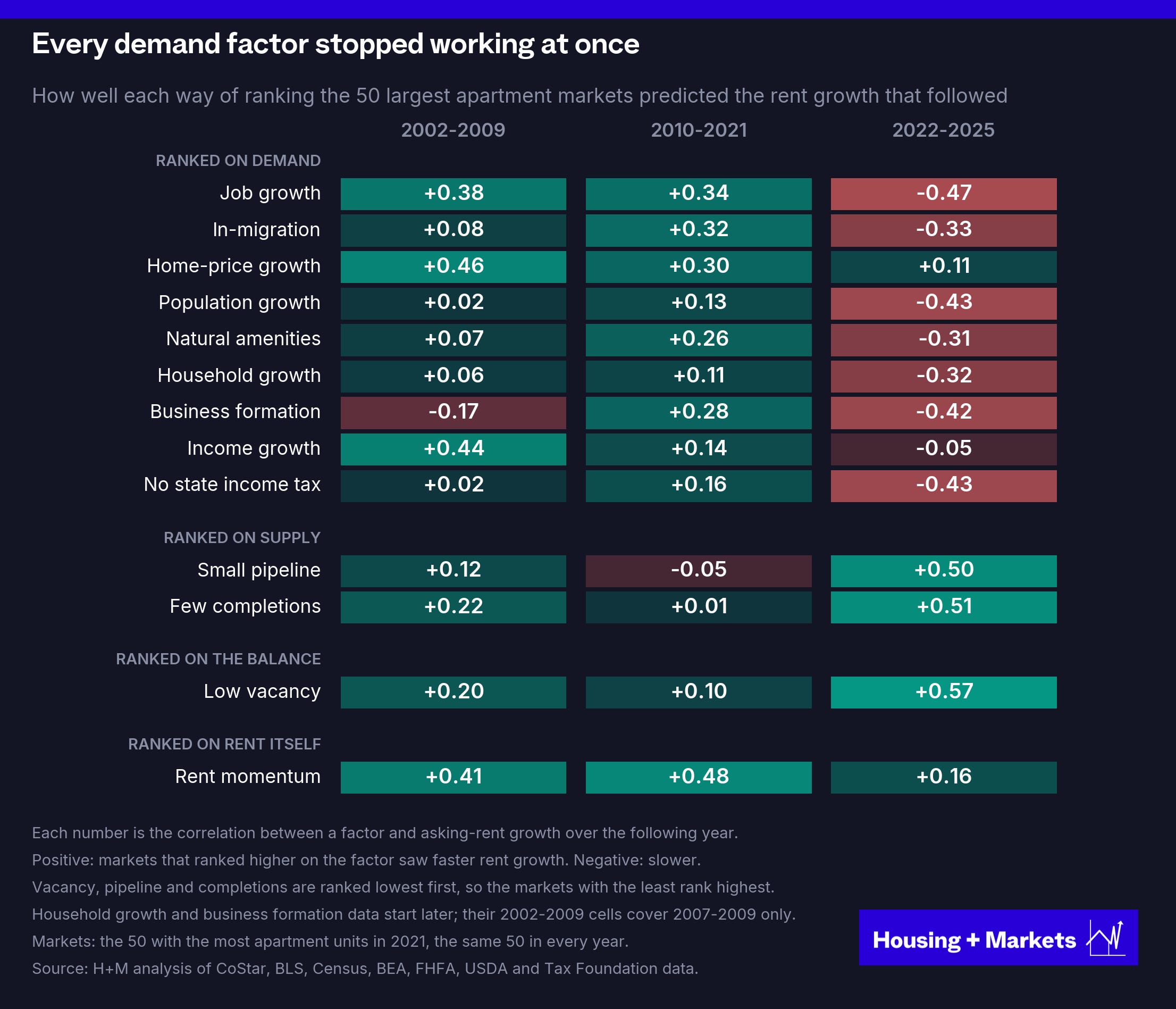
We took 13 of the factors investors actually use to decide where to invest, ranked the 50 largest apartment markets on each one every December and scored each ranking against the rent growth that followed. Each factor stands alone. This is a horse race, not a regression. One note on timing, the opening chart paired each year’s jobs with the same year’s rents. The board below uses the prior December’s reading, which is how investors actually allocate. We ran it both ways.
Same-year, jobs went from +0.51 before 2022 to −0.33 after. With the lag, +0.34 to −0.47. The direction of travel holds either way.
One more caveat, since astute readers will wonder. Why the 50 largest markets? Because that is where the money is. Those 50 hold about four-fifths of the apartment stock in the 200 largest metros, and the universe was fixed before any numbers came back. We ran everything on the next 150 markets too. The reversal shows up in every size band. The big markets simply give the cleanest reading in both directions, which is why they are the ones on the charts.
We broke the factors into four groups: demand-driven factors, supply-driven factors, momentum (a market’s own rent growth over the prior two years) and vacancy, which is neither demand nor supply but the place where the two meet.
So what does the data say?
From the early 2000s through 2021, almost every factor investors relied on showed a material positive correlation with the rent growth that followed. Job growth led the demand side at +0.34 across 2010 to 2021, with in-migration at +0.32 and home-price growth at +0.30 close behind. Rent momentum, a market’s own recent rent growth, scored +0.48, which tells you how persistent the era was.
After 2021 almost every demand factor inverted. Job growth went to −0.47, population growth to −0.43, in-migration to −0.33. The two supply factors, which had scored near zero through the 2010s, jumped to +0.50 and +0.51. And vacancy, which is neither demand nor supply but the place where the two meet, became the strongest factor on the board at +0.57.
What should we make of all this? Some basic economics should shed some light.
In 1890, the economist Alfred Marshall ended a century-long argument about what sets prices. One camp said the cost of production or supply. The other said what buyers would pay. Asking which one does it, Marshall wrote, is like asking which blade of a pair of scissors cuts the paper. Price is set where supply meets demand.
But the blades don’t share the work evenly. The shorter the horizon, the more demand governs, because supply can’t move quickly. Over the long run, supply reasserts itself. In a business where a building takes years to deliver, that asymmetry is everything.
Rents run on the same scissors. Economists Kenneth Rosen and Lawrence Smith demonstrated it for apartments in their landmark 1983 study. Every market has a vacancy rate at which rents hold still. Push vacancy below it and rents accelerate. Push vacancy above it and rents stall. Doesn’t matter what the job market is doing.
None of that is revelatory.
What needs pointing out is the next part.
The things we treat as demand (job growth, wage growth, in-migration, etc.) are not demand. They are all proxies for it.
Only two things ever set the rent.
How many units are available and how many households are going to rent them.
The first one we can count. Inventory, completions and the construction pipeline are tallies of actual buildings. Cranes are hard to hide. The second one we cannot. We cannot see into people’s heads and divine who will rent which apartment, where, over the next twelve months. Not directly, anyway.
So the board is lopsided. The supply numbers count the thing itself. Every demand number is a proxy, a stand-in for a decision we can’t see. And in 2022 the factors didn’t break randomly. They broke along a principle.
If every market looks the same on a factor, that factor can’t tell them apart.
Not “a factor has to correlate.” It has to correlate and it has to vary between markets. Miss either half and the ranking is noise. Which hands you a test to run before ranking on anything: how far apart are the markets on it?
Look at the last cycle’s best rent-growth years through that lens and they change shape.
The early 2010s were a construction depression.
Across the 50 largest markets, apartment deliveries ran at 0.8% of standing inventory a year from 2010 through 2013, and the median market bottomed near 0.3% in 2011.
And the same thing was happening in every market. In those years there were under two percentage points between the lightest built market in the country and the heaviest. Supply existed. It was just too small and too similar everywhere to push vacancy around.
That left demand as the only axis that markets meaningfully differed on, and job growth as the best demand proxy at the time. It sorted markets effectively because it was the only blade still moving.
Jobs didn’t rule because jobs are inherently the better indicator. Jobs ruled because supply was silent. Demand became the only factor you had to watch.
That changed when developers followed the same demand signals and built where people had been moving. The markets with the strongest domestic in-migration in 2017 through 2019 also added the most apartment inventory in 2022 through 2024. The more people a market drew, the more it built: 19 of the 25 biggest draws were among the 25 biggest builders. Of the twelve markets that drew the most people, ten have seen asking rents grow less than 5% in the three years since, and four have seen them fall. The outsized 2019 demand became the outsized competition in 2024.
Fast forward to today and the job-growth gap between American metros has collapsed to 0.8 percentage points, the narrowest in 35 years of data. Every market now hires at roughly the same pace, so there’s almost nothing left to rank on the demand side. The construction gap went the other way. Austin delivered about a quarter of its entire inventory in three years while Providence delivered 4%, and by 2024 markets differed nearly four times as much on levels of new construction as on job growth.
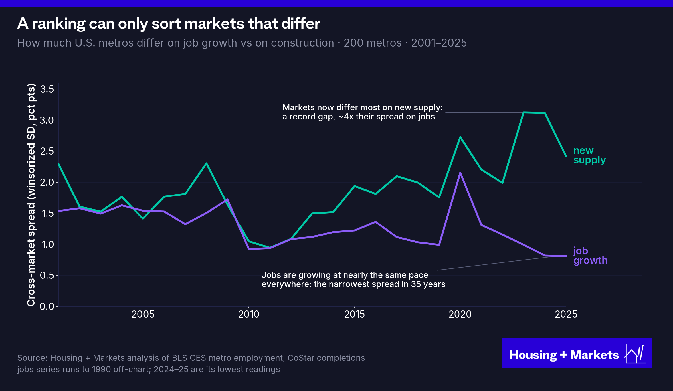
Here is the answer to question two. What predicts rent growth right now is supply, and the reason it does is that supply is the only thing markets still meaningfully differ on.
And here is the number that never let go. Vacancy stayed positive in every era, +0.20 through the 2000s, +0.10 through the 2010s and +0.57 now, and in the current era it is the strongest factor on the board. That is not because vacancy is cleverer than job growth. It is because vacancy was never a proxy for one blade. Every unit delivered and every household that showed up are already inside that number by the time you read it. Marshall’s answer to the whole argument was to stop picking a blade and look at the cut. Vacancy is the cut.
Fewer jobs, higher rents
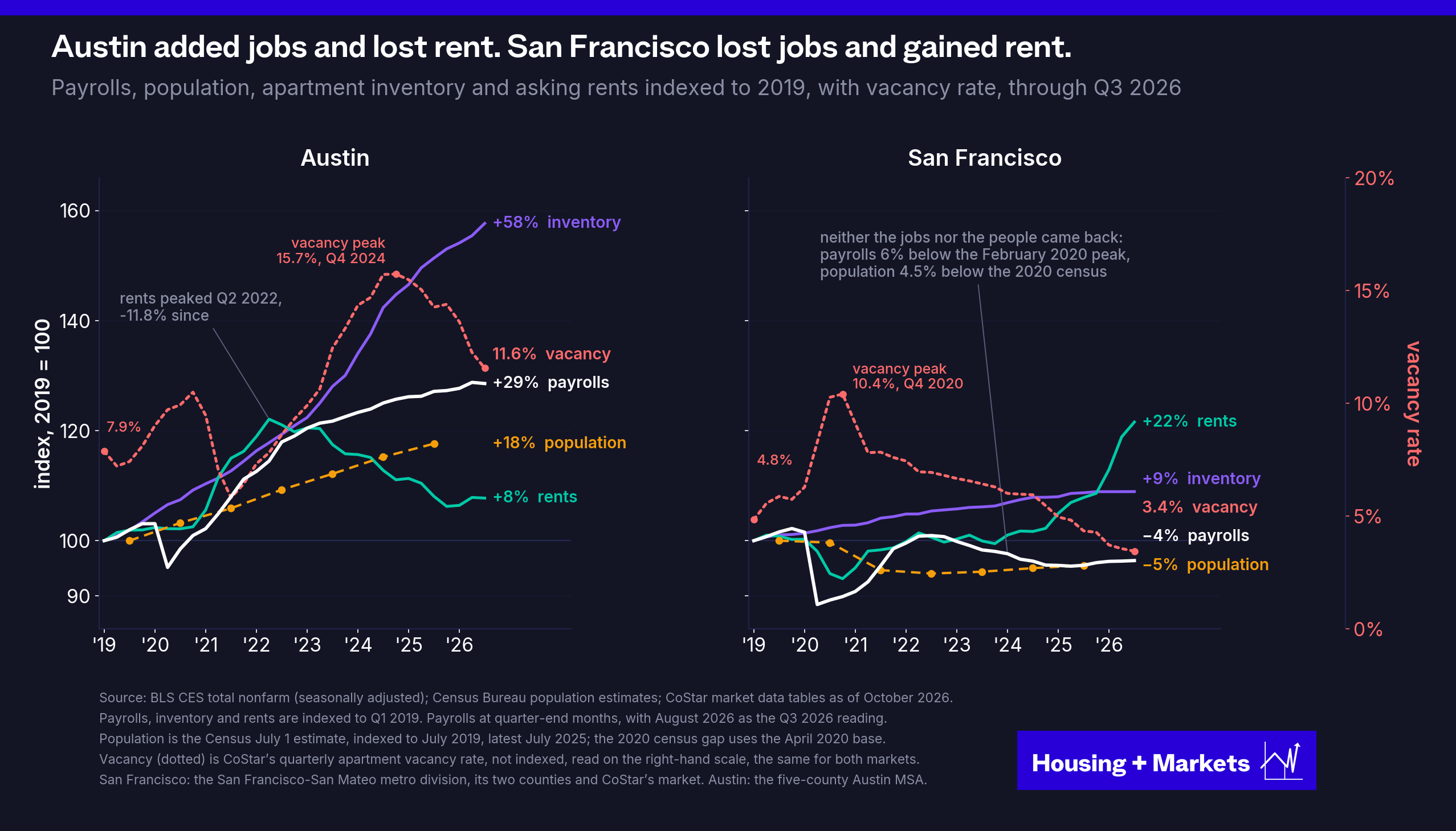
The cleanest example of all this is playing out right now. Owners across the country have spent the last several years grumbling about lackluster rent growth. Not those with holdings in San Francisco. Asking rents there were up 12.7% year over year in the third quarter. The AI boom gets the credit, and deserves it. But look at what kind of demand it is.
Jobs and people have thronged back to the Bay Area, right? Not quite. Payrolls in San Francisco and San Mateo counties were still 6.2% below their February 2020 peak in August. They have grown a little over the last year, up 0.9%, but the pandemic hole has not been filled. Neither has the population hole. The two counties lost almost 100,000 residents between the 2020 census and mid-2022 and have won back about a quarter of them. As of July 2025 they were still 73,000 people short of their 2020 count, 4.5% fewer.
So jobs and people are both still below where they were before the pandemic. But the city and the Peninsula went into it already short on housing, with apartment vacancy hovering around 5% through the 2010s, and they have added very little since: 9% more apartment inventory since early 2019, 3.2% since the end of 2022 and only 20 units so far this year. Vacancy has fallen from 10.4% at the 2020 trough to 3.4% today, the lowest in CoStar’s data back to 2010.
Now look at the market that every jobs ranking loved. Austin’s payrolls are up 29% since January 2019, and its population is up 18%, nearly 400,000 more people. Its apartment inventory is up 58% over the same stretch, more than 125,000 units, 80,000 of them since the end of 2022, and vacancy peaked at 15.7% in 2024. Asking rents are 11.8% below their 2022 peak.
One market added 29% more jobs and lost 12% of its rent. The other lost jobs and people, and rents surged.
A metro payroll total compresses two different channels. One is the number of households seeking homes. The other is the purchasing power of the households competing for particular homes. A relatively small group with large income gains can matter greatly at a specific price point without producing a spectacular aggregate jobs print. That is the AI boom in San Francisco. Personal income per resident in San Francisco County, which counts investment income as well as paychecks, rose from $127,302 in 2019 to $171,497 in 2024, according to the Bureau of Economic Analysis, about 10% ahead of inflation in a county with fewer people in it. The gain alone, $44,000 a head, is more than half of what the average resident of Austin’s Travis County had in total in 2019. Yet the median household’s income fell about 8% behind inflation over the same years, which tells you how concentrated those gains were. The boom has not brought back the bodies the pandemic took. It has brought back a somewhat smaller number of very well-paid ones, and they are bidding for a stock of apartments that has barely grown.
Research from the San Francisco Fed makes that distinction explicit. Studying longer-run housing dynamics, the authors associate income growth more closely with housing prices (and rents) and population growth more closely with the quantity of housing produced. Their subject is price levels across cities over decades; ours is year-to-year rent growth, where the delivery wave dominates. The distinction carries over either way. A payroll count tells you neither how many households arrived nor what they can pay.
A better reading is that economic growth does not reliably translate into rental scarcity, and scarcity is what sets the rent.
That is the risk in buying a growth story without pricing its supply response. The story is public. The employers are visible. The moving households appear in the same research reports. A market can be a genuinely attractive place to live and work and still offer a weak rent growth proposition.
The underwriting mistake is not believing in growth. It is assuming that the owner, rather than the renter, will capture its benefits.
Remote work changed location. It did not abolish the local market.
RealPage named remote work and “the changing nature of work” as the drivers. It is the obvious suspect. Millions of people started working from home, and the return-to-office argument has never stopped. So what actually happened?
In 2019, 5.7% of American workers, about 9 million people, usually worked from home, according to the Census Bureau’s American Community Survey. Then the offices emptied. The Census never published a standard 2020 estimate, but in May 2020 one real-time survey found about a third of workers doing their jobs entirely from home. By 2021 the count had tripled to 27.6M, and it has settled since at a little over double the old level: 13.3% of workers in 2024, about 22M people.
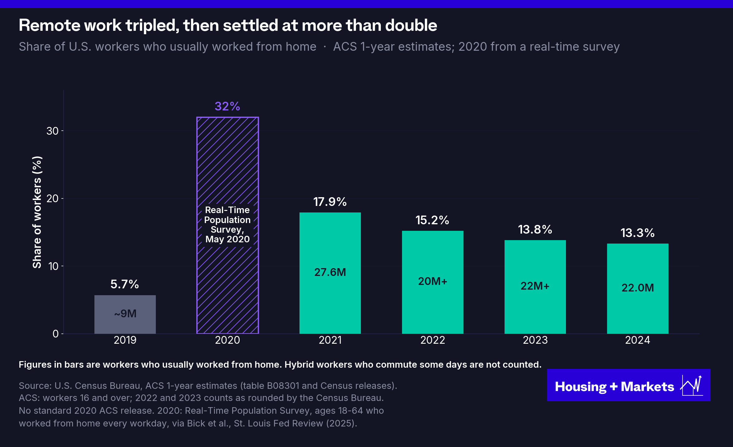
Return to office clawed back about a third of the pandemic jump and then stopped. If 22 million people can live anywhere, why should local jobs still matter?
Because the move was never as footloose as it looked. Most people who left a downtown stayed in its orbit. The ones who crossed the country took their paychecks to the markets that were already on every investor’s list.
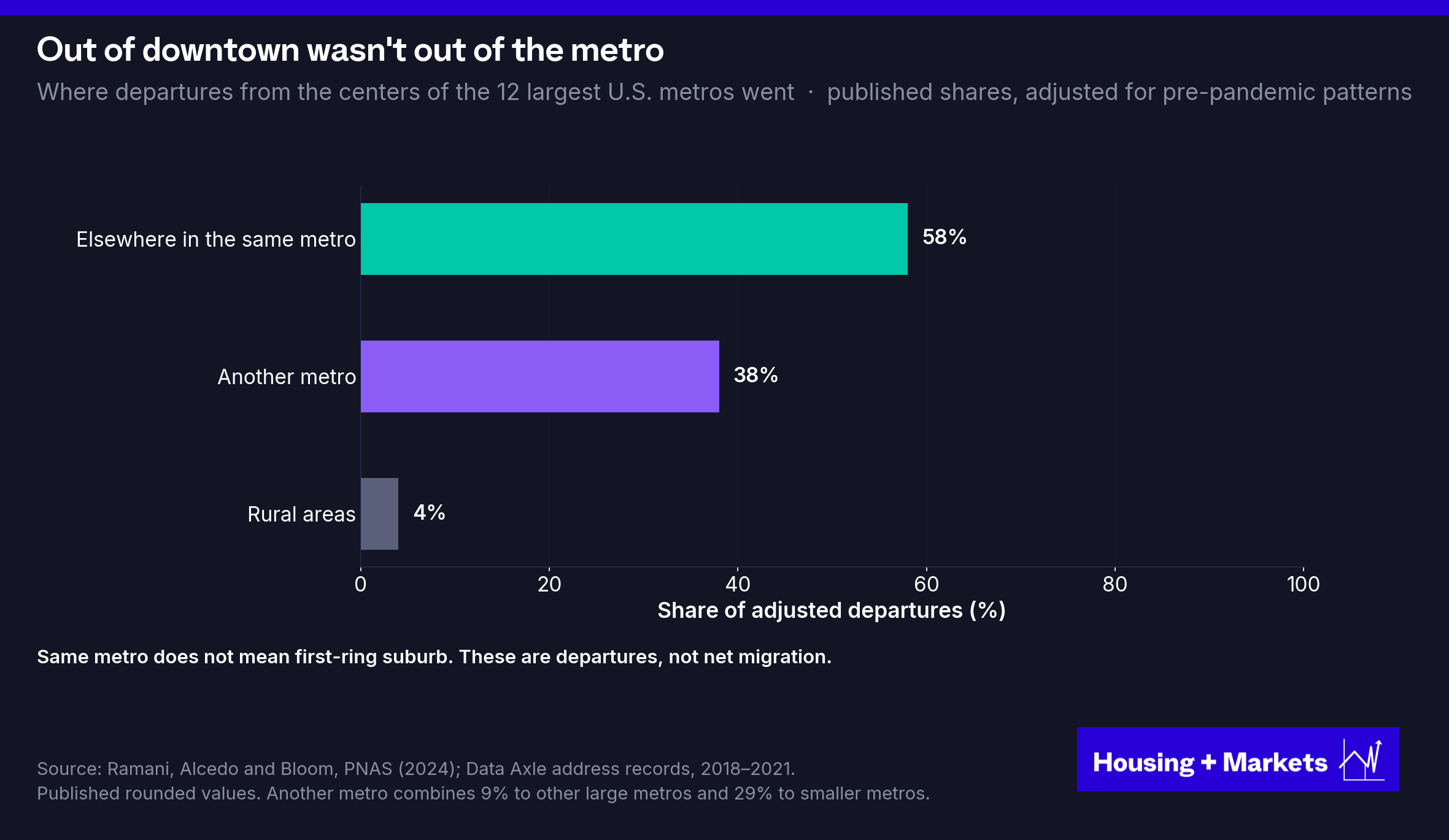
Leaving a downtown and leaving a metropolitan economy are different events. Ramani, Alcedo and Bloom’s study of address records found that 58% of pre-pandemic-adjusted departures from the centers of the twelve largest metros went elsewhere in the same metro; 38% went to other metros and 4% to rural areas.
Hybrid work tethers even more households to an office. In the August 2026 Survey of Working Arrangements and Attitudes, 27% of full-time workers were hybrid and 12% fully remote. A longer tolerable commute changes which neighborhood a household picks, not which regional labor market it belongs to.
The moves that did cross metro lines ran straight into the industry’s oldest reflex: build where the demand is showing up. Remote work did not redraw that map. It poured fuel on it. San Francisco Fed economists John Mondragon and Johannes Wieland estimate that the shift to remote work explains at least half of the national house-price and rent boom of 2020 and 2021, and that most of the effect holds even after accounting for migration.
Across these 50 markets, net domestic migration jumped by half. But it was flowing to the same markets that were already growing. Rank the migration destinations of 2019 against those of 2021, the height of the scramble, and the map comes back 0.83 the same. What changed was volume, poured into exactly the markets every investor already loved, by movers carrying origin-market paychecks. The industry read a one-time surge as a permanent regime, gave it a name, decoupling, and built a record pipeline against it. The surge was over by 2023, when Americans were moving less than at any time since records began in 1948, and by 2024 the redistribution across these 50 markets was 22% below its 2019 level. The deliveries kept coming.
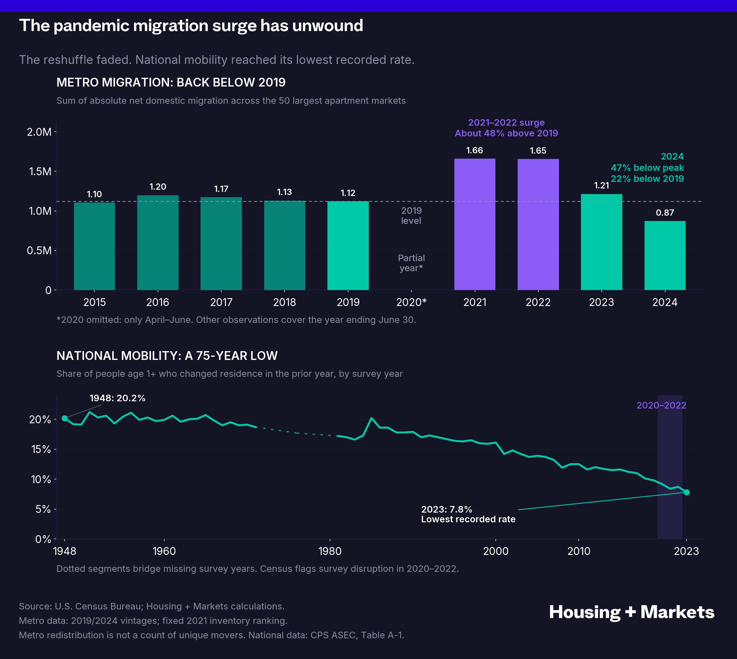
So remote work matters. It was a real demand shock, and a temporary surge in moving can leave a durable change in where people live. But it does not, on its own, explain the break between jobs and rents. Remote work did not break the compass. It handed the builders a map.
Do jobs still matter?
Yes. Of course they do. Supply only sorts markets while markets differ on supply, and that is ending fast.
Of the 92 metros that permitted at least a thousand apartments in 2022, 83% permitted fewer in 2024. This is not a Sunbelt hangover. It’s the development math breaking everywhere because of interest rates.
Permits lead deliveries by about two years, so the 2022 permit peak is the 2024 completion peak. The pipeline actually under construction has fallen by a third since the end of 2023, and deliveries are following it down. The 2026 and 2027 delivery years will be far thinner than 2024.
And the gap between markets has already closed. Across the 50 largest markets, the spread in what is under construction went from 3.7 points of inventory in 2022 to 1.6 in 2025, below the 2.0 of 2019. Forty-nine of the 50 markets are building less than they were in 2022, and 26 cut by more than half. Austin went from 17.6% of its inventory under construction to 4.8%, and sits near 4% today. Run that through the two-year lag and by 2027 markets will differ on new supply about as little as they did in the years when job growth ruled.
By 2027 supply will have stopped sorting markets. Demand will be doing all of it.
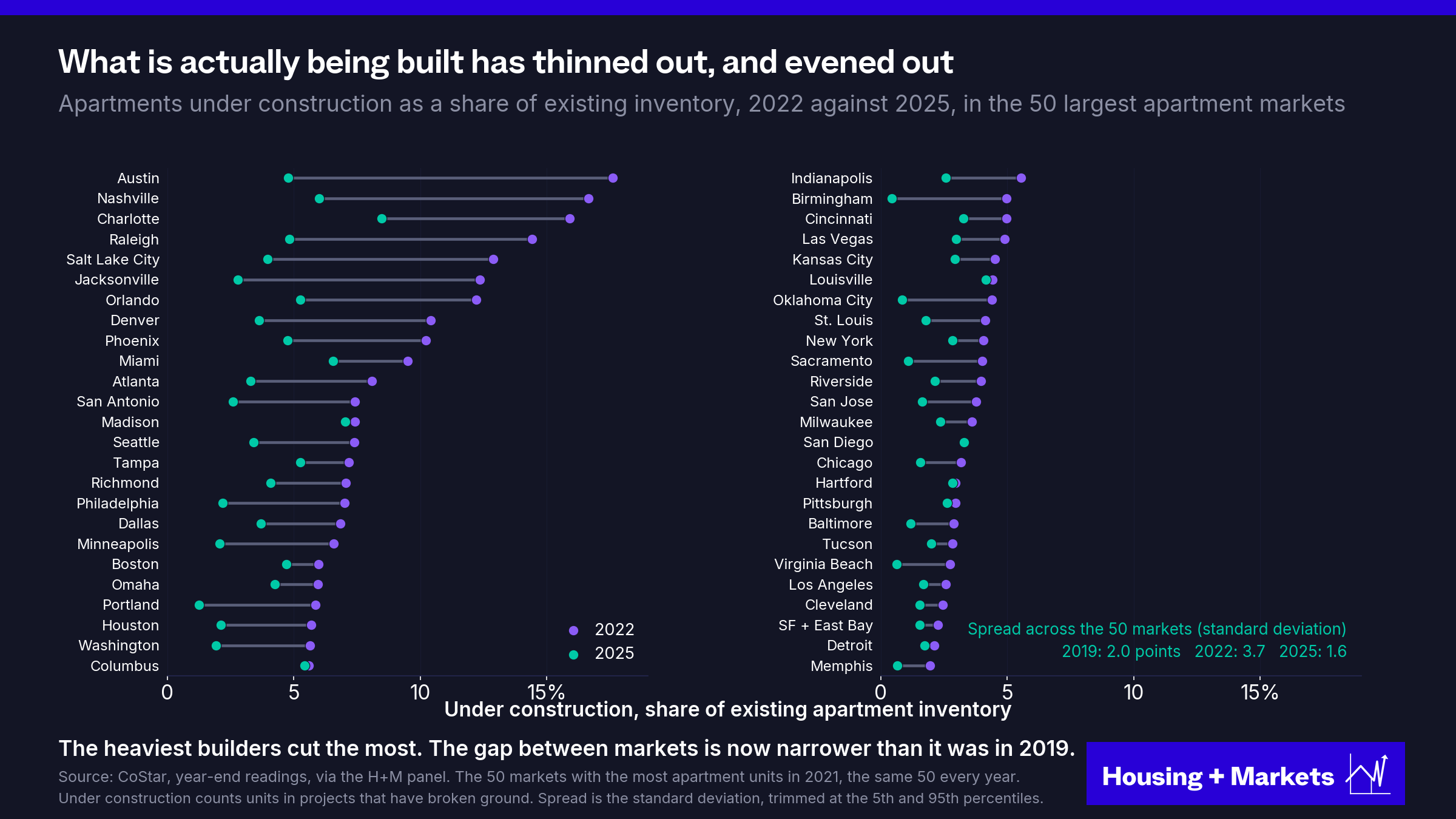
One caveat before anyone celebrates. Pipelines converge in 2027. The vacancy they left behind does not. Austin peaked at 15.7% vacant and is still absorbing, so the handoff to demand runs through absorption first, which is one more reason to watch vacancy rather than either blade on its own.
The reversal is already underway.
The 2019 playbook ranked markets on a number. Before you pull it back out, look at what has happened to that number.
The payroll data decoupled from the renter
So jobs never decoupled from geography. Payrolls and occupancy still move together, even after 2021. Something did decouple, and it is the part that should worry you. The payroll data decoupled from the renter. The renter still lives where the economy is. The survey has been losing track of them, four ways at once.
1. The jobs number is a questionable model, and the survey feeding it is shrinking
The first problem is accuracy. The payroll figure everyone trades on is not a count. It is an estimate. The Establishment Survey samples a slice of employers, seasonally adjusts their answers and bolts on a birth-death model to guess at the firms too new to be in the sample. Then it is revised, and revised again. The revisions are not small. Last year’s annual benchmark pulled 911,000 jobs out of the record on the preliminary estimate and 898,000 on the final. That is close to a full year of American job growth that turned out never to have occurred. And the survey underneath the model is thinning. The share of sampled employers who agree to take part at all fell from about 58% before 2020 to 43% in 2024, and the share whose reports arrive in time for the first estimate peaked near 79% in 2015 and ran about 60% in 2024. The first print is built from whoever answered in time.
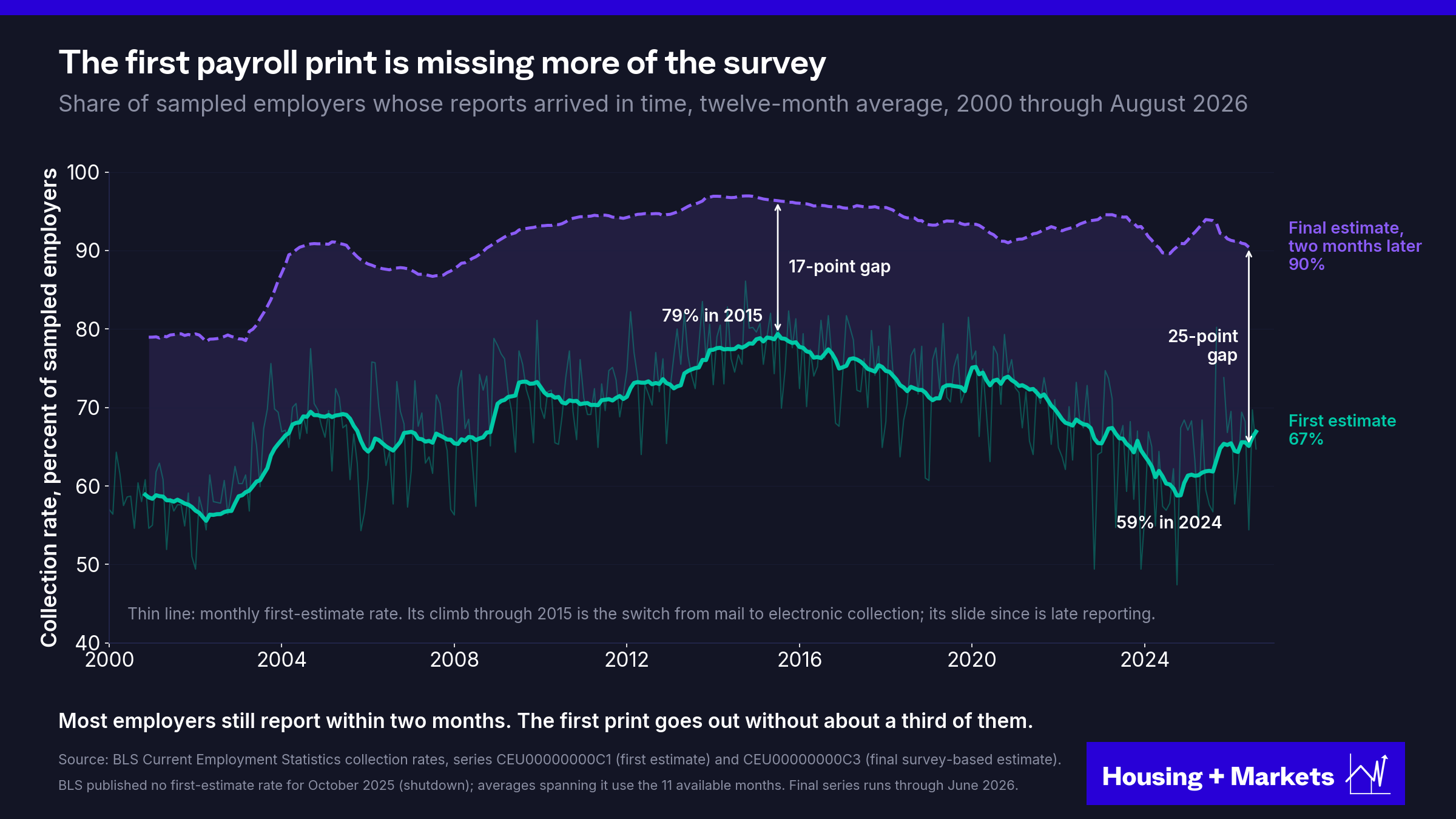
The number that actually counts is the QCEW, built from unemployment-insurance tax filings covering nearly every job in the country. It is as close to a census of American employment as exists, and I would trust it over anything else in the file. It also lands five to six months late. So one number is fast and modeled and one is real and slow, and the gap between them is not academic. Rank the 50 largest metros on 2025 private job growth using the survey, then rank them again using the tax records, and the two rankings correlate at +0.25 with a median miss of 0.78 percentage points. The survey had San Antonio up 1.6% when the truth was flat, and Austin up 0.3% when the truth was +3.0%. That is the whole problem in one sentence. The number you can get today is wrong, and the number that is right shows up six months after the leasing season.
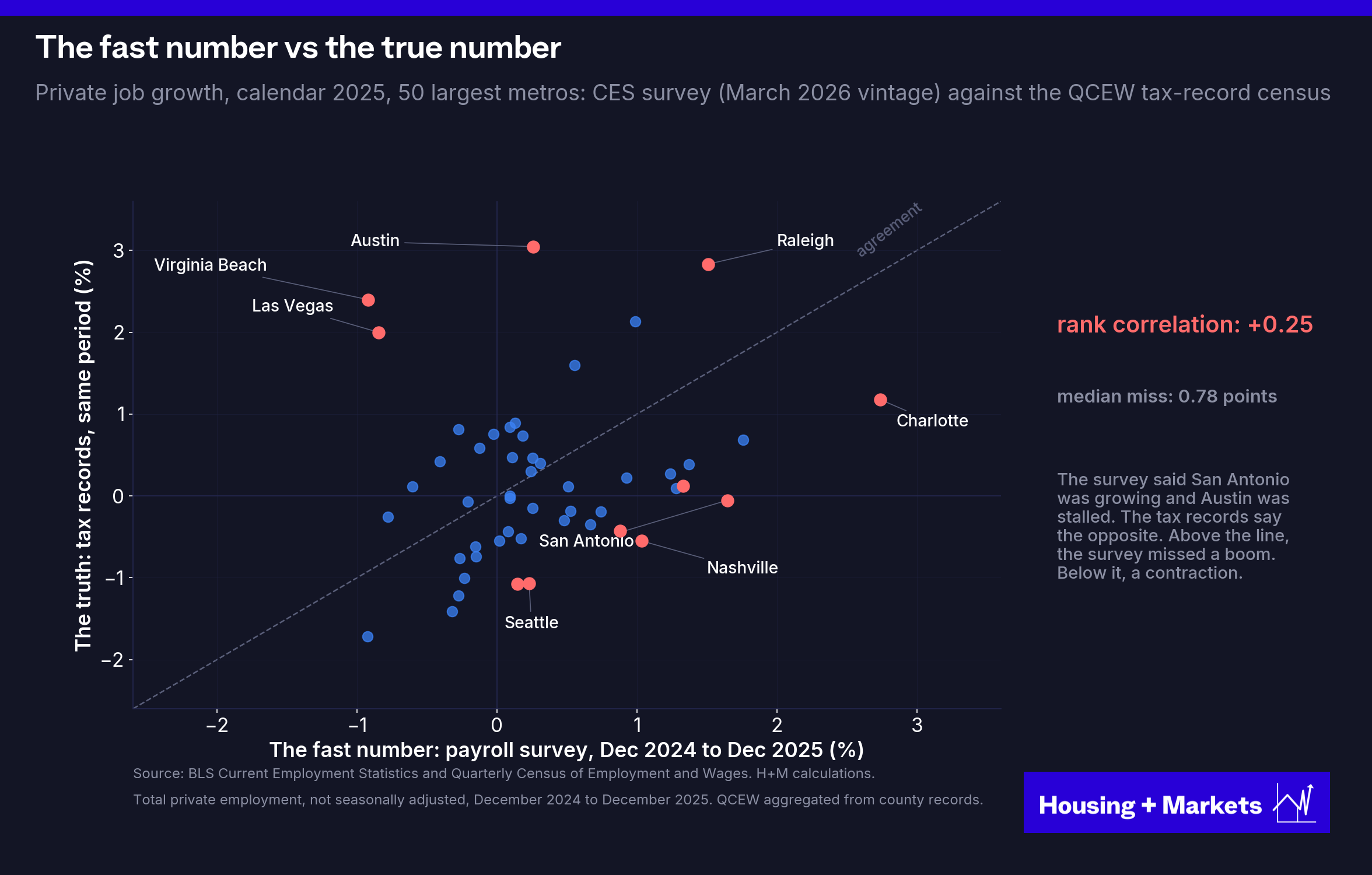
A faster count already exists, and it is not the government’s. ADP processes payroll for roughly one in six American private-sector workers and publishes a national read off real paychecks every month, and since October 2025 a preliminary one every Tuesday. It is national and regional rather than metro and it is benchmarked back to the government’s own quarterly census, so it does not solve the metro problem. What it proves is that a weekly count of actual paychecks is possible, while the number every market ranking runs on is still a Friday estimate drawn from a shrinking sample.
2. The margin of error is now larger than the signal
Even if the model were sound, the monthly payroll report carries a confidence interval of roughly plus or minus 122,000 jobs. In 2025 the average monthly gain was about 10,000, and through the first half of 2026 it has been about 92,000. In 2025 the margin of error was twelve times the signal. In 2026 it is still larger than the signal, and metro-level estimates are worse than the national one, not better. Every earlier visit inside that band came with a recession attached. In 2025 the economy spent an expansion year inside the ruler, and 2026 has not yet climbed out.
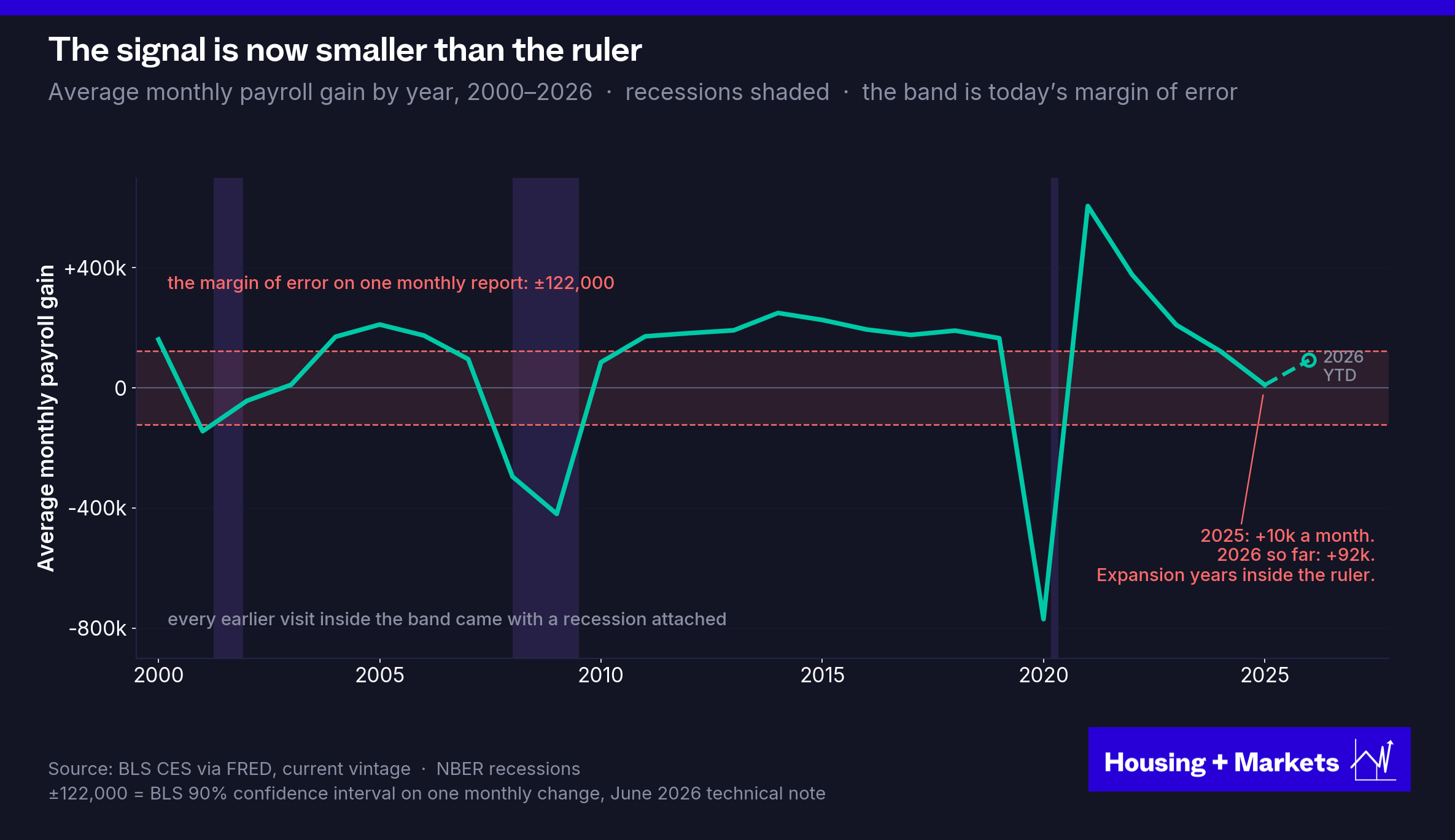
Now put that beside the dispersion chart. The spread in job growth across American metros is 0.8 percentage points. The median miss between the payroll survey and the tax records across the 50 largest metros in 2025 was 0.78 points. The differences the industry ranks on are about the same size as the instrument’s error.
3. The composition of the jobs matters, not just the count
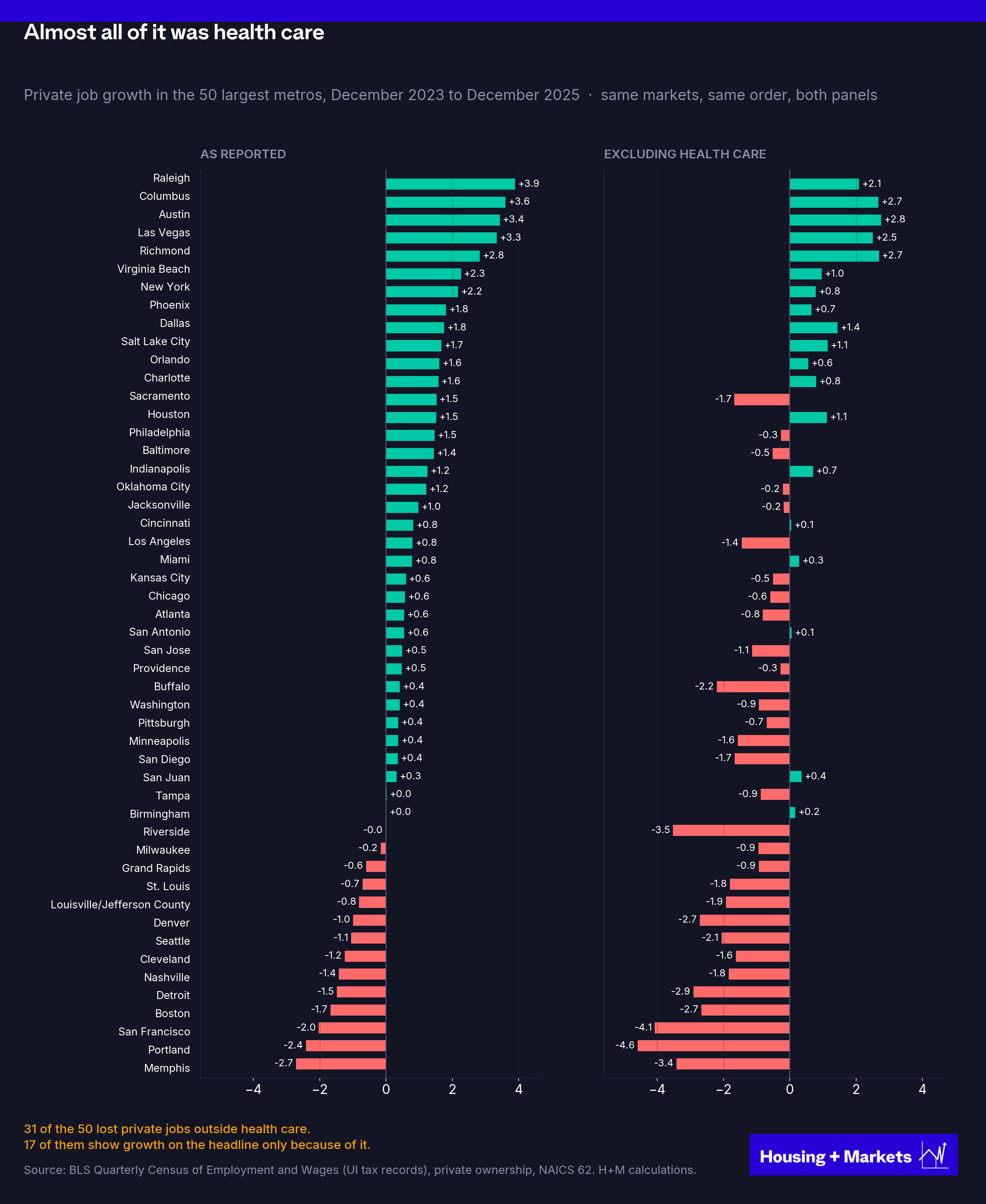
The third break is inside the number itself. From December 2023 to December 2025, private employment grew by 1.34 million. Health care grew by 1.53 million.
Strip out health care and the private economy lost 192,000 jobs.
Across the 50 largest metros, seventeen flip from growth to losses the moment you take health care out. Thirty-one are negative once you do. That matters for rent because these are not interchangeable jobs. A large share of the new health care jobs are home health and personal care aides, earning near the bottom of the wage distribution and paid largely through Medicaid. They are not the marginal renter for a new building, and a market whose entire job print is caregiving is not the market the headline number describes. That was the picture through December 2025, the last month the tax records cover. The survey data since then show the rest of the private economy hiring again, about 330,000 jobs in the first eight months of 2026, with health care still half of all private job growth.
And then there is the fourth break, the one I would argue matters most, because the survey is blind to one of the most interesting economic stories in America right now.
4. Income without a payroll
The United States is in the middle of the largest wave of business formation on record. Americans filed 5.6 million business applications in 2025, against about 3.5 million in 2019, and 2026 is running 16% ahead of that. The household survey counts 16.6 million self-employed Americans; the Census Bureau’s tax records count 33 million business owners. The payroll survey counts none of them as jobs. It cannot, because it counts positions on employers’ books. Applications don’t translate 1:1 into businesses, and many never earn a dollar. But the direction is not in doubt, and every bit of it is missed by the number the industry ranks markets on.
An apartment is leased by a household, not by a payroll count.
Economist Marvin Barth takes that distinction further. In his September 2025 analysis of slowing U.S. payroll growth, he argues that a shift toward self-employment helps reconcile weaker hiring with continued economic strength. For apartment investors, the provocative possibility is not simply that some workers are miscounted.
It is that earning power can grow without a corresponding increase in payroll jobs.
Barth estimates that 30,000 to 50,000 workers a month are moving into that self-employment blind spot, about the same as his estimate of how fast the labor force can grow. Put the two together and the implication is striking. If the new workers are going into self-employment instead of onto payrolls, a monthly payroll gain of roughly zero could be consistent with a completely healthy economy (and potentially strong rent growth).
Federal Reserve economists Seth Murray and Ivan Vidangos reach a similar place from a different direction. In April 2026 research they showed how slower immigration and an aging population could sharply reduce the hiring pace needed to keep unemployment steady.
Two mechanisms, one implication: a labor market can be balanced, and a household’s earning power can grow, with no payroll growth at all.
Stable unemployment does not, by itself, tell us how many additional households will seek apartments.
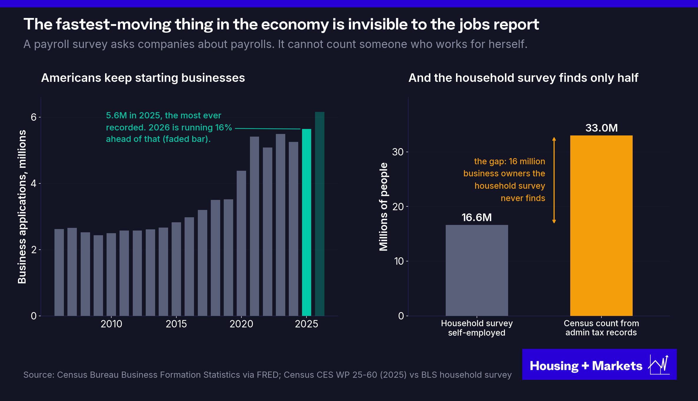
Consider a salaried professional who leaves a firm, starts an unincorporated consultancy and earns more. If the old position is not replaced, payroll employment falls while that household’s ability to pay rent rises. The payroll survey excludes unincorporated self-employment. The renter has not disappeared. The income has changed form.
Independent research shows why work arrangements are difficult to measure. In a study by Katharine Abraham and colleagues, follow-up questions in a specially designed survey nearly doubled the estimated share of workers who were independent contractors on their main job, to about 15%. Many initially described themselves as employees.
For the higher-earning end of the story, Stripe provides a different window. In its solopreneur index, more than twice as many solopreneurs earned over $1 million in 2025 as in 2023, and close to three times as many crossed $5 million and $10 million.
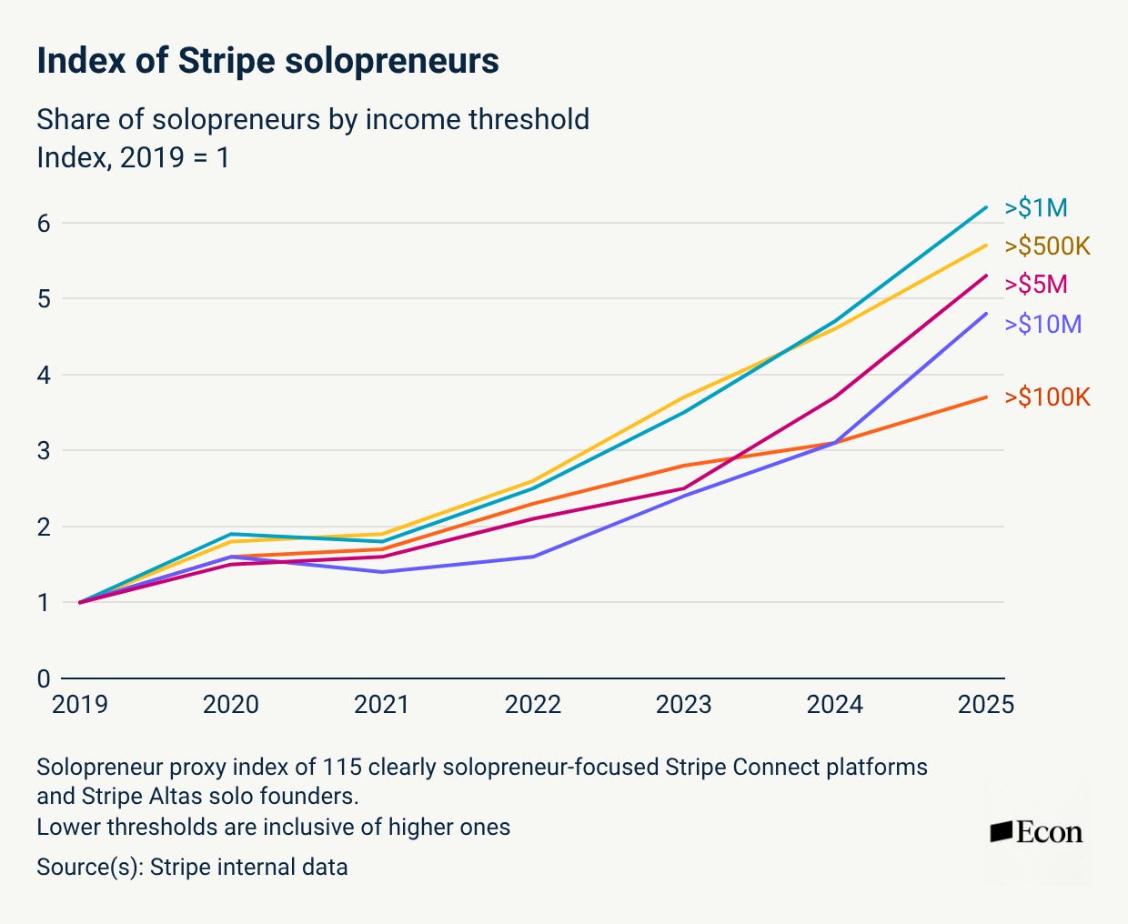
Business revenue is not take-home income, and a firm with seven-figure revenue may well have employees. Still, the evidence makes high-earning independent work worth tracking alongside salaried employment.
To be clear, the government does see this income. The household survey counts the self-employed and the national accounts count proprietors’ income. But nobody ranks apartment markets on proprietors’ income. They rank them on payrolls, the one series built to miss it.
Now line the numbers up. In 2025 the payroll survey averaged about 10,000 new jobs a month, a pace that had never before appeared outside a recession. That same year Americans filed 5.6 million business applications, 60% more than in 2019, and by Barth’s estimate 30,000 to 50,000 workers a month were going into self-employment instead of onto a payroll, roughly everything the labor force can add. Put those side by side and the headline number was reporting a stall while household income kept growing in the one place the survey cannot look. The payroll report did not record a weak year. It recorded the year the renter’s paycheck stopped passing through the survey.
A market ranking built on that number is no longer measuring demand. It is measuring the slice of demand that still comes with a W-2.
What the truck knows
So here is the answer to question three, and to the fourth. Yes, jobs will matter again, and soon: supply is about to stop sorting markets, which hands the job back to demand. And no, you should not plan on measuring them with the top-line jobs report number. The instrument this industry uses to read demand is a sampled, modeled, revised count of payroll jobs that has lost track of the renter four ways at once. The compass is coming back into use at the exact moment the needle has stopped reliably pointing north.
Supply was never the hard part. Entitlements, permits and cranes move at the speed of construction, and anyone willing to assemble the data can see a delivery wave two years out. Demand is hard because the thing we want to count is a decision: a household choosing when, where and how to live. We cannot count the decision. But the renter leaves a trail at every stage of the move, months before any of it reaches a rent print, and some of that trail is lying in plain sight.
Take the cheapest example there is. Buried in every U-Haul quote is the company’s own read on each market’s truck imbalance, repriced continuously by a business with money on every one-way rental. It took a couple of hours to reverse-engineer the quote flow and stand up a collector that now reads 48 route pairs a week, for nothing. On July 3, a ten-foot truck from Pittsburgh to Austin for an August 2 pickup cost $2,129. The same truck, the same day, going the other way, cost $1,064. The truck is the same truck in either direction. The price is not.
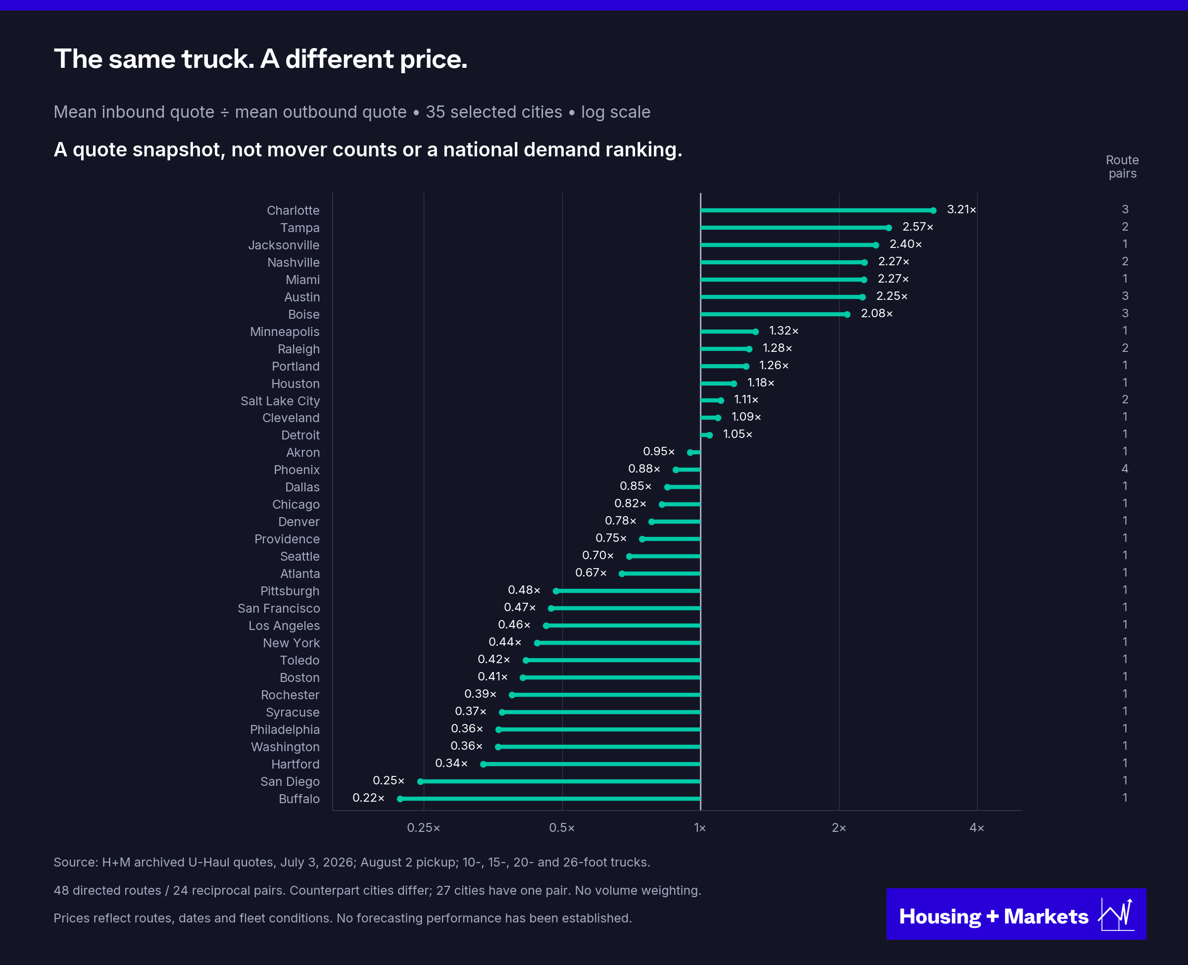
Now hold that number against the Austin chart above. People are still paying double to move there. Austin’s asking rents fell 12% anyway, because 125,000 apartments got there first.
That is the whole article in one truck. Demand is real, and it is still arriving. It is not scarcity. Only scarcity sets the rent.
We do not own a city’s payroll. We own the apartment that has to win the next lease.
Housing + Markets publishes analysis at the intersection of housing, capital markets and financial history. Just the data and the mechanisms underneath.
Sources and Further Reading
Data and definitions. The panel pairs CoStar’s March 2026 archive with BLS Current Employment Statistics metro payrolls: asking rents, not effective rents, and annual averages of twelve monthly payroll readings. The opening chart, the factor board, the migration chart and the under-construction chart use the 50 markets with the most apartment units in 2021, held fixed in every year; the market-size and dispersion tests use the 200 largest. Every pooled correlation removes each year’s cross-market mean first, so only differences between markets count. The factor board ranks markets each December and scores the ranking against the following year’s asking-rent growth. The 2022 through 2025 reversal survives dropping any single market or year (same-year r between −0.35 and −0.29; following-year between −0.48 and −0.42). The Austin and San Francisco figures come from CoStar’s October 2026 market data tables and BLS payrolls through August 2026; San Francisco payrolls are the San Francisco-San Mateo metropolitan division. Permit figures are Census Building Permits Survey annual metro files, with full-year 2025 from the CBSA files that replaced them; the under-construction spread is the cross-market standard deviation of CoStar units under construction as a share of inventory, trimmed at the 5th and 95th percentiles. The payroll margin of error is the BLS 90% confidence interval on one monthly change; survey participation figures are BLS collection rates and the CRS summary of CES response rates. The health care comparison uses the Quarterly Census of Employment and Wages, private ownership, NAICS 62, for the 50 largest metros by private employment, through December 2025, with the 2026 update from the national CES survey through August. Code, inputs and sensitivity tables are kept with the research files.
Rent, supply and market data
CoStar, market-level asking rents, inventory, completions, units under construction and vacancy; H+M panel built from the March 2026 archive, with Austin and San Francisco data tables pulled October 2026
BLS Current Employment Statistics, state and metro area payrolls; CES benchmark article and sampling-error notes
BLS Quarterly Census of Employment and Wages, private employment by metro and NAICS 62, through December 2025
BLS Consumer Price Index, rent of primary residence by metro area, 1972 to 2025; BEA regional accounts, wage and salary employment through 1990 and per-capita income
Census Bureau population estimates and components of change; American Community Survey one-year household counts; CPS Annual Social and Economic Supplement, geographic mobility (Table A-1)
Census Bureau Building Permits Survey, metro and CBSA annual files, 2019 to 2025; Census/HUD New Residential Construction, permits, starts, units under construction and completions in buildings of five or more units (FRED PERMIT5, HOUST5F, UNDCON5MUSA, COMPU5MUSA, POPTHM)
FHFA house price indexes; USDA ERS natural amenities scale; NBER business cycle dates
The payroll survey
BLS Current Employment Statistics collection rates, series CEU00000000C1 through C3; Congressional Research Service, “Current Employment Survey Monthly Revisions,” In Focus IF13084 (August 14, 2025)
BLS Current Employment Statistics, technical note on the reliability of the monthly change (June 2026 release), the source of the plus or minus 122,000 confidence interval
Marvin Barth, “The employment situation,” Thematic Markets (September 29, 2025)
Census Bureau Business Formation Statistics and Nonemployer Statistics; Census working paper CES 25-60; Stripe Economics, “The age of the solopreneur” (June 22, 2026)
ADP National Employment Report, monthly report and the weekly preliminary estimate published since October 28, 2025; ADP Research on sample representativeness and QCEW benchmarking
Economics and research
Alfred Marshall, Principles of Economics (1890), Book V, chapter 3
RealPage Analytics, “Job growth is not predicting rent growth” (February 2025)
Federal Reserve Bank of San Francisco Economic Letters, “Housing Affordability and Housing Demand” (February 2026) and “Remote Work and Housing Demand” (September 2022)
Mondragon and Wieland, “Housing Demand and Remote Work,” NBER Working Paper 30041
Ramani, Alcedo and Bloom, “How working from home reshapes cities,” PNAS (2024)
WFH Research, Survey of Working Arrangements and Attitudes (August 2026)
Demand data
U-Haul one-way rental quotes archived by the author on July 3, 2026, 48 routes, four truck sizes
Robustness checks
The 2022 to 2025 reversal
The sign flip survives leaving out any one market or any one year. For same-year jobs and rents in 2022 through 2025, the leave-one-market-out correlations range from −0.351 to −0.293; leaving out one year gives −0.378 to −0.309. For the following-year test the ranges are −0.482 to −0.421 and −0.532 to −0.356. Rank correlations are negative too: −0.341 same-year and −0.431 following-year. These are sensitivity ranges, not confidence intervals. Occupied-stock growth is a separate quantity check: its same-year correlation with employment is +0.404 in 2010 through 2021 and +0.312 in 2022 through 2025. Jobs still track how many units get filled. They stopped tracking what the units rent for.
Market size
Markets, ranked by 2021 apartment inventoryRent years 2010 to 2021Rent years 2022 to 2025Top 50+0.34 (n=600)−0.47 (n=200)51 to 100+0.24 (n=600)−0.32 (n=200)101 to 200+0.22 (n=1,200)−0.19 (n=400)All 200+0.24 (n=2,400)−0.29 (n=800)
Entries correlate preceding-year job growth with the following year’s asking-rent growth, pooled after removing each year’s cross-market mean, on a universe held fixed at each market’s 2021 inventory rank. The classic relationship was always weaker outside the top 50 (+0.22 across markets 51 through 200 before 2022, against +0.34), and the reversal appears in every band. Within-year dispersion of completions as a share of inventory averaged 1.2 points across the top 50 in 2010 through 2021 and 2.5 points across markets 51 through 200; the median 2021 inventory was about 155,000 units in the top 50 and about 18,000 units below it, so a single 400-unit project is 2% of a typical smaller market’s stock. Supply has an outsized effect in small markets, and thinner payroll and rent data blur what is left.
Regional sensitivity
Rent-outcome yearsSoutheast, 9 marketsSunbelt, 16 markets2010 to 2019+0.313 (n=90)+0.332 (n=160)2010 to 2021−0.013 (n=108)+0.006 (n=192)2022 to 2025−0.216 (n=36)−0.345 (n=64)
Entries correlate preceding-year job growth with the following year’s asking-rent growth after removing each subgroup’s annual mean. The Southeast subset is Atlanta, Charlotte, Jacksonville, Memphis, Miami, Nashville, Orlando, Raleigh and Tampa. The Sunbelt group adds Austin, Dallas-Fort Worth, Houston, Las Vegas, Phoenix, San Antonio and Tucson. The reversal is not a Sunbelt artifact, but it is strongest there.
The 1972 to 2025 history
The history chart pairs preceding-year employment growth with growth in the metro CPI rent of primary residence across 21 to 26 matched cities per year, with BEA wage-and-salary employment through 1990 spliced to BLS CES after. Only three years are negative on the one-year lag: 1973 (−0.083), 1974 (−0.046) and 2025 (−0.267), each on 21 cities. Dropping one city at a time gives −0.315 to +0.050 for 1973, −0.221 to +0.080 for 1974, and −0.412 to −0.167 for 2025. CPI rent records leases as they roll rather than asking rents, so this frame registers the current inversion about two years late, and the 1970s universe is roughly 20 large, mostly coastal metros.
New Orleans
The factor board uses the 50 markets with the most apartment units in 2021, held fixed, so New Orleans is not in it. On a floating top 50 that admits New Orleans in the 2000s, Hurricane Katrina alone (asking rents up 31.5% in 2006 while payrolls collapsed) drags the pooled 2002 to 2009 jobs reading from +0.38 to +0.01. That is one storm, not a decade without a signal.
The breakdown versus inversion distinction deserves to travel beyond housing, stated as a rule: noise degrades a signal, but only a crowd acting on the signal can reverse it. Capital that screens on job growth builds exactly where job growth was, two years late, so the predictor gets buried by its own disciples; your minus 0.33 after a decade at plus 0.51 is what a consensus eating its own edge looks like in data. It also explains why the 1970s comparison runs the other way: that wave was larger by your completions figures, but it was not allocated by the signal, so it blurred the relationship instead of flipping it.